13 Jan 2015

Timesheet for worked hours 2015

#30 Timesheet for worked hours 2015


Note (8-4-2015)
I made a new version of this Excel, which can calculate total project-hours, see:
 
http://worktimesheet2014.blogspot.com.es/2015/04/timesheet-for-worked-hours-2015-v3-with.html 
 
This post is about the new version (V2) of the Excel I made  to track your worked hours, the "Timesheet 2015". For my post about the previous version (V1), see:

http://worktimesheet2014.blogspot.com.es/2014/01/timesheet.html

What´s new in V2:

- V2 has the calendar for 2015 and the holidays in Spain/Madrid.
- V2 is better documented, and uses cell-comments to describe the columns of the 'input-table' (where you have to enter your worked hours)
- V1 showed all columns with formulas of the input-table, V2 only shows 1 calculated column, that with the end-result of all calculations (difference between your worked hours and contract-hours, which should be 0). This to avoid the risk that you accidentily change a column with a formula.
- V1 was mainly in Spanish and had a translation-table for English, V2 is in English
- V1 had, besides de the timesheet, also a year-calendar and vacations-planner, V2 doesn´t, these documents are now in separate Excels, see:

http://worktimesheet2014.blogspot.com.es/2014/12/year-calendar-and-planner-2015-and.html

http://worktimesheet2014.blogspot.com.es/2014/07/vacations-planner-in-excel.html

- V2 has more statistics.
- V2 has an extra input-table, to book the time you worked for a project per day per office-hour
- V2 has a new office-hours/work-week table for a short workweek of 35 hours.
- V1 was free of charge and V2 isn´t.. No, I was just kidding, V2 is also for free, but  if you want to make a small donation, I appreciate it. My PayPal-account is related to my hotmail-account "eigersoftware" (see also sheet-1 of the Excel of this post).


How to use this Excel:

step 0: delete all my input for this demo (green columns in sheet 'Tabla'), which has data for every (working) day in 2015 (with extra details for month decembre, that´s why I filtered the input-table for this month)

step 1: the Excel has some 'parameters' which you should check and maybe change, like e.g. the table with the office-hours, e.g.: for a 40 hour work-week. NB: you can use more then 1 workweek-table per year, e.g. in Spain during the months July and August, we have a summer-schedule of 37 hours in stead of the standard 40 hours-workweeks in the rest of the year.

step 2: fill for every day in sheet 'Tabla' (see fig.2)  the green columns of the input-table, like start-time and end-time of working-day and break(s). The yelow cell  'Tdiff' shows the difference of time-worked vs time-contract (should be >= 0), in minutes. And you can also register the time you worked for a project per day per office-hour, see sheet 'DiaHoras'.

step 3: update pivot-tables in sheet 'Estadisticas' (see fig.1), click menu Analizar > Actualizar Todo (o menu Datos > Actualizar (Analyze > Refresh). For more info about pivot-tables, see:
https://www.ablebits.com/office-addins-blog/2014/11/19/excel-pivot-table-tutorial/

For more details about this Excel, see the document itself, the demo-data, especially that of december should give a good impression how to use this Excel to track your hours.

And to conclude I want to thank Excel-MVP John Walkenback for adding my blog on his website about Excel, which is a great source of information about Excel, see:

http://spreadsheetpage.com
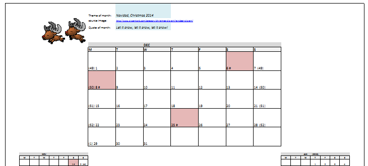

Figures:


Fig.1: Statistics: pivot-tables and graphs to show total worked time (and difference with time-contract, so the time you should work)


Fig.2: Input-table with start-time and end-time per day (input) and total hours worked and difference with contract (calculated). Table is input for pivot-tables (see fig.1).


Fig.3: Input-table with time you worked for a project per day per office-hour


Downloads:

#Mirror 1:
https://es.scribd.com/doc/252535966/TimeSheet-to-track-worked-hours-2015

 #Mirror 2 (Excel file):

NB: this site has MS Onedrive, which has 'Excel-Online', so you can view my Excel-files here if you don´t have MS Excel on your PC

http://1drv.ms/17BM33z

#Mirror 3:
http://goo.gl/OrcFbC

29 Dec 2014

Year calendar and planner 2015 and Month-calendar Jan.

#29 Year calendar and planner for 2015 and Month-calendar January in Excel and PDF

In this post the new year calendar and planner for 2015 and the month-calendar for January 2015, see fig.1-3. For the Spanish readers: the calendar includes all holidays (so it´s the 'calendario laboral 2015').
The graphic I used in this Excel, this time about the new year 2015, which is the year of the (green) sheep in the Chinese horoscope, is from this site with public domain cliparts:
http://www.clker.com/clipart-green-sheep.html


Fig.1: 2015 year-planner


Fig.2: 2015 year-calendar


Fig.3: Jan. 2015 month-calendar


Downloads:


#Mirror 1 (PDF file):
https://es.scribd.com/doc/251216011/Calendar-201501

 #Mirror 2 (Excel file):
NB: this site has MS Onedrive, which has 'Excel-Online', so you can view my Excel-files here if you don´t have MS Excel on your PC

http://1drv.ms/1JWMNPk

#Mirror 3 (Excel and PDF file in 1 zip):

http://goo.gl/eq5Mpq

http://goo.gl/rmWopZ

30 Nov 2014

Month-calendar for December and 2015 year-calendar in Excel

#28 Month-calendar for December and 2015 year-calendar in Excel 

In this post the new month-calendar for December 2014, with week-numbers (see fig.1) in my multi-language (English, Spanish, Chinese and some more languages) Excel. The Excel also has the year-calendar for 2015 (see fig.2). And soon I´ll make a new version which includes the 2015- year-planner.
The graphic I used in this Excel is from this site with public domain cliparts, this time about Xmas.

http://www.clipartlord.com/category/christmas-clip-art/reindeer-clip-art/

, thanks for sharing!


      fig.1 2014-Calendar month Dec.


           fig.2 2015 year-calendar

Downloads:

#Mirror 1 (zip file with Excel-file and PDF-file):

https://drive.google.com/file/d/0BywxxSJoaUYxMFI1UGlEUHAxbTQ/view?usp=sharing

23 Nov 2014

Statistics result 10-km run Corre por el niño 2014

#27 Statistics result 10-km run Corre por el niño 2014

On Sun. 9 Nov. I participated in the 4th ed. of the 10K run "Corre por el Niño 2014" (#CorrePorElNiño), together with 1827 other people. (In total there were 7000 runners, the rest participated in the other 4 km run. This run was organized by hospital Niño Jesus (in Madrid), to raise funds for investigation of severe diseases with childeren, like e.g. cancer. For more info  about this road-race, see:

http://correporelnino.wordpress.com

https://twitter.com/CorrePorElNino

https://www.facebook.com/pages/Carrera-Popular-Hospital-Ni%C3%B1o-Jes%C3%BAs/212488895455880

Every participant of the 10k run gets a chip, and in this race the bruto (gun) time and netto (chip) time are measured. The organization decided to use the bruto time as the oficial time (as prescribed by IAAF), although I think the netto time would be better because of the large number of participants, not everybody can start at the start/finish line at the same (gun-)time. For me for example it took 20 sec. after the gun to reach the start/finish line. And the final ranking raised also some doubts: the netto time of the fastest woman (33:47 min, and bruto time 37:03) was better than that of the fastest man (36:05 min. (netto and bruto time)), which probably is incorrect, as was noticed here:

http://www.forofosdelrunning.com/index.php?topic=6709.30  

And I think it´s a pity that in the ranking-table the columns 'gender' and 'category' (age-classes) are missing.
But of course the most important thing was the hospital raised about 70.000 euro (every participant pays 10 euro). For  some of my photos of the race (and that of 2013), see:

https://picasaweb.google.com/103278159654062440102/CarreraDelNino2013Madrid

(one of them has Pedro Delgado on it, the former Tour de France winner, who participated in the run to promoto it).

After the race I wondered how good (or bad) was my ranking (my bruto-time: 53:33 min., netto: 53:13, about half as slow as the world-record for the 10k road-race (26:44 min)...). The ranking was published here:

http://www.cronococa.com/ResultadosRunning.aspx

and I saw I ended at 828th place (my name is in blank because I registered last minute, on the day of the race). And on this site:

http://www.runedia.com/cursa/201418490/carrera-popular-corre-por-el-nino-10k/2014/

I saw that my ranking corresponds to 45%-percentile. And this site also had a nice histogram of the times of the participants, which gave me the idea to do the same in Excel, see fig.1 for the result.

    fig.1: Distribution of finish-times runners

How did I make this? First, I copied the data from the CronoCoca-website, see fig.2, blue columns. Then, I added the orange columns. First, the bruto time in seconds, and the (integer-)values of this column were input for the FREQUENCY-funcion (1st parameter, 'data-array') which calculates the freq. of the values in this data-array. Then I created another table with the 'bins', time-intervals of x minutes (I made 2 versions, with x=2 and x=5), for which I also calculated the equivalent in seconds, which is the 2nd  parameter, 'bins array') of the FREQUENCY-funcion.The results is the column 'Freq.' (see table in fig.1), for which I created a bar-chart (histogram) (see left graph in fig.1). The next column is the cumulative frequency and the last columns the relative cumulative frequenc, or 'percentile rank'. For a more detailed description of Excel and distribution-functions, see:

http://exceluser.com/formulas/frequency-distribution-five-ways.htm

fig.2: Table with all finish-times

For how you can calculate percentiles (quartiles) in Excel (see fig.2, 2nd orange column), using e.g. the  statistical functions PERCENTRANK.INC, PERCENTILE, QUARTILE, see:

http://best-excel-tutorial.com/55-advanced/219-calculate-percentile

http://www.excel-easy.com/examples/percentiles-quartiles.html

As I said, my percentil and ranking was 45% and 828 (see table of fig.1, the orange row). In the histograms with bin-widths of 5 minutes (fig.1, graph Cumul. Rel. Freq.) you can see that my time (53:33 min.) falls between the percentiles of bins 0:51-0:53 and 0:53-0:55 min., so between 41% and 51%. And if you look at the same graph in sheet-2, with the (bigger) bin-width of 5 min., it shows my time is between the 29% (bin 0:45-0:50) and 51% (bin 0:50-0:55). So the smaller the bin-width, the more exact is the percentile-estimation. For how to determine the optimal bin-width, see:

http://stats.stackexchange.com/questions/798/calculating-optimal-number-of-bins-in-a-histogram-for-n-where-n-ranges-from-30

The RunEdia-site also had some other statistics, like mean and standard deviation of the finish-times, things which can also be calculated in Excel with the statistical-functions (AVERAGE, STDEV), see sheet-2 and fig.3 and this site:

http://office.microsoft.com/en-us/excel-help/statistical-functions-HP005203066.aspx


 fig.3: Statistics finish-times

The distribution of the times of the runners looks like a normal distribution  (a bell-shaped curve) and to test this, I used the statistical function NORM.INV to calculate the 3 quartiles Q1, Q2, Q3 and compared them with the 'real' Q1,Q2, Q3, and as you can see, Q1 and Q2 of the normal distribution are quite close to that of the real distribution. Another test for 'normality' of the distribution which I did was the SKEW-function, with a result of 0,3, and according to this site:

http://help.gooddata.com/doc/public/wh/WHAll/Default.htm?#MAQLRefGuide/NormalityTesting-SkewnessAndKurtosis.htm

that indicates the distribution is approximately symmetric (like a normal distribution). The fact the skew is positive means that the distribution-function has a tail, which means in this case (10K run) that there are more runners that are slower than the mean time (54:50 min.) then that there are runners that are faster then the mean time.

For this race I used the Runtastic Android-app to measure my km-times, which you can see here:

http://www.runtastic.com/sport-sessions/347242237

I also included these results (km-times and speed) in my Excel, see fig.4

  fig.4: my km-times and speed

This graphic has besides my speed als the height(differences) during the race (to get the absolute height, you must add ca. 667m, the hight of Madrid (above sea-level). For a description how to combine 2 graphs in 1 graphic (in this case: area-chart for height) and line-chart for speed), see:

http://blogs.office.com/2012/06/21/combining-chart-types-adding-a-second-axis/

For this post I want to thank (Crono)Coca, the company responsable for the time-registration in this 10K run, for answering my questions about the time-ranking table, and José, my running/training-partner, for reviewing the statistics of my Excel.

And to conclude, some interesting websites I found while making this Excel:

- statistics for a 10K run (very profesional!):
http://cnr.lwlss.net/RealData/

-Q/A distribution times 5K run:
http://www.letsrun.com/forum/flat_read.php?thread=4612823

- graphics for distributions:
http://flowingdata.com/2012/05/15/how-to-visualize-and-compare-distributions/

-histograms and (normal) distribution functions in Excel:
http://peltiertech.com/Excel/Charts/Histograms.html
http://exceluser.com/formulas/statsnormal.htm

- race-timing and discussion bruto vs netto finish times and funny anecdote:
http://www.aimsworldrunning.org/race_timing.htm
http://www.iaaf.org/news/news/sometimes-rules-can-be-complicated-to-explain

Downloads:

#Mirror 1 (PDF file):

https://es.scribd.com/doc/247957028/Statistics-10km-Run-CorrePorElNino2014-in-Excel

 #Mirror 2 (Excel file):
NB: this site has MS Onedrive, which has 'Excel-Online', so you can view my Excel-files here if you don´t have MS Excel on your PC

https://onedrive.live.com/redir?resid=3F963E9F1A42D952%21251

#Mirror 3 (Excel and PDF file in 1 zip):

https://drive.google.com/file/d/0BywxxSJoaUYxRkx4RnQwLWNNbVU/view?usp=sharing 


1 Nov 2014

Calendar 2014 November in Excel in Chinese

#26 Calendar 2014 November in Excel in Chinese

I made a new version (v13) of my Excel Calendar (see fig.1), which is almost the same as v12, but now with the month-calendar for November, and I also added Chinese day and month names. I don´t know anything about Chinese, except that it is a CJK-language and I thought that if I have Korean as a language in my Excel Calendar, I should also include Chinese as the most spoken language in the world. For more info about CJK-languages and special characters in MS Excel (Office), see my post with a calendar in Korean:

http://worktimesheet2014.blogspot.com.es/2014/01/calendar-2014-v5-korean-part-12.html

This month´s item is 'La carrera del niño 2014', a run organized by hospital Niño Jesus, to raise funds for investigation of severe diseases with childeren, like e.g. cancer. For more info see:

http://correporelnino.wordpress.com

And if you find this calendar a bit boring, you can decorate it as you like, see fig.2 for an example of a 'kids-version'.


fig.1 2014-Calendar month Nov., in Chinese


fig.2 (photo of) Excel-Calendar, kids-version


Downloads:

#Mirror 1:
https://drive.google.com/file/d/0BywxxSJoaUYxRy1ULUxwTnBSZWs/view?usp=sharing

22 Oct 2014

Infographic Win/Loss record Rafa Nadal in Excel

#25 Infographic Win/Loss record Rafa Nadal in Excel

This post has 2 Excels (see paragraph Downloads below):
-Tennis_Input.xlsx: data with match-results (copy this to dir: C:\Temp\)
-Tennis_Statistics.xlsx: has Tennis_Input as its datasource.


The other day I saw in the Spanish sports-newspaper Marca (30/9/2014, pag.68, or see www.marca.com) an 'infographic' (made by Sergio Bartolome) of the win/loss record of Rafa Nadal, from the year of his break-through in the tennis world top (2005) until hist latest Wimbledon (july 2014). The graphic showed wins vs losses on the x-axis, and the years on the y-axis. I was wondering if I could make this graphic in Excel, and from scratch, so not using the numbers form Marca, but some website with the results of all the match-results from Nadal from 2005 until 2014. And the answer is yes, see fig.1 for the end-result (Tennis_Statistics.xlsx).
BTW: the numbers in my statistics are not exactly the same as those in Marco, because in my statistics I included doubles, Marco only has singles.

  
        fig.1: Win/Loss record Nadal


The type of graphic in Marca reminded me of a population-pyramid graph,with on the y-axis the age-ranges and on the x-axis the genders (men on the left and women on the right side of the y-axis), and this graph can be made in Excel, see e.g.:

http://www.uvm.edu/~agri99/spring2004/Population_Pyramids_in_Excel.html

or:

http://chandoo.org/wp/2010/08/03/immigrants-in-denmark/

Comparing the win/loss graph with the population-pyramid graph in this example (of the 1st URL), you have this equivalents:
- men : losses (in Excel-graph: data series 1)
- women : wins (in Excel-graph: data series 2)
- age-classes :  years (in Excel-graph: category)

To get the numbers of the losses on the left side of the y-axis (years), so the negative numbers on the x-axis, without the minus sign, you have to give the cell format 'Number' '0:0', for more details see:

http://peltiertech.com/Excel/NumberFormats.html

or:

http://office.microsoft.com/en-us/excel-help/create-a-custom-number-format-HP010342372.aspx

The other part of this Excel is the data-part (Tennis_Input.xlsx). I found all (903) match-results (singles and doubles) of Nadal here:

http://www.itftennis.com/procircuit/players/player/profile.aspx?playerid=100007935

The format of the data on this site is quite structured, but I couldn't use PowerQuery to get the data from the Web into a table in Excel. So I copied all data from the website myself and made a table of it, with the result-data (Win/Loss) in column B and I added column F, with the year (in which the match was played). So these (yellow) columns (B and F) form the table with the input for my Excel with the Win/Loss Record (Tennis_Statistics.xlsx), see sheet-1 ('DataWeb') and fig.2

                                  fig.2 Input-table with data from website


 In sheet-2 ('TableResult' and fig.3) you can see a pivot-table and graph for this table. The pivot-table has 2 values: total number of matches won/lost and the percentage won vs lost.

fig.3: pivot-table for input-table with match-results Nadal


And in sheet-3 ('Finals') I used the table of sheet-1 (pink lines) to get the results (won/lost) of the finals Nadal played in 2014, using a 'sparkline' mini-graph of type 'Win/Loss' to display this binary variable (W/L), see fig.4.


fig.4 sparkline mini-graph results (W/L) finals Nadal in 2014

Another example of a mini-graph you can see in fig.1, in the table, column ´Total', which shows besides numbers a bar-chart. For more about sparklines/mini-graphs, see:

http://www.vertex42.com/blog/help/excel-help/sparklines-in-excel.html

To get the data from this Excel 'database' (Input) to the other (Statistics), I made an connection of type Excel-Query (SQL). For my post about how to use data from one Excel into another, see:

http://worktimesheet2014.blogspot.com.es/2014/04/excel-and-relational-databases.html

The final part of this Excel (Statistics) was to add some 'decoration', so that if it could  be used for a newspaper like Marca, as readers like an (info)graphic probably more then just a plain Excel-graph. One of the 'decorations' was to use tennis-balls as a fill-pattern for the bar-charts. For how you can do this, see:

http://www.internet4classrooms.com/excel_picto_chart.htm


or:

http://m.youtube.com/watch?v=8um7jaOw_vA

And I added 2 (royalty-free) photos to the Excel, which I got from:

http://pixabay.com/es/rafael-nadal-288554/
http://pixabay.com/es/cancha-de-tenis-tenis-amarillo-443267/

(my thanks to the autors of these photos).

Although infographics are mainly about presentation (visualization of data), I also made sure my Excel passed the 'accesiblity-check' included in Excel (to be sure the information is also accesible for people with a visual handicap), e.g. I added 'alternative text' for the infographic and hyperlinks. For my post about MS Excel and accesiblity, see:

http://worktimesheet2014.blogspot.com.es/2014/01/calendar-2014-v6-accessible-version.html

And to conclude, some links of interesting websites I found while making this Excel:

- about Excel and infographics: 
http://www.excelcharts.com/blog/infographics-data-visualization/

- nice infographic about Nadal in Marca after winning his 9th (!) Roland Garros title:
http://www.marca.com/2014/06/09/multimedia/graficos/1402304176.html

- example of how MS Business Intelligence (BI) products (like Excel is, and its plugins like Powerview) can be used for the tennis-'business':
http://husting.com/2012/09/17/tennis-analytics-with-microsoft-sharepoint-and-powerview/

NB: for my post about MS Excel and BI, see:

http://worktimesheet2014.blogspot.com.es/2014/05/excel-2013-and-business-intelligence.html

 -Tennis and Big Data:
http://www.bigdata-startups.com/BigData-startup/the-australian-open/

- Infographics sports:

http://visual.ly/sports-infographics
 NB: you can upload your infographics to this site, which I did, see:
http://visual.ly/winloss-record-rafa-nadal

http://www.pinterest.com/infographics4u/sports-infographics/
 NB: you can upload your pics to this site, which I did, see:
http://www.pinterest.com/eigeres/infographics-sports/

http://deadspin.com/the-12-best-sports-infographics-of-2013-1484953458


Downloads:


#Mirror 1 (PDF file):

https://es.scribd.com/doc/244207372/Infographic-Win-Loss-record-Rafa-Nadal 

 #Mirror 2 (Excel file):
NB: this site has MS Onedrive, which has 'Excel-Online', so you can view my Excel-files here if you don´t have MS Excel on your PC

- Input
https://onedrive.live.com/redir?resid=3F963E9F1A42D952%21245

- Statistics
https://onedrive.live.com/redir?resid=3F963E9F1A42D952%21244

#Mirror 3 (Excel and PDF file in 1 zip):

https://drive.google.com/file/d/0BywxxSJoaUYxcVk1emtqZGFqSnM/view?usp=sharing


1 Oct 2014

Calendar 2014 October in Excel


#24 Calendar 2014 v12, for month Oct.

I made a new version (v12) of my Excel Calendar (see fig.1), which is almost the same as v11 (see post #23), but now with the month-calendar for October (and I deleted the animation and macro, so now it is in xlsx-format, not xlsxm).
This month´s item is BiciMad, the renting of electric bicycles in Madrid, for more info see:

http://www.madrid.es/portales/munimadrid/es/Inicio/Ayuntamiento/Movilidad-y-Transportes/Oficina-de-la-bici/Madrid-en-bici?vgnextfmt=default&vgnextchannel=655b19927c278210VgnVCM2000000c205a0aRCRD

fig.1
s://drive.google.com/file/d/0BywxxSJoaUYxQXFGRzZJUVU0V0k/edit?usp=sharing
https://d


Downloads:


#Mirror 1 (Excel and PDF file):

httprive.google.com/file/d/0BywxxSJoaUYxQjFZUU1JUWxnNFE/edit?usp=sharing


#Mirror 2 (PDF file):

http://es.scribd.com/doc/241548579/Month-Calendar-201410-October