#64 Results 6K run/cross Dehesa de la Villa 2019, category Men Veteran B
Last week (15/12/2019) I participated in the running race "XXXVII (37th edition) Cross de Invierno Ciudad de los Poetas - Memorial Javier Martínez Morales", a 6 km race in the beautiful park Dehesa de la Villa in Madrid, organised by the local running club Agrupación Deportiva Ciudad de los Poetas (A.D. Ciudad de los Poetas).
For map-details, see: https://runedia.mundodeportivo.com/carrera/cross-de-invierno-ciudad-de-los-poetas-2019/20193350/For the analysis of the results with Excel, I used the same method as I did last year, see for detailed description:
https://worktimesheet2014.blogspot.com/2018/12/data-analysis-for-finishing-times-of.html
NB: for download-details of the Excel, see end of blog. I also uploaded it to Excel Online (on Microsoft Onedrive) so you can also look into it even if you don't have Excel installed.
Besides Excel, I used this time also Flourish for data-vizualization, see e.g. fig.1 for an example of a chart made with this tool. The Vega-Lite charts that Flourish uses have some nice features, e.g:
- online editor Flourish Studio, to which you can upload an Excel with your data
- charts are described in JSON (very compact), see fig.2a-b
- animation-effect when a chart is loaded
- you can create a 'story' to group charts which can be embedded in a web-page and 'played' (aka Powerpoint) , as the one I made and you can see below fig.1.
fig.1: Flourish / Vega Lite Boxplot-chart finish-times byclub
..
My Flourish story (click on below arrow to go through 4 charts of this story):
The Flourish/Vega Lite charts are also responsive, so they adapt to the resolution of the device (laptop, smartphone, tablet), see fig.2c
fig.2a: Flourish Studio
https://app.flourish.studio/visualisation/1132053
fig.2b: Flourish Studio
fig.2c: Flourish responsive charts
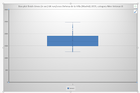
I also used Excel to analyze the data and my finish-time (30:42 min., so 1842 sec, rank #83) using the Data Analysis menu with options "Descriptive Statistics' and "Rank and Percentile", see fig.3-4 for the result. And in Excel 2016 it is also quite easy to make Histogram- and Boxplot charts, see fig.5-6.
fig.3: Excel 'Data Analysis'-menu, option "Descriptive Statistics'
fig.4: Exel 'Data Analysis'- menu, option "Rank and Percentile"
fig.5: Excel Histogram-chart Finish-times (in sec)
fig.6: Excel Boxplot-chart Finish-times (in sec)
And to conclude I wanted to to thank AD Ciudad de los Poetas and all its volunteers for organizing this race, and also for giving all runners a nice memory of the race with all the photos they made and uploaded to Flickr, like this one of me, in white shirt, which I got with another race , of hospital Nino Jesus, and which I also made an analysis for using Power BI as dataviz.tool, see:
http://worktimesheet2014.blogspot.com/2017/11/statistics-result-10-km-run-corre-por.html
What I liked about Flourish is that it is 100%cloud and there is a free edition. When I looked for the opinion of others on Flourish, I found this interesting article in which various dataviz-tools are demonstrated, among which Flouris (and Power BI, Excel and more):
http://www.storytellingwithdata.com/blog/2019/1/24/new-year-new-tools

source:
https://www.flickr.com/photos/adcpoetas/49241485423/in/album-72157712270066027/
Downloads:
#Mirror 1: Google Drive
https://cutt.ly/freIKwU
#Mirror 2: Microsoft OneDrive
https://cutt.ly/oreI1cX
--


No comments:
Post a Comment