Showing posts with label COVID-19. Show all posts

6 Jun 2021


#77: Power BI report with ArcGIS map: "COVID-19 in USA"


This post is about a new Power BI report I made: "COVID-19 in USA", see FIG.1.


FIG.1: Power BI report COVID-19 in USA with (animated) ArcGIS map


In this report I used the ESRI ArcGIS map. I used this map also in my previous post, but this time I wanted to experiment with a nice feature of the ArcGIS map: animation of time-series. The dataset I used for this is open data from the New York Times:

https://raw.githubusercontent.com/nytimes/covid-19-data/master/us-states.csv

NB: for more details about this NYT COVID-19 data, see e.g.:
https://developer.nytimes.com/covid
https://www.nytimes.com/article/coronavirus-county-data-us.html

The dateset's oldest data is from Feb.2020 and it is updated daily. 
I have limited the number of data-points by filtering only the first day of the month. See FIG.2 for the Power Query I used for this:


FIG.2: NYT Dataset and applied transformations (in Power Query)


As a reference-layer for the map I used demographic data, e.g. US Median Age. And I also added an infographic with this data (median age), and also for the total population.

I made this video with the animated map and how to interact with it in Power BI, e.g by filtering by dimensions location (state) and time (year/month):

https://youtu.be/se5pLNCdo0M  


NB: I used this nice free tool https://www.screencastify.com/ to make this screencast.


My Power BI report also has a time-slicer, so you could check e.g. : 'what was the total number of COVID-19 cases in 2020 (at 1/1/2021)', see FIG.3 (which also includes a screenshot of this site: https://datausa.io/coronavirus, which I used to check the numbers in my report)


FIG.3: total COVID-19 cases in USA in 2020


To know more about how ESRI ArcGIS maps are used in this pandemic, I can really recommend this video of ESRI:

COVID-19 & Crisis Management - A GIS Approach

And for a another nice video of ESRI in which they show how AI (Machine Learning) can be used to do COVID-19 predictions, see:

Modeling COVID-19 in ArcGIS 

In this video, they say:

It has been amazing to watch how the GIS-community has done an amazing work in the COVID-19 response, from data collection, modelling and data-visualization..

I've also seen great initiatives in the Netherlands about which I wrote in earlier blog-posts, e.g.:

- data collection:

CoronaWatchNL
- open COVID-19 data of Netherland,  by Jonathan de Bruin of Utrecht University

https://dataverse.harvard.edu/dataverse/covid-19-eu
by Vyacheslav Tykhonov #4tikhonov

- dashboard:

ESRI Nederland COVID-19 dashboard with ArcGIS map


References

*COVID-19 in USA

https://www.nytimes.com/interactive/2020/nyregion/new-york-city-coronavirus-cases.html

https://datausa.io/coronavirus

https://covid.cdc.gov/covid-data-tracker/#datatracker-home

https://www.worldometers.info/coronavirus/country/us/#graph-cases-daily

https://news.google.com/covid19/map?hl=en-US&mid=%2Fm%2F09c7w0&gl=US&ceid=US%3Aen&state=1


*Power BI and ArcGIS

https://docs.microsoft.com/en-us/power-bi/visuals/power-bi-visualizations-arcgis

ArcGIS Maps for Power BI: Demographic Data

https://doc.arcgis.com/en/power-bi/design/map-time-aware-data.htm

* GIS and Location Intelligence

COVID-19 & Crisis Management - A GIS Approach

Modeling COVID-19 in ArcGIS

Using spatial analysis to understand key factors in the COVID-19 epidemic

Analyze and Visualize the Impact of COVID-19 Pandemic 


Downloads

Power BI file


31 May 2021

Power BI report with ArcGIS map: COVID-19 in the Netherlands


#76: Power BI report with ArcGIS map: "COVID-19 in the Netherlands"

Power BI has several types of maps, and one of them is the ArcGIS Map, which I used in a new report "COVID-19 in the Netherlands", see FIG.1. 

Update 6/6/2021: I made a new Power BI report for COVID-19 in USA, which also uses a ArcGIS-map, and includes also a video of the report, see:

https://worktimesheet2014.blogspot.com/2021/06/77-power-bi-report-with-arcgis-map.html

https://youtu.be/se5pLNCdo0M

FIG.1: Power BI report with ArcGIS Map, combining COVID-19 data and (demo) employee-address data

ArgGIS is GIS-software of company ESRI. The ArcGIS-map in Power BI is both available for ArcGIS-users as for people without a ArcGIS-license (as is my case), although the latter group has can't use all map-features.
NB:
-I read here that ESRI offers a free (trial) of ArcGIS-Online to companies that use their maps to fight COVID-19.
-The famous COVID-19 dashboard of the Johns Hopkins University is also made with ArcGIS


ESRI Netherlands offers maps of the Netherlands with (actual) COVID-19 data, e.g. the map "#Diagnosed per 100K inhabitants in the last 7 days per municipality", see:
https://www.arcgis.com/home/item.html?id=aafffb2776194e0db063b7b7e751997d
This map I used as a reference layer (see here how to do this) for my Power BI report, see FIG.2.

FIG.2: Power BI report with ArcGIS Map which includes a reference-layer with COVID-19 data


If you click on a municipality, you can see the related ArcGIS-data (e.g. for municipality Zwijndrecht: it has 44K inhabitants, and in the last 7 days, 93 (new) COVID-19 cases (Diagnosed):


FIG.3: Power BI report with ArcGIS Map with card showing Municipality-data and COVID-19 data that is included in the map.


On top of this COVID-19 map layer (municipalities filled with color brown) is a layer with the 'actual' data: the number of employees (of a fictitious company) who live in a certain municipality (the green 'bubbles').
NB: in my previous post I had a similar map-report, made with Report Builder (see FIG.4 of that post), but creating that one, was much more work as I had to collect and transform the COVID-19 data myself, and also configure the shape-map, while with the ArcGIS-map, this comes 'out of the box'.

And as is always the case in a Power BI report, the map and other widgets in the report are interconnected, so if you filter e.g. in the bar-chart on Utrecht (municipality where 18 employees live), automatically the map zooms in to this region:


FIG.4: Filtering chart > zooming map

I also made a mobile version for my report (which does not have the bar-chart of the desktop-version, to adapt to the (smaller) screen-size of a mobile):


FIG.5: Power BI report on mobile


Note that my map (the brown reference-layer with COVID-19 data) is the same as that in the COVID-19 dashboard of  ESRI NL:


FIG.6: ESRI NL COVID-19 dashboard 

https://experience.arcgis.com/experience/ea064047519040469acb8da05c0f100d


References


*Power BI:

ArcGIS Maps for Power BI

Microsoft Power BI: Deep dive into the ESRI Map Visual in Power BI 

At Home with Power BI - ArcGIS maps

Mapbox v ArcGIS v Power BI Maps v Azure Maps. Which one should I use in Power BI?

https://powerbi.microsoft.com/en-us/blog/how-public-agencies-keep-communities-informed-on-covid-19-with-power-bi/

https://docs.microsoft.com/en-us/power-bi/create-reports/sample-covid-19-us


*ESRI ArcGIS

https://coronavirus-resources.esri.com/

https://www.esri.com/about/newsroom/arcuser/johns-hopkins-covid-19-dashboard/

https://www.arcgis.com/apps/dashboards/85320e2ea5424dfaaa75ae62e5c06e61
 

*ESRI NL

https://nlcovid-19-esrinl-content.hub.arcgis.com/


*GIS

Geographic Information Systems (GIS): Dan Scollon at TEDx Redding


Downloads

Power BI file

16 May 2021

Power BI dashboard "COVID-19 in the Netherlands" with CoronaWatchNL-data

#75: Power BI dashboard "COVID-19 in the Netherlands" with CoronaWatchNL-data

This post is about my third (and last) dashboard "COVID-19 in the Netherlands", with data from CoronaWatchNL. I made this dashboard with Microsoft Power BI. The 2 previous dashboards in this series, which I made with Tableau and Google Data Studio, you can find here and here.  In March 2020, I also made a Power BI COVID-dashboard (see here), but the data in that dashboard was not refreshed automatically, while this happens in this new (2021) Power BI dashboard. And the new Power BI report has some other improvements as:
- it has a has a responsive design, so it fits well on each type of device (see FIG.1)
- it has a (new) (shape-)map
- it has a improved dataset, which made it possible to combine the 3 COVID-19 metrics (# Diagnosed, Hospitalized and Deaths) in one chart

FIG.1: My COVID-19 dashboard in Power BI, on tablet, laptop and mobile

Shape Map

The report has the Shape Map custom-visualization Drilldown Choropleth (which you can download here), with 2 layers: provinces and municipalities in the Netherlands, which data is in these 2 TopoJson files:

https://raw.githubusercontent.com/cartomap/nl/gh-pages/wgs84/provincie_2020.topojson

https://raw.githubusercontent.com/cartomap/nl/gh-pages/wgs84/gemeente_2020.topojson

And I saw on the website of these files, so:

https://github.com/cartomap/nl

https://cartomap.github.io/nl/

that they also have other TopoJson-files, e.g. for GGD (Dutch Municipal Health Services), which could be interesting if you would like to make a GGD-map, so one that shows the COVID-19 numbers in the 25 GGD-regions.


FIG.2: Shape Map, showing layer-1 of map: Provinces 


FIG.3: Shape Map, showing layer-2 of map: Municipalities


NB: The (score-)Card 'Total Diagnosed' shows a 'normal' number, so not abbreviated as 331K, and how to do this, I found on:
https://community.powerbi.com/t5/Desktop/Number-Formatting-on-Card-Visualization/m-p/229483


In the beginning of the COVID-19 outbreak in the Netherlands, in March 2020, I made a similar Shape-map for my work, with Microsoft Reportbuilder. This is a free 'classical' reporting- tool (download-link) to make paginated reports that can be printed, while more modern reporting-tools as Power BI are meant for visual exploration ('slicing-and-dicing') of the data.

My COVID-19 Report Builder report (see FIG.4) shows 3 kinds of information:

*A: the Dutch municipalities where your employees live, ranging from 0 (white) to 100 (dark grey)

*B: # COVID-19 cases, the green/yellow/red circles, ranging from 0 (green) to 100 (red)

*C: # employees that live in a municipalities with COVID-19 cases, ranging from 0 (small circle) to 100 (big circle)

The goal of this report was to see if a company has employees which live in municipalities with a high number of COVID-19 cases and if so, propose them to work from home. FIG.4 shows the situation (for a fictitious (test-)company) in March 2020, when the (known) COVID-19 cases were concentrated insmall amount of municipalities. The first weeks, we updated this COVID-19-report frequently, to adapt the max. values for # COVID-19 cases (B in Legend of map), but as soon COVID-19 was spread in all the Netherlands, we stopped with it, and the report was not needed anymore as everyone started working from home (and more than 1 year later, most of us still are...).


FIG.4: Microsoft Report Builder report that combines COVID-19 data (in beginning of outbreak) and employee-location data.

Update 31/5/2021: for a new version of this report, now made in Power BI with a ArcGIS-map, see the next post.


Dataset

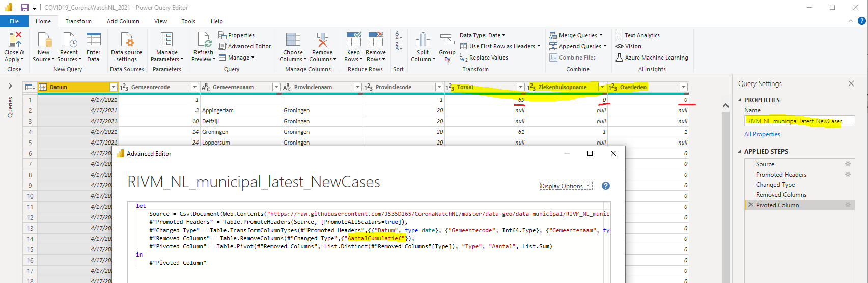
The 3 COVID-19 metrics that I use in my report (# Diagnosed, Hospitalized, Deceased) are stored in the CoronaWatch-files in such a way that it would not be possible to draw more than 1 metric in a chart (each metric is in a separate row, instead that they are all in 1 row). Power BI has the Power Query language 'M' to do all kind of data-transformations, and in this case I used the Pivot-function to get all the 3 metrics from 3 rows in 1 row with 3 'metric-columns' (see FIG.5-7).
NB: For more info about this function, see e.g.:
https://radacad.com/pivot-and-unpivot-with-power-bi
 

The CoronaWatch-files has both the metric day-values ('delta') as the total (cumulative) values, and to be able to do the pivot, I had to split these 2 metric-values in 2 separate datasets, e.g.: 'RIVM_NL_municipal_latest_NewCases' and 'RIVM_NL_municipal_latest_TotalCases', and then join them together (resulting in dataset 'RIVM_NL_municipal_latest'), what can be done in M using the Expand function (see FIG.5-7). To be able do this join, I created a datamodel in which I linked the 3 datasets (1:1 relations) (see FIG.8).
NB: For more info about this function, see e.g.:
https://radacad.com/how-to-change-joining-types-in-power-bi-and-power-query

For dataset 'RIVM_NL_municipal_latest' , I used 2 other M-functions:

- Sort, so that table is sorted by date, province and municipaltiy.
NB: For more info about this function, see e.g.:
https://support.microsoft.com/en-us/office/sort-a-table-power-query-baf200d5-1097-49cf-80b3-f1ce07b5f114

-Replace, to get rid of NULL values.
NB: For more info about this function, see e.g.:
https://www.youtube.com/watch?v=EoRjNx1G2g4


FIG.5: datasource of report


FIG.6: datasource of report and transformation of data with M (Power Query) 


FIG.7a:  datasource of report and transformation of data with M (Power Query)


FIG.7b:  datasource of report and transformation of data with M (Power Query)

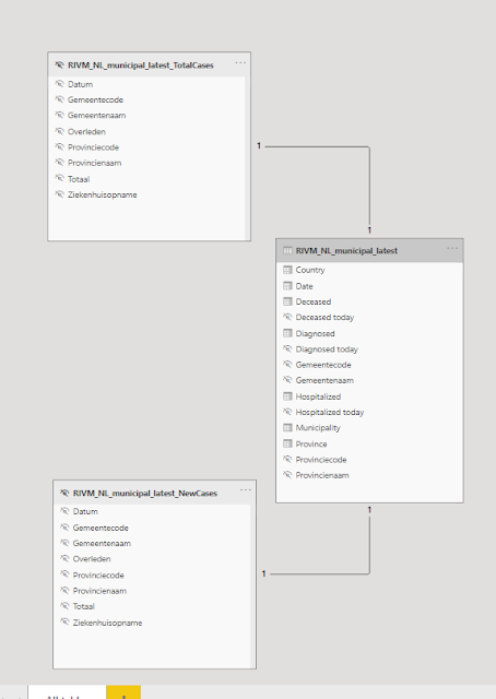
FIG.8: tables of datasourcein Power BI Datamodel


In the upper chart in tab-2 of the report you can an example of a chart that has now more than 1 metric (e.g. Hospitalized and Deceased).

Mobile report

I made a mobile layout for the report,  so it automatically displayed in the best format for the device (PC, mobile or tablet) on which the report runs (as you can see in FIG.1).

For a nice video that explains all the features of the Power BI Mobile app (so Power BI for mobile devices as smartphones and tablets), e.g. natural language query and query by voice-message, see:
https://youtu.be/pF_ST8B_XU0


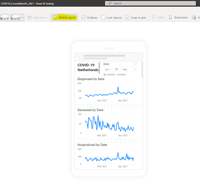
FIG.9:  mobile report design in Power BI Desktop


 Power BI Service (cloud) features: Dashboards,
Machine Learning generated reports, natural language query, sharing and colaboration

After publishing a Power BI report to the cloud (Power BI Service), I normally do a quick check with the 'Quick Insights' feature to see if the build-in AI (Machine Learning) detects some interesting patterns which I didn't see, so also this time. It detected e.g. there is a correlation between Diagnosed and Hospitalized, or that in April 2020, there the Hospitalized-number had some outliers.


FIG.10:  Quick insights on datasets


FIG.11:  Quick insights Reports


FIG.12: Quick insights Report: correlation between Diagnosed and Hospitalized numbers

For more details about Quick Insights / AI in Power BI, see:
https://docs.microsoft.com/en-us/power-bi/consumer/end-user-insight-types

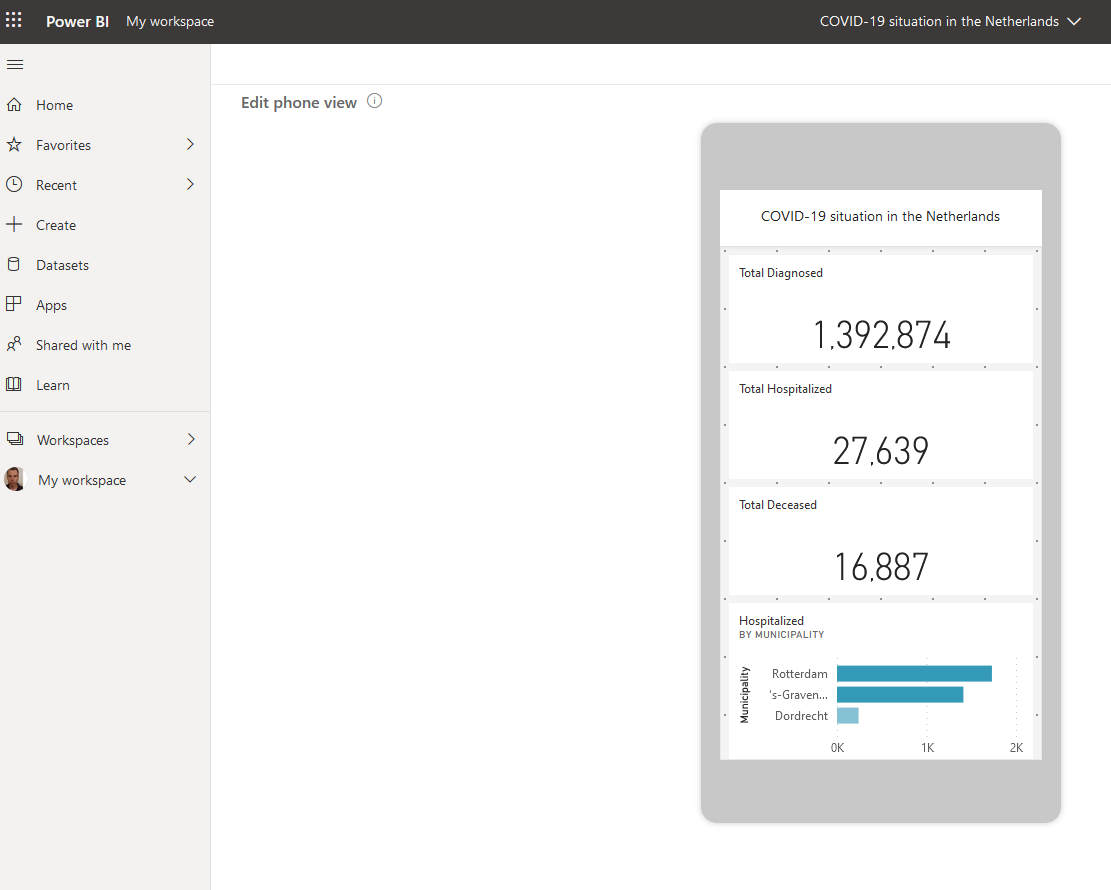
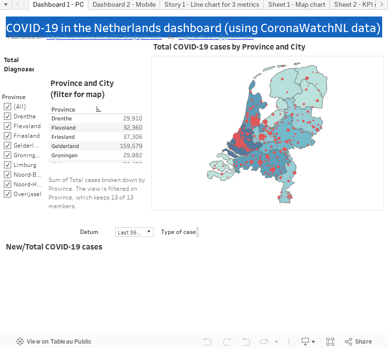
In the Power BI Service, it is possible to pin elements of a report to a dashboard, to show for example just some high-level numbers that fit on 1 screen, which can be usefull for a CEO, who might not be interested in more detailed break-down charts with which you can interact, which might be more a task for a business analyst. I made a dashboard (for PC and mobile) that shows the 3 main COVID-19 metrics (total Diagnosed, Hospitalized, Deceased), and by clicking on them, you go to the corresponding report of these charts. And the dashsboard has also 3 charts coming from 'Quick Insights' (so charts which were not in a report I made).


FIG.13: Power BI dashboard (desktop version)


FIG.14: Power BI dashboard (mobile version) 


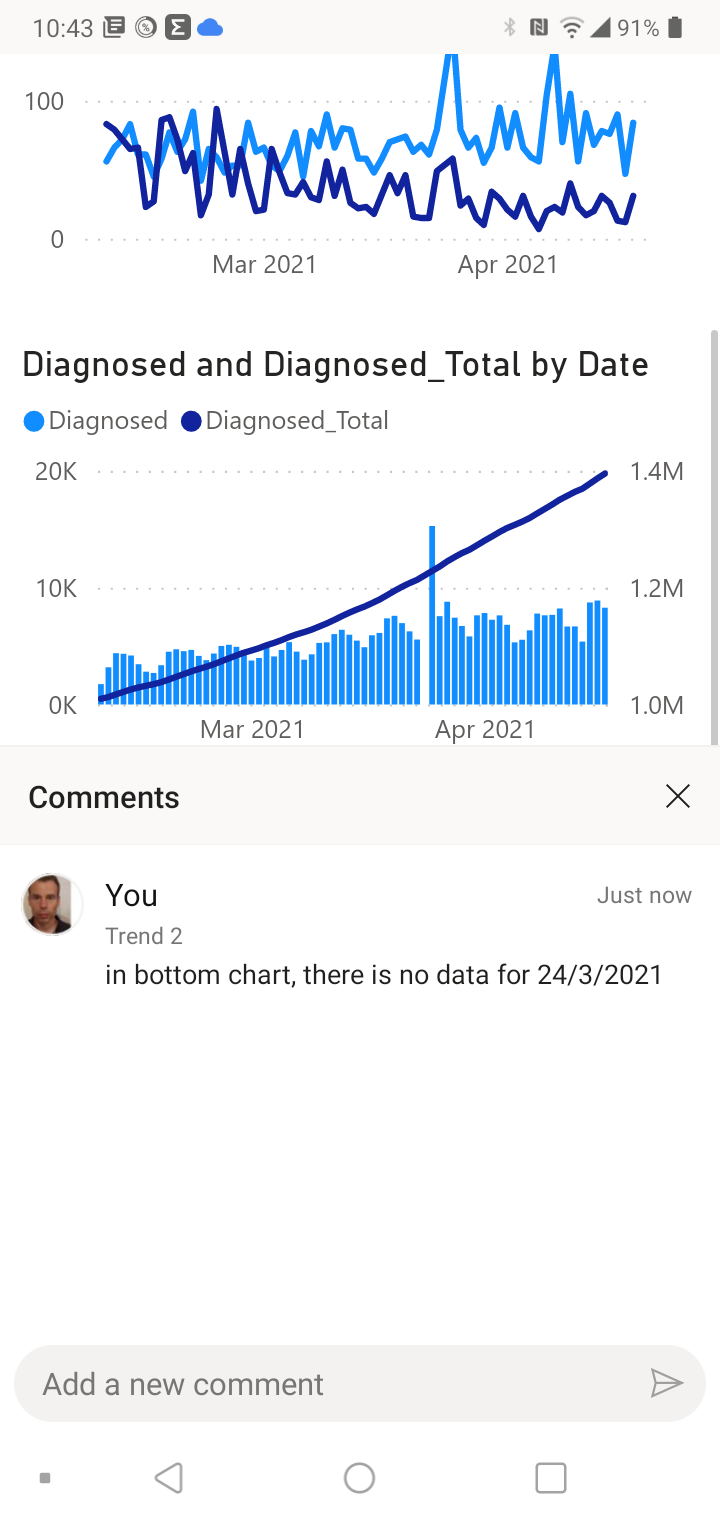
Power BI also has colaboration feaureIt is possible to comment on / annotate dashboards and reports that are in the Power BI Service. Here you can see some examples of this (from mobile):

--

--

FIG.15: comment in (mobile) report


FIG.16: anotate in (mobile) report


In Power BI Service, it is now also possible to create reports (before, it was only posssible todo this with Power BI Desktop). So if you share your workspace with the datasets that you created (in Power BI Desktop) with someone else, he can create his own report for this, as you can see here:


FIG.17:Power BI report made in the cloud (Power BI Service)

In Power BI Service, you can set the schedule for the refresh of the data of your datasource, see. e.g.: https://docs.microsoft.com/en-us/power-bi/report-server/configure-scheduled-refresh
For My COVID-19 report I set the refresh-schedule to Daily, as this was the frequency with which my datasource (CoronaWatchNL ) was updated, but... :


 End of CoronaWatchNL and consequence for my dashboard 

CoronaWatchNL stopped at 17/4/2021, so my Power BI dashboard (and also the 2 other ones in Google Data Studio and Tableau) are not COVID-19 live-trackers anymore. CoronaWatchNL recommends to use the data of the RIVM-website, which is now of good quality, making CoronaWatchNL's work not necessary anymore as they say.

Although CoronaWatchNL is history now (and hopefull COVID-19 will soon be as wel..), we should remember that in the period of over 1 year of CoronaWatchNL's existence, this was the best (Dutch) COVID-19 datasource for reporting, especially in the beginning of 2020, when using the RIVM-data for reporting was not really an option. For the details why, read this article of Follow the Money, for which CoronaWatchNL-founder Jonathan de Bruijn was also interviewed, and made this nice statement about the RIVM initial problems with sharing COVID-19-data:

We hebben [aan RIVM] toen aangeboden om te helpen die [COVID-19 data op RIVM-website) te structureren, maar daar hebben ze geen gebruik van gemaakt.’ Met een lach voegt hij toe: ‘Waarschijnlijk hadden ze het te druk om te zien dat wij ze hadden kunnen ontlasten.’

So CoronaWatchNL, Jonathan and Roos and all other people who helped in this Open Data project, thanks for all the effort!

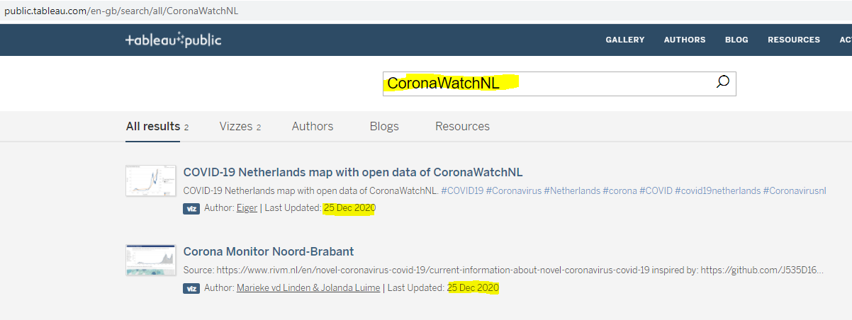
I'm not sure yet if I will still do this datasource-replacement (so CoronaWatchNL -> RIVM) for my COVID-19 in NL dashboards, but I've seen a Tableau Public dashboard that did do this, see:
https://public.tableau.com/profile/jolanda.luime#!/vizhome/CoronaMonitorNoord-Brabant/OntwikkelingNederland

which has this datasource-link:
https://www.rivm.nl/en/novel-coronavirus-covid-19/current-information


Microsoft Power BI Desktop vs Tableau Public vs  Google Data Studio

So I used for my COVID-19 Dashboard these 3 free tools to create them:

- Microsoft Power BI Desktop

- Google Data Studio

- Tableau Public  

Which one would I recommend to someone who is looking for a free BI-tool?
Tableau Public has the big limitation that you can only store your work on their website: https://public.tableau.com. For me, this was not a problem, as my report was for a (public) COVID-19 dataset (CoronaWatchNL), but I guess for most reports you don't want to make it public, but just share it with your co-workers. Another big disadvange of Tableau Public is that the number of possible datasources you can connect to is limited.

So that leaves Microsoft Power BI Desktop and Google Data Studio. If you don't have a paid Power BI license, and so you don't have an account for Power BI Service (cloud), your sharing-options are more limited. You can share your report by email or embedding your report in your website, as I did here (see the end of this blog post). With Google Data Studio, sharing is just as easy as for any other Google Drive file (e.g. a Google Sheets doc). And if your dataset is already in a good shape for visualization (so no data-transformations needed), I think Google Data Studio is the best option. But if you have to prepare your data before you can make your dataviz (as I had to pivot the data of CoronaWatchNL) or want more advanced datav-options (as the Shape Map for Dutch municipalities that I used), then I would recommend Power BI.

I also googled  a bit to see what others say in a comparision of these BI tools, and I found in a post about Google Data Studio here this statement:

Not everyone needs an airplane to get to work in the morning

And this post, from 2016, when Google Data Studio was just made general available, also says:

The market is now starting to make visualization solutions accessible to small organizations without the means to pay a team of elite analysts and developers to take care of visualizing their data.

So what they mean is that Google Data Studio (100% free) would be a better option for a lot of (smaller) companies than Power BI or Tableau (which are not free if you want to use all it's features). For a more recent (2021) review of GDS, see e.g.:
https://towardsdatascience.com/google-data-studio-for-beginners-99355e9df809

If the choice for a BI-tool wouldn't be constrained by budget, then at this moment (2021), according to the Magic Quadrant for Analytics and BI tools of analyst house Gartner, Power BI would be the best choice, see e.g. :

https://powerbi.microsoft.com/en-us/blog/microsoft-named-a-leader-in-2021-gartner-magic-quadrant-for-analytics-and-bi-platforms/


AI - COVID-19 hackathon University of Groningen

University of Groningen (RUG) will organize a AI - COVID-19 hackathon #aiHackCovid, and they asked me if I could maybe tell something about my COVID-19 dashboards. If you want to be a speaker, participant of the hackathon, or a member of the jury, let them know.

https://aihackcovid.aimedgroningen.com/


Update 27/6/2021 (after my presentation):

Here a post on Linkedin, which includes the powerpoint I used for the presentatio

--

--

And now for something completely different:

The Johan Cruyff Foundation, who work to make sport accesible for all children, including e.g. disabled children, organized a 14K virtual run to raise money, and the runners can help with that by asking people to sponsor them. I participated on 25/4/2021 (although the race is open until 19/5), see my Strava-activity, and raised 102 euro so far. If you also want to be my sponsor and donate something, you can do so here:

https://acties14k.cruyff-foundation.org/actie/maarten-van-reek?utm_source=kentaa&utm_medium=email-share&utm_campaign=cruyff-legacy-14k&locale=en

Here a video of the good work the foundation did on Greek islands with refugee-camps:
https://www.cruyff-foundation.org/en/news/first-cruyff-court-in-refugee-camp/

https://pt-br.facebook.com/cruyfffoundation/videos/192881359314861/?__so__=permalink&__rv__=related_videos 


References

 *Power BI:

https://www.datacamp.com/community/tutorials/data-visualisation-powerbi

https://blogs.msn.com/tools-to-sharpen-your-data-journalism-skills/

https://news.microsoft.com/microsoft365forjournalists/

https://news.microsoft.com/microsoft365forjournalists/learning-tools/visualizing-data-with-power-bi/

https://news.microsoft.com/wp-content/uploads/prod/sites/557/2020/11/AnatomyPoster-12.01.20.pdf

https://docs.microsoft.com/en-us/power-bi/consumer/end-user-insight-types

https://carldesouza.com/using-quick-insights-in-power-bi/

https://community.powerbi.com/t5/Data-Stories-Gallery/Covid-19-Report-Global-and-Netherlands/m-p/1047015#M3826

https://community.powerbi.com/t5/COVID-19-Data-Stories-Gallery/bd-p/pbi_covid19_datastories


*DataVisualization best practices

https://material.io/design/communication/data-visualization.html#behavior

https://eazybi.com/blog/data-visualization-and-chart-types

https://www.youtube.com/watch?v=-tdkUYrzrio - Power BI visualization best practices
by Marco Russo

https://help.tableau.com/current/blueprint/en-us/bp_why_visual_analytics.htm

https://www.datacamp.com/community/tutorials/data-visualisation-powerbi - From Information Visualization to Visual Analytics by Jack van Wijk (Eindhoven University of Tech)

https://coolinfographics.com/blog/2016/10/10/5-great-ted-talks-about-dataviz.html


*COVID-19 info (in Dutch) that I used to check the numbers in my dashboard:

https://coronadashboard.rijksoverheid.nl/landelijk

https://allecijfers.nl/nieuws/corona-virus-covid19-bevestigde-besmettingen-per-dag-nederland-provincie-gemeente/

 https://allecijfers.nl/nieuws/statistieken-over-het-corona-virus-en-covid19/#Corona_opgenomen_personen

https://www.rtlnieuws.nl/nieuws/nederland/artikel/5212577/miljoen-coronagevallen-maar-hoeveel-mensen-hebben-het-virus-gehad

https://data.rivm.nl/geonetwork/srv/dut/catalog.search#/search?any_OR__title=covid-19&isChild='false'&fast=index


Downloads:

Power BI file on G-drive:

https://drive.google.com/file/d/1ySo2KGmsgHCpWFf3DkAqWgYfXQj6OZPU/view?usp=sharing


Embedded Power BI report

--

<iframe width="600" height="373.5" src="https://app.powerbi.com/view?r=eyJrIjoiZmJhZmY3MTUtZTEwNi00NDA0LWJhZTMtNDYzMTRjZmJiNDE2IiwidCI6ImI3OWIyMzE3LTM0ZGQtNDNlNS05MWEyLWNkNjZkM2FlMWYwYiIsImMiOjh9" frameborder="0" allowFullScreen="true"></iframe>

---

---

29 Dec 2020

Tableau-dashboard COVID-19 in the Netherlands with CoronaWatchNL-data

 #72: Tableau-dashboard "COVID-19 in the Netherlands" with CoronaWatchNL-data

My previous post was about a Google Data Studio (GDS)  COVID-19 dashboard I made. GDS-reports are meant for viewing on a PC, not for mobile devices, as the GDS-canvas doesn't have a responsive design, although there is a way to make a (embedded) GDR-report reponsive, see e.g. : https://kpis.studio/blog/mobile-friendly-data-studio/

But I decided to make a new COVID-19 dashboard, this time with Tableau, as the Tableau-canvas does have a responsive design, or better said: a "device specific designer", see e.g. Design for mobile devices (device specific designer). And I also choose Tableau because I was inspired by the "Tableau & Visual Analytics inspiration-session' we had at work, in which I saw things of Tableau that I wanted to try myself. For the end-result of my first Tableau- experiment, see FIG.1. And for Tableau-workbook and the 'live' (embedded) dashboard, see the bottom of this post. And the live dashboard you can also find here:
https://public.tableau.com/shared/SH2PRJH77?:display_count=y&:origin=viz_share_link


FIG.1: my COVID-19 Tableau dashboard with responsive design, so works both for PC as mobile

To create my dashboard I used the free version of Tableau, Tableau Public 2020.3 (vs the Tableau Desktop client, for which you need a license). This version has the limitation that you can't save your dashboard locally, but only on the web, here:
https://public.tableau.com

So this makes your dashboard publically available once you saved (=published) it (for my dashboard that was on 2/12/2020). When I searched for my dashboard (using 'covid-19 netherlands'), I found it, with ranking #2 (se FIG.2). I'm not sure why my dashboard was ranked so high in the 35K(..) results for my search , but maybe it helped that my dashboard is automatically updated each day, which is not true for the other top 6 dashboards in FIG.2.  Later I'll explain how this can be done with Tableau Public, but this wouldn't have been possible of course if my datasource, CoronaWatchNL, wasn't updated daily as well (for more details about this datasource, see my previous post). 
Out of curiousity I checked if there were other COVID-19 dashboards that used CoronaWatchNL, and I found one, see FIG.3 
and for the (very nice) dashboard, see: 
https://public.tableau.com/views/CoronaMonitorNoord-Brabant/OntwikkelingNederland?:language=en-GB&:display_count=y&:origin=viz_share_link


FIG.2: my Tableau dashboard on Tableau Public cloud


FIG.3: (other) COVID-19 dashboards that use open data of CoronaWatchNL


Now more details about my dashboard:

Datasources

My dashboard has 2 datasource, the same 2 Google Sheets (that import data of CoronaWatchNL) that I used to create my Google Data Studio (GDS) dashboard. For the details of these datasources, see:
- Datasource 1: RIVM_NL_municipal_latest.csv 
- Datasource 2: RIVM_NL_national.csv
Remember that these Google Sheets get updated automatically as soon as CoronaWatchNL has new data. And to get a 'live' dashboard in Tableau Public, you have to select 'Keep my data in sync with Google Sheets..' when you save the Tableau-workbook, see for more details e.g.:


https://www.thedataschool.com.au/nicholas-hills/how-to-create-a-dynamic-dashboard-for-coronavirus-with-google-sheets-and-tableau/

For datasource-1, with geo-data, I set the 'Geographic Role' for the geo-columns as Country :


And for field 'Type' (of COVID-19 case), which has (3) possible values and are in Dutch in the datasource, I created alias-values in English:


Dashboard and Charts

The 2 charts you see in the dashboard have different datasources: 
the Map-chart uses Datasource 1(RIVM_NL_municipal_latest.csv)  and the Line-chart uses Datasource 2 (RIVM_NL_national.csv). So these charts are not 'connected' (filtering in one chart has no effect on the other chart).

I made 2 dashboard-versions, one for PC (see FIG.4a) and one for mobile phone (see FIG.4B).

FIG.4a: PC-dashboard


FIG.4b: Mobile-dashboard + designer

I started with the one for PC (desktop), and this one I used as a start the the mobile version. I wanted to fit both the Map-chart and the Line-chart in one screen (of a mobile phone), so that the mobile user has (more or less) the same user experience as the PC user, so he can see the current state of COVID-19 in the Netherlands by city (in the Map-chart) and the COVID-19 'curve' (the Line-chart).
For this, I had to eliminate some widgets (e.g. the date-and location-filters). If the mobile user would like to see more details or have more interaction-options (for filtering), he should use the PC-dashboard.
NB: I could have been better to use different 'tabs' for the map- and line-chart, see for an nice (responsive) dashboard that does this: https://covid19.innouveau.com/#/
(TODO)

To get the 2 charts in the mobile dashboard (vertically) aligned and fitting in 1 screen, I used a Vertical Container. For more details how this works, see e.g. :
How to Lay Out a Dashboard in Tableau


Map-chart 

I made the (Dual-axis) Map-chart, with the colored Provinces and sized Cities/Municipalities, following this Tableau Tutorial ("Maps with shaded States and sized Cities"):
https://www.youtube.com/watch?v=3VAolG-YEa0 
It's a pity that many locations on the map are unrecognized.
I checked with a Tableau expert at my work, and she said:
"With Tableau maps there is a limitation, in the sense that it cannot plot all the locations automatically. This can be overcome with custom geocoding (they offer resources for that online)"
(TODO) 
I did solve the issue for one city (The Hague, in Dutch: 'Den Haag' or 's‑Gravenhage) manually, see FIG.5 how I did this.

FIG.5: screen to manually fix unrecognized locations


The map has the option to drill-down (province -> city/municipality), see FIG.6.
For this, I created a 'geo-hierarchy' in the dataset, see FIG.7

FIG.6: Drill-down for province Zuid-Holland to municipality Zwijndrecht


FIG.7: Map-chart with datasource


Line-chart

The line-chart shows both the total (in orange) and new (in blue) COVID-19 cases, where you can select which metric to use for #case:
  • Diagnosed ('Totaal')
  • Hospitalized ('Ziekenhuis opname')
  • Deceased ('Overleden')


FIG.8: Line-chart with datasource


Story

Besides dashboards, you can also create 'stories' in Tableau. As written here:

.. a story is a sequence of visualizations that work together to convey information. You can create stories to tell a data narrative, provide context, demonstrate how decisions relate to outcomes, or to simply make a compelling case.

..a story is also a collection of sheets, arranged in a sequence. Each individual sheet in a story is called a story point.

And for how to create a story in Tableau, see: 
https://help.tableau.com/current/pro/desktop/en-us/story_create.htm

In my story (see FIG.9), there are 3 'story-points', which are the line-charts for the 3 different metrics (Diagnosed, Hospitalized, Deceased) and this story I could use if I would like to ask to someone with more knowledge of the COVID-19 situation in the Netherlands (NL), why in the Diagnosed-chart there was no 'spike' in the outbreak (in April 2020) of  COVID-19 in NL while in the Hospitalized/Deceased-charts there is a spike for the 1st wave (answer would probably be: there was almost no testing then).


FIG.9: Story (2 of the 3 story-points) with the line-chart for different metrics

N.B:
In this post I marked some pending things in my dashboard with "TODO" . I might do this later... 


References

https://public.tableau.com/en-us/s/covid-19-viz-gallery

https://www.tableau.com/covid-19-coronavirus-data-resources

https://www.tableau.com/covid-19-coronavirus-data-resources/global-tracker

https://public.tableau.com/profile/deloitte.visual.analytics#!/vizhome/DeloitteCOVID-19EconomicRecoveryDashboard/DeloitteCOVID-19Analysis

https://help.tableau.com/current/pro/desktop/en-us/default.htm

Tableau Desktop vs Public vs Reader


Downloads

Tableau-workbook


Embedded (live) Dashboard

i-frame:

<div class='tableauPlaceholder' id='viz1609218470236' style='position: relative'><noscript><a href='#'><img alt=' ' src='https:&#47;&#47;public.tableau.com&#47;static&#47;images&#47;CO&#47;COVID-19NetherlandsmapwithopendataofCoronaWatchNL&#47;Dashboard1-PC&#47;1_rss.png' style='border: none' /></a></noscript><object class='tableauViz'  style='display:none;'><param name='host_url' value='https%3A%2F%2Fpublic.tableau.com%2F' /> <param name='embed_code_version' value='3' /> <param name='site_root' value='' /><param name='name' value='COVID-19NetherlandsmapwithopendataofCoronaWatchNL&#47;Dashboard1-PC' /><param name='tabs' value='yes' /><param name='toolbar' value='yes' /><param name='static_image' value='https:&#47;&#47;public.tableau.com&#47;static&#47;images&#47;CO&#47;COVID-19NetherlandsmapwithopendataofCoronaWatchNL&#47;Dashboard1-PC&#47;1.png' /> <param name='animate_transition' value='yes' /><param name='display_static_image' value='yes' /><param name='display_spinner' value='yes' /><param name='display_overlay' value='yes' /><param name='display_count' value='yes' /><param name='language' value='en-GB' /><param name='filter' value='publish=yes' /></object></div>                <script type='text/javascript'>                    var divElement = document.getElementById('viz1609218470236');                    var vizElement = divElement.getElementsByTagName('object')[0];                    vizElement.style.width='100%';vizElement.style.height=(divElement.offsetWidth*0.75)+'px';                    var scriptElement = document.createElement('script');                    scriptElement.src = 'https://public.tableau.com/javascripts/api/viz_v1.js';                    vizElement.parentNode.insertBefore(scriptElement, vizElement);                </script>