#74: AEMET Open Data for weather in Spain, analysis with Python
2021 started in Spain with extreme weather caused by storm
Filomena, with heavy snowfall, and extreme low temperatures, and with a record of -34 C, see:
When I looked on the site of AEMET ("The State Meteorological Agency", an agency of the Government of Spain), to find more information about Filomena, I saw they offer open data via a REST-API, see: https://opendata.aemet.es/centrodedescargas/AEMETApi?
For how to use this API, see this video by AEMET (starting at min. 25): https://www.youtube.com/watch?v=l-YF_dQ983Y&feature=emb_logo
I tested it with this URI for extreme temperatures, see:
https://opendata.aemet.es/dist/index.html?#/valores-climatologicos
and for the parameters I chose:
- value: temperature (in decimal degrees Celcius, so e.g. -1.0 C = -10 dC
Jupyter Notebook
FIG.1: Jupyter notebook with min.temperatures in Navacerrada
(with min.temp. of -203 'decigrado Celcius = -20.3 C in 1962).
NB:
- For 1962 there are duplicate lines, so it looks like AEMET forgot to clean this data (de-duplicate)
- 1956 was one of the coldest winters in Spain and the temp. of -18.6 in Navacerrada was the 4th coldest temp. that winter, see:
You can run this notebook for another weather station by replacing in the GET-statement the IDEMA-code for the station in Navacerrada (2462). To get the IDEMA-code of a station, see e.g. :
I run it, so Google Colab, from my Android-phone, for the province of Teruel (IDEMA-code: 8368U), which had one of the lowest temperatures during Filomena, with this result (note that Jan. 2021-1, with -21C, was the coldest month in the history of Teruel).
FIG.1b: Jupyter notebook run on Android-phone for province Teruel
FIG.2b: Jupyter Notebook in Binder
And I also used
Microsoft Visual Code (open source IDE, multi-platform, multi-language) and
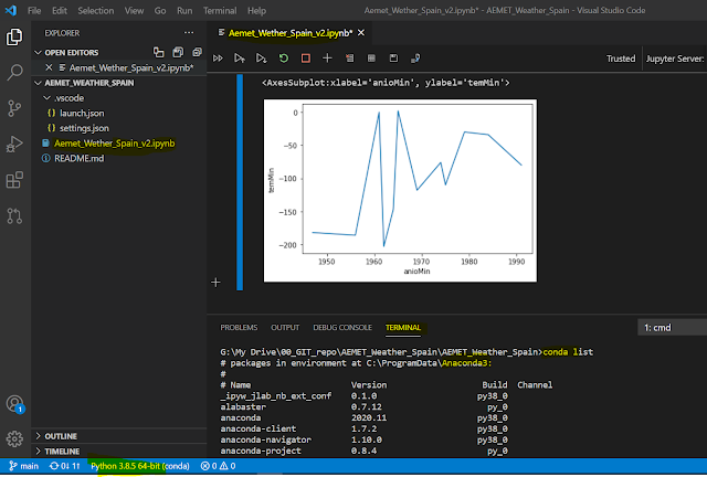
Anaconda (tool for data science with Python and R) to run the notebook, see FIG.2c.
FIG.2c: Jupyter Notebook in VS Code
API
The API-result consists of a JSON-file that has 2 URLs: one for the actual data and one for the meta-data, and these are also in JSON-format, see FIG.3-5
FIG.3 : result API-call
FIG.4: actual data (JSON-format)
FIG.5: meta data (JSON-format)
Chart
For the chart, I selected (in the notebook) these columns:
- name of weather station ('nombre')
- min.temperature, in 'deci-grados' Celcius ('temMin')
- date of measurement ('anioMin' (year), 'mesMin' (month), 'diaMin' (day))
To store the JSON-data returned by the API, I used a dataframe of the
Pandas-library and for the data viz (line-chart) I used the
Seaborn-library.
To conclude this post, here a link with some photos of how my neighborhood in Madrid looked like when it was covered in the Filomena-snow:
If you liked this post, you can leave a comment below (non-anonymous, to prevent spam).
And if you'd like to donate something, check the Donate (via PayPal) button on the top-right.
References:
Python Tutorial | How to use a Jupyter notebook online with Binder and Google Colab
Webinar AEMET Open Data
Google Colab turorial
Data Visualization using Python on Jupyter Notebook" en YouTube
Filomena snowstorm
VS Code :
Using VS Code with Python for Data Science / Data Analysis
Anaconda:
Downloads:
Jupyter Notebook:
#Mirror 2 - Google Colab:


1 comment:
Nice Post Product Engineering Company in UK
Post a Comment