#78: Power BI Animated Bar Chart Race for Formula 1 season 2021
This post is about a Power
BI report I made after Max Verstappen's victory of the Formula 1 championship 2021, a historic victory for the Netherlands as he is the first Dutchman to win a Formula 1 world championship. It was a battle between Lewis Hamilton and Max Verstappen, which was decided in the last race, and even in the last lap:
https://www.youtube.com/watch?v=MTe12fH2xtQ
Report
On this page: https://www.formula1points.com/season/season-progression/2021
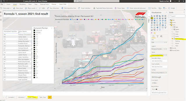
I saw a line-chart which has a line-chart that shows how close Verstappen and Hamilton were until the last race. I added this chart to my dashboard (see FIG.1).
FIG.1: Line-chart timeseries cumulative points per driver
But to 're-live' the F1 2021 season, I also added 2 'racing bar charts', so an animation with the total points per driver over time:
*racing bar chart 1:
for this I used custom visual 'Power BI Animated Bar Chart Race', see e.g:
How to create Animated Bar chart race in Power BI
https://inovista.com/animatorFiles/demoProjects/BarRacePBI.html
NB: this visual has a limit of max 20 bars (while in F1 2021 season there were 21 drivers..)
 |
FIG.2: Animated Bar Chart Race
NB: for a video-recording I made of this chart, see:
*racing bar chart 2:
for this I used custom visual 'Play Axis', see video:
Guy in a Cube: Can we have ANIMATED Power BI visuals
FIG.3: Play Axis
Chart-1 is IMO the most fun one, as bar-charts (one bar per F1-driver) are moving up and down based on the driver's cumulative points after each race (date).
The date in this chart I had to format as a number (YYYYMMD), else the date-counter (bottom-right of chart) stayed 0. For more details, see:
https://community.powerbi.com/t5/Desktop/Period-Shown-in-Animated-Bar-Chart-Race/m-p/822985
NB: On the charts, I added this photo as a background:
https://commons.wikimedia.org/wiki/File:2015_Malaysian_GP_opening_lap.jpg
from https://commons.wikimedia.org/wiki/User:Morio
This file is licensed under the Creative Commons Attribution-Share Alike 4.0 International license
Data
The main data source that I have used is:
https://www.formula1points.com/season/season-progression/2021
Unfortunately, this page did not have the race-date, just the race/round-nr, and the date-field is a must-have for a racing bar chart. To get the race-dates, I found this F1-API:
http://ergast.com/mrd/
As a best practice, I also created a table for the Date-dimension, for how to do this, see e.g.:
https://docs.microsoft.com/en-us/power-bi/guidance/model-date-tables
My data source has the points per round, but for the charts, I needed the cumulative points.
To calculate this, first thing I did was to add a calculated Date-column to the Points-table, and as I created relations between this Points-table and the Rounds/Date table, I could do this with this DAX-formula:
With this, I could use the DAX-pattern for the 'running total per group' (where in this case, the group is the driver, so for each driver, I needed to accumulate the points for the in total 22 races):
For more details about this DAX-formula, see e.g:
https://stackoverflow.com/questions/30072341/dax-running-total-multiple-critiera-grouping
https://www.daxpatterns.com/cumulative-total/
There were some other issues with the data source (e.g. race-points sometimes had a red star (*),
or for round 8, the country-name was not correct. If someone knows a better site with Formula-1 data, please share, for if I would make for the new season a new report (only if Verstappen wins ;)
Interesting reads
https://community.powerbi.com/t5/Data-Stories-Gallery/Formula-1-analysis-1950-2021/m-p/2052947
https://towardsdatascience.com/formula-one-extracting-and-analysing-historical-results-19c950cda1d1
https://www.linkedin.com/pulse/data-analysis-decision-making-formula-1-part-1-abhishek-kumar/
Downloads
Embedded report


1 comment:
Very well done! Great overview!
Post a Comment