Blog with real world examples of Excel spreadsheets for work (e.g. timesheet) and sports (e.g. analysis of results of 10K races). And blog has also examples made with other Business Intelligence tools as MS Power BI and Google Sheets and Google Data Studio.
#95 Power BI dashboard Messi Goals Tracker with new PBIP and PBIR file format
In 2026, the new Power BI default file format will be PBIR (JSON text format), which facilitates version control. NB: for more details about this, see e.g.:
I wanted to try this out, so I made a new Messi Goals Tracker dashboard, using the PBIP (Power BI project) file format, that includes a PBIR-file for the report part, and a TMDL-file for the semantic model part. NB: for earlier versions of Messi Goals Tracker dashboards, which I made with Google Looker Studio and Tableau, see these posts:
And here is a video that I made about the dashboard:
This video shows a ´master class´penalty goal that Messi made in 2025 with Inter Miami. And in this video you can see another, very special, penalty goal which Messi/Suarez made for Barcelona in 2016, in a way Cruyff did for Ajax in 1982 (also included in the video).
For version-control, I use the Git-functionality in MS Visual Studio Code. A nice feature it has that with Copilot, you can generate the content for the commits.
Here an example of a measure that I added to the Semantic Model in Power BI and the traces of this in Visual Code and GitHub:
And here you can see the PBIR-file with the code of the Info-page in the Power BI report:
If you enjoyed this post and want to make a small donation, you can do this with the Paypal Donate button (at the top right of this post) or via BuyMeAcoffee .
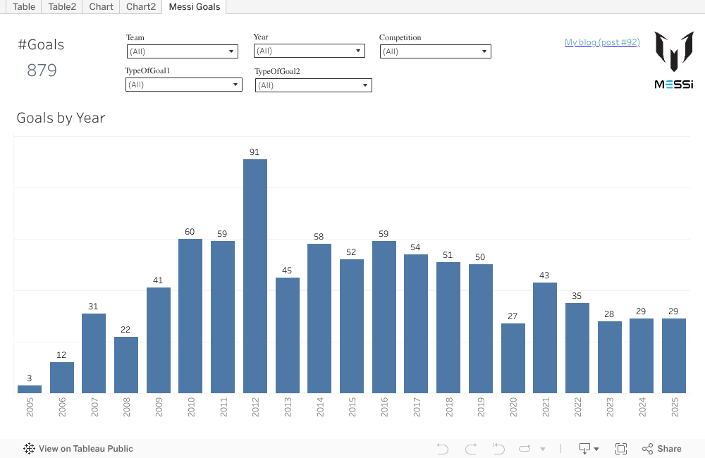
But that was already some time ago, so I thought it was time to make a new Tableau-dashboard, and I chose to make one similar to my Messi Goals Tracker Google/Looker Data Studio dashboard (see this post). This is the result, which I published on Tableau Public :
NB: you can see the embedded version on the end of this post.
Here a video that I made that shows how to use the dashboard, and a fact-check on Youtube that I did for one curious finding (spoiler: la mano del D10S 2.0):
If you enjoyed this post and want to make a small donation, you can do this with the Paypal Donate button (at the top right of this post) or via BuyMeAcoffee .
#91 End-to-end analysis of participants race Cross de Invierno 2023 with Microsoft Fabric (and Power BI)
In this old post I wrote about the run Cross de Invierno 2023 in Madrid I which I participated, which included an analysis of the finish-times, in Excel. In this new post I used the data of the this run again, but this time for an analysis of the participants of schools and athletic-clubs, and now I used Microsoft Fabric. Fabric is Microsoft's quite new SAAS data analytics platform (it went GA in Nov.2023). It's a suite of tools to facilitate end-to-end analysis of data, and includes Power BI, One Lake, Data Factory (Data Pipeline, Dataflow), Synapse Warehouse and Lakehouse, Spark Notebooks etc. Fabric is made for 'personas' as Data Engineer, Data Scientist, Business Analyst etc., for which there are different built-in workloads ('experiences'). For more info about Fabric, see e.g: https://learn.microsoft.com/en-in/fabric/get-started/microsoft-fabric-overview
The Power BI report that I made has these race-participants stats:
The results of the race are published in several PDF-files, and for my analysis, I used 2 files, with the results of all men and women, so all adults (categories senior and junior). I converted these PDF-files to Excel and uploaded them in my Onedrive. I then used a Data Pipeline with 'activity' Dataflow Gen2 (with PowerQuery) to load the data from the Excel-files into a (Synapse) Lakehouse:
A Lakehouse is a data asset of OneLake, the central storage place of all data loaded in Fabric. All data in OneLake is stored in the Delta Parquet format, an open data format that can be read by all engines in Fabric (e.g. Power BI, using Direct Lake mode), which looks like this :
I made a Notebook to query the tables that I created in Onelake (Lakehouse), using the pyspark Python-library:
And another notebook with the sempy-Python library. with which a PowerBI semantic model can be queried, using DAX:
I created in a Fabric Warehouse the view RunnersAll, to combine the data from the 2 tables MenAll and WomenAll, with this SQL (run in the LakeHouse's SQL-endpoint):
In Fabric there's a Visual Query Editor (PowerQuery) that can generate
the SQL for you, here an example to get a list of all teams of both men
and women runners:
And the generated SQL:
Note that in this (generated) SQL "DISTINCT .. UNION ALL" is used, where I would have used UNION (which filters out the duplicates, no separate DISTINCT needed).
I made some other (dimension-)tables that I then added in this Power BI Semantic Model (star-schema):
And this model was the source for this Power BI report:
The table in this dashboard (PBIX-report) with the details of the runners is a long list to scroll through. A better way to show (long) lists are paginated reports (RDL-report). There are 2 ways to make a paginated report:
*1: in the Power BI Service, using the semantic model, and a query in DAX:
*2: in Power BI Reportbuilder, using the SQL-endpoint of Fabric Lakehouse/Warehouse, and a query in SQL (report shows top 3 runners per category):
The query for the dataset in this report can be made in SQL or the Query Designer (that generates SQL):
NB: for a good post about PBIX-reports ('dashboards') vs RDL-reports ('classic' paginated reports), see:
To see if the schools that participated in the run were all coming from my neighbourhood (Ciudad de los Poetas) where the race was held (park Dehesa de la Villa), I made this PBIX-report:
I worked on this project in Dec.2023 and Jan.2024 (with a free Fabric trial license), so shortly after MS Fabric went 'GA', although actually it was still a beta-version back then... But what is the status now, in Jun.2025, is MS Fabric 'production-ready' now? It looks it still isn't:
And is Microsoft's idea to bundle all their data-tools (as Power BI and Azure Synapse) in one suite (Fabric), a good idea? Some more critical opinions:
"Only time will tell if Fabric stands the test of time against competitive technologies.[e.g. Databricks or Snowflake]."
If you enjoyed this post and want to make a small donation, you can do this with the Paypal Donate button (at the top right of this post) or via BuyMeAcoffee .
#90 Power BI dashboard Rafael Nadal's Grand Slam tournament finals in whole career (2001-2024)
Recently Rafael Nadal, one of the GOATs of tennis, announced that he will retire (at age 38). His last tournament will be the Davis Cup in Nov.2024 in Malaga (Spain).
In 2014, I made an infographic (in MS Excel) about Nadal's win/loss records, see this blog-post. And now, 10 years later, at the end of Nadal's career, I made a dashboard with MS Power BI, with the result of all Nadal's Grand Slam finals (#30) in his 23 years-career (2001-2024), finals that he played between 2005 (when he won his 1st Grand Slam tournament, at age 19) and 2022.
NB: The embedded version of this Power BI dashboard, you can find at the bottom of this post.
The dashboard is interactive, e.g. you can filter on all Nadal's Grand Slam wins (22):
Or you can 'drill-through' from a chart in the dashboard to the table with the underlying details, e.g. in chart "Finals by Tournament and Result", for tournament = 'French Open' :
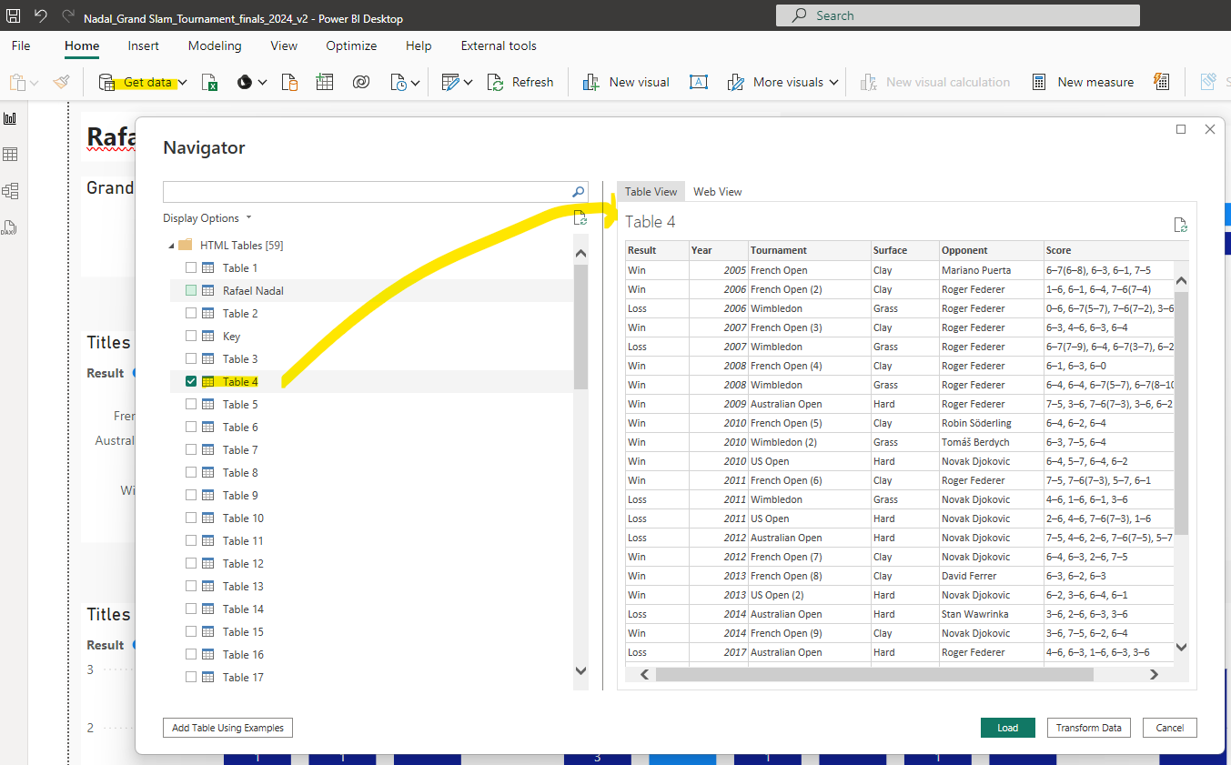
And this is the complete table, so with all Nadal's Grand Slam finals:
*FACT 1: Grand Slam finals played by Nadal: 30, wins: 22, losses: 8
*FACT 2: Nadal played 9 finals against Roger Federer. And the other opponent he met often (also 9x) in a final was Novak Djokovic (who has 24 Grand Slam titles until now, so 2 more than Nadal). Here the chart with the win/loss details of Nadals finals against these other 2 tennis-GOATs, in Spotlight-mode:
*FACT 3: Nadal played and won 14 finals of the French Open (Roland Garros), which is played on clay, his favorite surface. No other winner of the French Open comes close to this. Bjorn Borg is 2nd in the Roland Garros-winners ranking, with 6 wins, as this chart generated by ChatGPT shows:
NB: this is the Python-code of ChatGPT's analysis:
And ChatGPT gave also this other fact about Nadal's 14 Roland Garros wins:
*FACT 4: 2010 was Nadal's best Grand Slam year: he played 3 finals (French Open, US Open and Wimbledon), and won all 3. NB: I added a (special) custom tooltip to chart "Finals by Year and Result", so that you can see more details of these finals:
(Page 2 of dashboard)
*FACT 5: Of the 14 finals of the French Open that Nadal played, most were against Federer: 4 finals
*FACT 6: Nadal played against Djokovic in the finals of all 4 Grand Slam tournaments, in total 9 finals (wins: 5, losses: 4): -French Open, wins: 3 -US Open, wins: 2, losses: 1 -Australian Open: losses: 2 -Wimbledon: losses: 1
*FACT 7: Nadal won all 4 Grand Slam tournaments in his career. He reached this 'career Grand Slam' in 2010:
*FACT 8: What is maybe not so easy to see in my Power BI dashboard about Nadal, is the fact that there were 3 years that Nadal did not play any Grand Slam final: in 2015 and 2016 (after having played in the previous 14 years at least 1 Grand Slam final each year) and in 2021. I made another dashboard where I enriched the data from the original Wikipedia-datasource with these 3 years:
NB: This post explains more about the reason why in 2015-2016 Nadal had a weak period:
But Nadal came back, and won again 4 years in a row: in 2017-2020 6 Grand Slams and 2 more in 2022.
When I saw that ChatGPT could make the Roland Garros winners chart (see FACT 3 above), I was wondering if it could also create a dashboard with multiple charts:
But Power BI can auto-generate a report/dashboard (using built-in AI), and here you can see the result for my Nadal-dataset, where I marked with green the charts that I think are useful (and with red those charts that are not).
So I think this proves that AI can't replace a (human) data-analyst. I also asked ChatGPT about this:
I wanted to see how good Power BI's AI feature 'autocreate report' was, but I was disappointed, it looks to take some random permutations of the different attributes to slice the measure, I guess because it doesn't know about the underlying concepts, as a human does, is this true?
And here's GPT's answer:
And I also liked GPT's alternative response, which includes this:
I used GPT also for a review of my Power BI dashboard, for which I made a screenshot of the dashboard and attached this file in my prompt ('please review my dashboard, see attached file'):
Even though Nadal will stop with tennis soon, the future of Spanish tennis looks bright with Carlos Alcaraz, who already won 4 Grand Slams at the age of 21, and of which Nadal said: "he's going to be one of the best in history" (see this post). I asked GPT to plot a chart with Nadal's and Alcaraz's number of Grand Slams per age, here the result (after some iterations/mistakes by GPT):
I hope that Nadal will play in the Davis Cup and that he's in a good shape (no injuries..), and it would be very nice if Nadal and Alcaraz would play together in the double.
If you enjoyed this post and want to make a small donation, you
can do this with the Paypal Donate button (at the top right of this blog-post) or via BuyMeAcoffee .