Showing posts with label Map. Show all posts

27 Mar 2022

Google Data Studio report of Ukraine-refugees and destination-countries


#82: Google Data Studio report of Ukraine-refugees and destination-countries


The war between Ukraine and Russia is already going on for more than a month now, and the number of Ukraine-refugees who fled to a neighbor-country is close to 4M now. Also another 6M people fled to other safer regions in Ukraine. So in total aprox. 10M have left their homes now. Of them aprox. 4M are children, which is about half of the country's children, see e.g.:

https://www.washingtonpost.com/kidspost/2022/03/26/war-ukraine-has-forced-half-nations-children-flee-their-homes/

https://www.bbc.com/news/world-60555472


A previous post was about a Power BI report that I made with as a source UNHCR-data of Ukraine-refugees, see:

https://worktimesheet2014.blogspot.com/2022/03/power-bi-flow-map-of-ukraine-refugees.html.


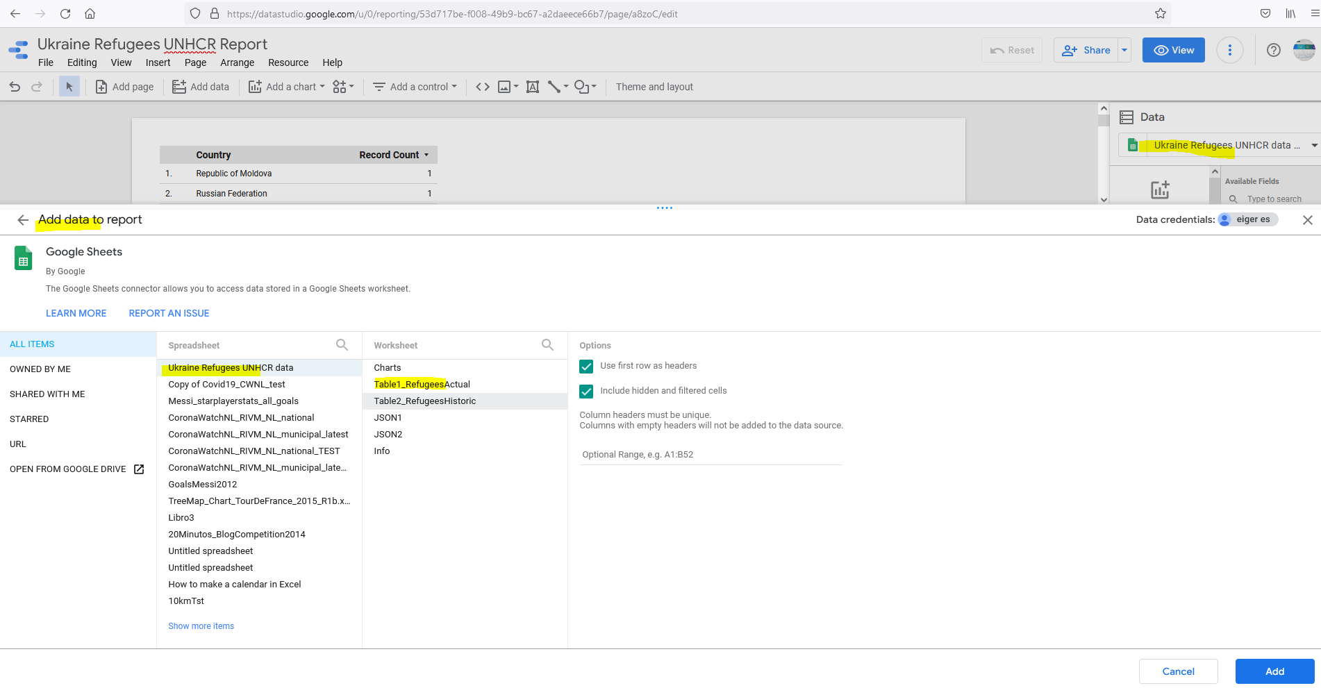
In this post I made a similar report, but now with Google Data Studio:

https://datastudio.google.com/reporting/53d717be-f008-49b9-bc67-a2daeece66b7


The data-source of this report is a Google-Sheets that I made:

https://docs.google.com/spreadsheets/d/e/2PACX-1vSX2Oxyqwy6qA2RBRkBkmvlEu_npVea1ZPp6bE7AWBxue6rRIUhL2r_-53iQXyLqPoRH7LyvLMlw4S3/pubhtml

Here I import the JSON-files of the UNHCR data-portal. G-Sheets does not have a built-in function do do this, but there is a G-Sheets extension for this which I used:

https://nodatanobusiness.com/resources/importjson-your-first-importjson-function/

https://www.youtube.com/watch?v=EXKhVQU37WM - IMPORTJSON Function - Google Sheets Tutorial - How to Import JSON feed to Spreadsheets


NB: This add-on has a limit of  #refreshes per day (100), but it looks there is a workaround:
https://discourse.gbif.org/t/api-importjson-spreadsheet-quota-limit-reached/2218

To format this data in table-format and in a separate worksheet (needed for Google Data Studio), I defined named ranges and used the QUERY-function:

https://infoinspired.com/google-docs/spreadsheet/learn-query-function-with-examples-in-google-sheets/

 https://www.youtube.com/watch?v=kQ7DKx3eZQg - Create a Data Table in Google Sheets Like Excel


PEACE TO UKRAINE !

Source:

https://euromaidanpress.com/2014/03/02/russian-designer-creates-icon-for-peace-in-ukraine-using-the-shapes-of-the-national-symbolic/


References

https://www.statista.com/study/86697/russia-ukraine-conflict/#professional

https://www.forbes.com/sites/rashishrivastava/2022/03/15/how-one-google-doc-is-helping-thousands-of-ukrainian-refugees-navigate-borders/?sh=6c2fd8fed18e

https://twitter.com/Schwarzenegger/status/1504426844199669762 

https://eacnur.org/es


Embedded Report


13 Mar 2022

Power BI dashboard with Flow Map Ukraine-refugees and Map NATO-countries


#81: Power BI dashboard with Flow Map Ukraine-refugees and Map NATO-countries

Today is the 18th day of the war between Ukraine and Russia and there are now 2.6 Ukraine-refugees.

In my previous blog-post, there was a live-tracker of the number of refugees based on this page, and I saw it was not updated, but that is fixed now. I also added some elements to the report, and some more details to that post.

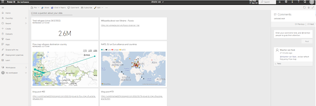
In this post I wanted to combine the Flow Map of this live tracker report with the report'
'NATO-countries Map from this post.
Combining reports (or elements of it) is something you can do with Dashboards

Here is the result:

Note that on 2 tiles (coming from the report with the live-tracker of the number of refugees) you can see when it was refreshed.

You can also add tiles with other things than a link to a report, see e.g. the tile with a link to:

https://en.wikipedia.org/wiki/Russo-Ukrainian_War 

See also the sample-comment I made, and by using a tag @.., an email is send to that person.

Update 15/3/2022:

I just saw that the Power BI report on the UNHRC data-portal changed the visualization from bubble-map to flow-map, and a nicer one than that of the custom-visual I used:


PEACE TO UKRAINE !

source pic:

https://euromaidanpress.com/2014/03/02/russian-designer-creates-icon-for-peace-in-ukraine-using-the-shapes-of-the-national-symbolic/


References

https://www.unhcr.org/nl/2022/03/dataportal-cijfer-vluchtelingen-oekraine/ 

https://www.theatlantic.com/photo/2022/03/photos-ukrainian-refugees-say-goodbye-home-and-family-members/626964/

https://news.sky.com/topic/data-and-forensics-9532

https://www.youtube.com/watch?v=yzNxLzFfR5w  - Winter on Fire: Ukraine's Fight for Freedom | Full Feature | Netflix


5 Mar 2022

Power BI Flow Map of Ukraine refugees and destination countries


#80: Power BI Flow Map of Ukraine refugees and destination countries

Update 13/5/2022:
I made some improvements in the report, see Embedded report (at bottom), or see my post on the Power BI Data Stories Gallery here.


Today is the 10th day of the war between Ukraine and Russia and there are already over 1M Ukraine-refugees.

I saw here a flow map which shows to which countries they flee:

https://www.bbc.com/news/world-60555472#:~:text=Which%20countries%20are%20Ukraine's%20refugees,gone%20to%20Russia%20and%20Belarus.

https://www.aljazeera.com/news/2022/2/28/russia-ukraine-crisis-in-maps-and-charts-live-news-interactive\


I made something similar in Power BI, using the custom-visual Flow Map, for more info, see:

https://weiweicui.github.io/PowerBI-Flowmap

 with as data source a Jason-file from the UNHCR site:

https://data2.unhcr.org/population/get/sublocation?widget_id=283559&sv_id=54&population_group=5459,5460&forcesublocation=0&fromDate=1900-01-01


This JSON-file I found here:

https://data2.unhcr.org/en/situations/ukraine

Below the map you can see a JSON-feed, with URL:

https://data2.unhcr.org/population/get/sublocation?widget_id=284488&sv_id=54&population_group=5459,5460&forcesublocation=0&fromDate=1900-01-01

and to view this file, you can use this nice (free) online JSON-file viewer:

https://jsonformatter.org/json-viewer


And I conclude this blog-post with the same picture as in the last post.
So as you can see in the URL, it is made by a Russian designer, wishing 


                PEACE TO UKRAINE


https://euromaidanpress.com/2014/03/02/russian-designer-creates-icon-for-peace-in-ukraine-using-the-shapes-of-the-national-symbolic/


Interesting links

https://www.nytimes.com/2022/03/01/world/europe/ukraine-war-migration.html


Download

Power BI report


Embedded report


2 Mar 2022


#79: Power BI Map of Europe and its alliances NATO EU Euro

Because of the war between Ukraine and Russia, and the importance of NATO-membership for especially East European countries that border with Russia as e.g. the Baltic states (Estonia, Latvia and Lithuania), I was wondering if it would be possible to make visualization in Power BI that can show for all European countries their membership in the most important military, political and economic alliances (NATO, EU and Euro), in one map. I came up with this solution, so a map with a pie-chart for each country that can have between 1 and 4 parts (Europe, EU, Euro, NATO):


REPORT


Note that in this pic, I filtered on field Indicator = NATO (see legend), which is the highlighted purple pie in the chart.

And if you zoom-out, you can see which other countries in the world belong to NATO. 

And to my surprise I also saw that outside Europe, there are some countries were the Euro is used (ex-colonies of Europe, e.g. French Guiana):


DATA

When I googled to find a list with NATO/EU/Euro-countries, I found this site:

https://www.wolframalpha.com

Here you can formulate a natural language query using the Wolfram(computational) language
which does:

Compute expert-level answers using Wolfram’s breakthrough algorithms, knowledgebase and AI technology

and you get the result like this (I used the plain text version):

https://www.wolframalpha.com/input?i=countries+in+nato


MODEL

For the 4 datasets (Wolfram-output files), I made a dataset in Power BI, pivoted the 1-line-file (a list of  countries) to have a table of countries, and added an indicator as e.g. 'NATO' for the NATO-dataset. And the last step was to 'union' these 4 datasets into 1 dataset:


Interesting links

https://www.washingtonpost.com/graphics/world/how-european-countries-are-bound-together/

https://euromaidanpress.com/2014/03/02/russian-designer-creates-icon-for-peace-in-ukraine-using-the-shapes-of-the-national-symbolic/

which this very nice (free to share) icon:


Download

Power BI-file


Power BI Embedded 

(i-frame)


6 Jun 2021


#77: Power BI report with ArcGIS map: "COVID-19 in USA"


This post is about a new Power BI report I made: "COVID-19 in USA", see FIG.1.


FIG.1: Power BI report COVID-19 in USA with (animated) ArcGIS map


In this report I used the ESRI ArcGIS map. I used this map also in my previous post, but this time I wanted to experiment with a nice feature of the ArcGIS map: animation of time-series. The dataset I used for this is open data from the New York Times:

https://raw.githubusercontent.com/nytimes/covid-19-data/master/us-states.csv

NB: for more details about this NYT COVID-19 data, see e.g.:
https://developer.nytimes.com/covid
https://www.nytimes.com/article/coronavirus-county-data-us.html

The dateset's oldest data is from Feb.2020 and it is updated daily. 
I have limited the number of data-points by filtering only the first day of the month. See FIG.2 for the Power Query I used for this:


FIG.2: NYT Dataset and applied transformations (in Power Query)


As a reference-layer for the map I used demographic data, e.g. US Median Age. And I also added an infographic with this data (median age), and also for the total population.

I made this video with the animated map and how to interact with it in Power BI, e.g by filtering by dimensions location (state) and time (year/month):

https://youtu.be/se5pLNCdo0M  


NB: I used this nice free tool https://www.screencastify.com/ to make this screencast.


My Power BI report also has a time-slicer, so you could check e.g. : 'what was the total number of COVID-19 cases in 2020 (at 1/1/2021)', see FIG.3 (which also includes a screenshot of this site: https://datausa.io/coronavirus, which I used to check the numbers in my report)


FIG.3: total COVID-19 cases in USA in 2020


To know more about how ESRI ArcGIS maps are used in this pandemic, I can really recommend this video of ESRI:

COVID-19 & Crisis Management - A GIS Approach

And for a another nice video of ESRI in which they show how AI (Machine Learning) can be used to do COVID-19 predictions, see:

Modeling COVID-19 in ArcGIS 

In this video, they say:

It has been amazing to watch how the GIS-community has done an amazing work in the COVID-19 response, from data collection, modelling and data-visualization..

I've also seen great initiatives in the Netherlands about which I wrote in earlier blog-posts, e.g.:

- data collection:

CoronaWatchNL
- open COVID-19 data of Netherland,  by Jonathan de Bruin of Utrecht University

https://dataverse.harvard.edu/dataverse/covid-19-eu
by Vyacheslav Tykhonov #4tikhonov

- dashboard:

ESRI Nederland COVID-19 dashboard with ArcGIS map


References

*COVID-19 in USA

https://www.nytimes.com/interactive/2020/nyregion/new-york-city-coronavirus-cases.html

https://datausa.io/coronavirus

https://covid.cdc.gov/covid-data-tracker/#datatracker-home

https://www.worldometers.info/coronavirus/country/us/#graph-cases-daily

https://news.google.com/covid19/map?hl=en-US&mid=%2Fm%2F09c7w0&gl=US&ceid=US%3Aen&state=1


*Power BI and ArcGIS

https://docs.microsoft.com/en-us/power-bi/visuals/power-bi-visualizations-arcgis

ArcGIS Maps for Power BI: Demographic Data

https://doc.arcgis.com/en/power-bi/design/map-time-aware-data.htm

* GIS and Location Intelligence

COVID-19 & Crisis Management - A GIS Approach

Modeling COVID-19 in ArcGIS

Using spatial analysis to understand key factors in the COVID-19 epidemic

Analyze and Visualize the Impact of COVID-19 Pandemic 


Downloads

Power BI file


31 May 2021

Power BI report with ArcGIS map: COVID-19 in the Netherlands


#76: Power BI report with ArcGIS map: "COVID-19 in the Netherlands"

Power BI has several types of maps, and one of them is the ArcGIS Map, which I used in a new report "COVID-19 in the Netherlands", see FIG.1. 

Update 6/6/2021: I made a new Power BI report for COVID-19 in USA, which also uses a ArcGIS-map, and includes also a video of the report, see:

https://worktimesheet2014.blogspot.com/2021/06/77-power-bi-report-with-arcgis-map.html

https://youtu.be/se5pLNCdo0M

FIG.1: Power BI report with ArcGIS Map, combining COVID-19 data and (demo) employee-address data

ArgGIS is GIS-software of company ESRI. The ArcGIS-map in Power BI is both available for ArcGIS-users as for people without a ArcGIS-license (as is my case), although the latter group has can't use all map-features.
NB:
-I read here that ESRI offers a free (trial) of ArcGIS-Online to companies that use their maps to fight COVID-19.
-The famous COVID-19 dashboard of the Johns Hopkins University is also made with ArcGIS


ESRI Netherlands offers maps of the Netherlands with (actual) COVID-19 data, e.g. the map "#Diagnosed per 100K inhabitants in the last 7 days per municipality", see:
https://www.arcgis.com/home/item.html?id=aafffb2776194e0db063b7b7e751997d
This map I used as a reference layer (see here how to do this) for my Power BI report, see FIG.2.

FIG.2: Power BI report with ArcGIS Map which includes a reference-layer with COVID-19 data


If you click on a municipality, you can see the related ArcGIS-data (e.g. for municipality Zwijndrecht: it has 44K inhabitants, and in the last 7 days, 93 (new) COVID-19 cases (Diagnosed):


FIG.3: Power BI report with ArcGIS Map with card showing Municipality-data and COVID-19 data that is included in the map.


On top of this COVID-19 map layer (municipalities filled with color brown) is a layer with the 'actual' data: the number of employees (of a fictitious company) who live in a certain municipality (the green 'bubbles').
NB: in my previous post I had a similar map-report, made with Report Builder (see FIG.4 of that post), but creating that one, was much more work as I had to collect and transform the COVID-19 data myself, and also configure the shape-map, while with the ArcGIS-map, this comes 'out of the box'.

And as is always the case in a Power BI report, the map and other widgets in the report are interconnected, so if you filter e.g. in the bar-chart on Utrecht (municipality where 18 employees live), automatically the map zooms in to this region:


FIG.4: Filtering chart > zooming map

I also made a mobile version for my report (which does not have the bar-chart of the desktop-version, to adapt to the (smaller) screen-size of a mobile):


FIG.5: Power BI report on mobile


Note that my map (the brown reference-layer with COVID-19 data) is the same as that in the COVID-19 dashboard of  ESRI NL:


FIG.6: ESRI NL COVID-19 dashboard 

https://experience.arcgis.com/experience/ea064047519040469acb8da05c0f100d


References


*Power BI:

ArcGIS Maps for Power BI

Microsoft Power BI: Deep dive into the ESRI Map Visual in Power BI 

At Home with Power BI - ArcGIS maps

Mapbox v ArcGIS v Power BI Maps v Azure Maps. Which one should I use in Power BI?

https://powerbi.microsoft.com/en-us/blog/how-public-agencies-keep-communities-informed-on-covid-19-with-power-bi/

https://docs.microsoft.com/en-us/power-bi/create-reports/sample-covid-19-us


*ESRI ArcGIS

https://coronavirus-resources.esri.com/

https://www.esri.com/about/newsroom/arcuser/johns-hopkins-covid-19-dashboard/

https://www.arcgis.com/apps/dashboards/85320e2ea5424dfaaa75ae62e5c06e61
 

*ESRI NL

https://nlcovid-19-esrinl-content.hub.arcgis.com/


*GIS

Geographic Information Systems (GIS): Dan Scollon at TEDx Redding


Downloads

Power BI file