Blog with real world examples of Excel spreadsheets for work (e.g. timesheet) and sports (e.g. analysis of results of 10K races). And blog has also examples made with other Business Intelligence tools as MS Power BI and Google Sheets and Google Data Studio.
#93 Power BI report ´Big 3 of Tennis´ with qualitative data and the Power BI custom visual Card Browser
The other day, a friend asked me if I could help with a dashboard for his work that should facilitate data-exploration of the results of a survey, which had just qualitative data. So the dashboard was not supposed to be the typical ´pivot-table dashboard´ with measures, so quantitive data (e.g. sales) and some dimensions (e.g. Product, Customer, Date), but more a ´Power Point interactive dashboard´.
I checked on the web if there were examples of Power BI dashboards with qualitative data, and found this:
This dashboard is made by DiscoverEI , that converted a 107 pages (e-)book into an interactive Power BI report. As they say:
"Power BI is not just limited to visualising quantitative data, it is also a fantastic data storytelling tool for transforming large amounts of text (qualitative data) into an interactive dashboard"
Another intersting example of this, is the (public) dashboard they made for the project ´Environmental Data Storytelling - Gippsland Water's Urban Water Strategy´:
In their dashboard, I saw the Card Browser Power BI custom visual which I thought could be interesting to use into the prototype dashboard for my friend.
First I created with ChatGPT the dataset for my report, so with some properties of the ´Big 3 of Tennis´, Federer, Nadal and Djokovic, e.g. favourite surface (clay, grass, hardcourt), left/right handed, playing-style (baseline, all court) etc. Then I made the Power BI report for this data, so using the Card Browser visual:
And in animated gif format:
NB: the data of this report is correct for Federer (retired in 2022) and Nadal (retired in 2024), but a bit outdated for Djokovic, who is still active and has now (Sept. 2025) 100 ATP titles, making hem part of the group of 3 tennis players with 100(+) ATP-titles, with Federer (103 titles) and Conners (109 titles)
And for a (longer) video with a demo of this dashboard, see:
NB: at the end of my video, there is a fragment of the match:
Rafael Nadal vs Roger Federer - Battle of Surfaces 2007, an exhibition match where half of the court was of clay (the favourite surface of Nadal) and the other half was of grass (the favourite surface of Federer) , source:
https://fightagainstcorruption.eu/Dashboard - Dashboard with anti-aorruption practices in the EU, as described in ´Handbook of good practices in the fight against corruption´.
For these dashboards, a lot of attention was paid to the design of the user interface, and in this video of Greg Deckler, you can learn more about the UX-design work for a Power BI report, for which he uses in this very nice dashboard:
If you enjoyed this post and want to make a small donation, you can do this with the Paypal Donate button (at the top right of this post) or via BuyMeAcoffee .
#90 Power BI dashboard Rafael Nadal's Grand Slam tournament finals in whole career (2001-2024)
Recently Rafael Nadal, one of the GOATs of tennis, announced that he will retire (at age 38). His last tournament will be the Davis Cup in Nov.2024 in Malaga (Spain).
In 2014, I made an infographic (in MS Excel) about Nadal's win/loss records, see this blog-post. And now, 10 years later, at the end of Nadal's career, I made a dashboard with MS Power BI, with the result of all Nadal's Grand Slam finals (#30) in his 23 years-career (2001-2024), finals that he played between 2005 (when he won his 1st Grand Slam tournament, at age 19) and 2022.
NB: The embedded version of this Power BI dashboard, you can find at the bottom of this post.
The dashboard is interactive, e.g. you can filter on all Nadal's Grand Slam wins (22):
Or you can 'drill-through' from a chart in the dashboard to the table with the underlying details, e.g. in chart "Finals by Tournament and Result", for tournament = 'French Open' :
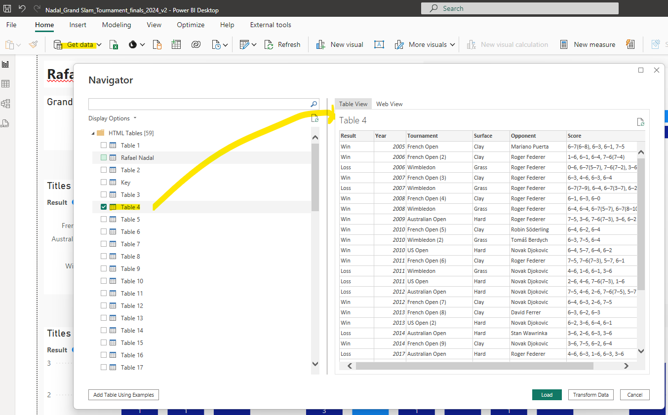
And this is the complete table, so with all Nadal's Grand Slam finals:
*FACT 1: Grand Slam finals played by Nadal: 30, wins: 22, losses: 8
*FACT 2: Nadal played 9 finals against Roger Federer. And the other opponent he met often (also 9x) in a final was Novak Djokovic (who has 24 Grand Slam titles until now, so 2 more than Nadal). Here the chart with the win/loss details of Nadals finals against these other 2 tennis-GOATs, in Spotlight-mode:
*FACT 3: Nadal played and won 14 finals of the French Open (Roland Garros), which is played on clay, his favorite surface. No other winner of the French Open comes close to this. Bjorn Borg is 2nd in the Roland Garros-winners ranking, with 6 wins, as this chart generated by ChatGPT shows:
NB: this is the Python-code of ChatGPT's analysis:
And ChatGPT gave also this other fact about Nadal's 14 Roland Garros wins:
*FACT 4: 2010 was Nadal's best Grand Slam year: he played 3 finals (French Open, US Open and Wimbledon), and won all 3. NB: I added a (special) custom tooltip to chart "Finals by Year and Result", so that you can see more details of these finals:
(Page 2 of dashboard)
*FACT 5: Of the 14 finals of the French Open that Nadal played, most were against Federer: 4 finals
*FACT 6: Nadal played against Djokovic in the finals of all 4 Grand Slam tournaments, in total 9 finals (wins: 5, losses: 4): -French Open, wins: 3 -US Open, wins: 2, losses: 1 -Australian Open: losses: 2 -Wimbledon: losses: 1
*FACT 7: Nadal won all 4 Grand Slam tournaments in his career. He reached this 'career Grand Slam' in 2010:
*FACT 8: What is maybe not so easy to see in my Power BI dashboard about Nadal, is the fact that there were 3 years that Nadal did not play any Grand Slam final: in 2015 and 2016 (after having played in the previous 14 years at least 1 Grand Slam final each year) and in 2021. I made another dashboard where I enriched the data from the original Wikipedia-datasource with these 3 years:
NB: This post explains more about the reason why in 2015-2016 Nadal had a weak period:
But Nadal came back, and won again 4 years in a row: in 2017-2020 6 Grand Slams and 2 more in 2022.
When I saw that ChatGPT could make the Roland Garros winners chart (see FACT 3 above), I was wondering if it could also create a dashboard with multiple charts:
But Power BI can auto-generate a report/dashboard (using built-in AI), and here you can see the result for my Nadal-dataset, where I marked with green the charts that I think are useful (and with red those charts that are not).
So I think this proves that AI can't replace a (human) data-analyst. I also asked ChatGPT about this:
I wanted to see how good Power BI's AI feature 'autocreate report' was, but I was disappointed, it looks to take some random permutations of the different attributes to slice the measure, I guess because it doesn't know about the underlying concepts, as a human does, is this true?
And here's GPT's answer:
And I also liked GPT's alternative response, which includes this:
I used GPT also for a review of my Power BI dashboard, for which I made a screenshot of the dashboard and attached this file in my prompt ('please review my dashboard, see attached file'):
Even though Nadal will stop with tennis soon, the future of Spanish tennis looks bright with Carlos Alcaraz, who already won 4 Grand Slams at the age of 21, and of which Nadal said: "he's going to be one of the best in history" (see this post). I asked GPT to plot a chart with Nadal's and Alcaraz's number of Grand Slams per age, here the result (after some iterations/mistakes by GPT):
I hope that Nadal will play in the Davis Cup and that he's in a good shape (no injuries..), and it would be very nice if Nadal and Alcaraz would play together in the double.
If you enjoyed this post and want to make a small donation, you
can do this with the Paypal Donate button (at the top right of this blog-post) or via BuyMeAcoffee .
#25 Infographic Win/Loss record Rafa Nadal in Excel
This post has 2 Excels (see paragraph Downloads below): -Tennis_Input.xlsx: data with match-results (copy this to dir: C:\Temp\) -Tennis_Statistics.xlsx: has Tennis_Input as its datasource.
The other day I saw in the Spanish sports-newspaper Marca (30/9/2014, pag.68, or see www.marca.com) an 'infographic' (made by Sergio Bartolome) of the win/loss record of Rafa Nadal, from the year of his break-through in the tennis world top (2005) until hist latest Wimbledon (july 2014). The graphic showed wins vs losses on the x-axis, and the years on the y-axis. I was wondering if I could make this graphic in Excel, and from scratch, so not using the numbers form Marca, but some website with the results of all the match-results from Nadal from 2005 until 2014. And the answer is yes, see fig.1 for the end-result (Tennis_Statistics.xlsx).
BTW: the numbers in my statistics are not exactly the same as those in Marco, because in my statistics I included doubles, Marco only has singles.
fig.1: Win/Loss record Nadal
The type of graphic in Marca reminded me of a population-pyramid graph,with on the y-axis the age-ranges and on the x-axis the genders (men on the left and women on the right side of the y-axis), and this graph can be made in Excel, see e.g.:
Comparing the win/loss graph with the population-pyramid graph in this example (of the 1st URL), you have this equivalents:
- men : losses (in Excel-graph: data series 1)
- women : wins (in Excel-graph: data series 2)
- age-classes : years (in Excel-graph: category)
To get the numbers of the losses on the left side of the y-axis (years), so the negative numbers on the x-axis, without the minus sign, you have to give the cell format 'Number' '0:0', for more details see:
The format of the data on this site is quite structured, but I couldn't use PowerQuery to get the data from the Web into a table in Excel. So I copied all data from the website myself and made a table of it, with the result-data (Win/Loss) in column B and I added column F, with the year (in which the match was played). So these (yellow) columns (B and F) form the table with the input for my Excel with the Win/Loss Record (Tennis_Statistics.xlsx), see sheet-1 ('DataWeb') and fig.2
fig.2 Input-table with data from website
In sheet-2 ('TableResult' and fig.3) you can see a pivot-table and graph for this table. The pivot-table has 2 values: total number of matches won/lost and the percentage won vs lost.
fig.3: pivot-table for input-table with match-results Nadal
And in sheet-3 ('Finals') I used the table of sheet-1 (pink lines) to get the results (won/lost) of the finals Nadal played in 2014, using a 'sparkline' mini-graph of type 'Win/Loss' to display this binary variable (W/L), see fig.4.
fig.4 sparkline mini-graph results (W/L) finals Nadal in 2014
Another example of a mini-graph you can see in fig.1, in the table, column ´Total', which shows besides numbers a bar-chart. For more about sparklines/mini-graphs, see:
To get the data from this Excel 'database' (Input) to the other (Statistics), I made an connection of type Excel-Query (SQL). For my post about how to use data from one Excel into another, see:
The final part of this Excel (Statistics) was to add some 'decoration', so that if it could be used for a newspaper like Marca, as readers like an (info)graphic probably more then just a plain Excel-graph. One of the 'decorations' was to use tennis-balls as a fill-pattern for the bar-charts. For how you can do this, see:
Although infographics are mainly about presentation (visualization of data), I also made sure my Excel passed the 'accesiblity-check' included in Excel (to be sure the information is also accesible for people with a visual handicap), e.g. I added 'alternative text' for the infographic and hyperlinks. For my post about MS Excel and accesiblity, see:
#Mirror 2 (Excel file):
NB: this site has MS Onedrive, which has 'Excel-Online', so you can view my Excel-files here if you don´t have MS Excel on your PC