21 Mar 2020

Coronavirus in the Netherlands: embedded daily refreshed Power BI report

#67 Coronavirus in the Netherlands: embedded daily refreshed Power BI report

NB 31/3/2020:
Since today, this report is not daily updated anymore, because the format and content of the source-data (RIVM CSV file) has been changed and I haven't adopted my reported for this. In case you are interested in this, please let me know in a comment on this post.

NB: the embedded report is at the bottom of this page, and is updated Daily 


The Coronavirus (COVID-19) Power BI report that I made and wrote about in my previous blog-post:

http://worktimesheet2014.blogspot.com/2020/03/coronovirus-in-netherlands-power-bi.html

, I embedded in this new blog-post, so you can see every day the latest numbers. The data in this report get's refreshed daily at aprox. 14:00, when RIVM  (National (Dutch) Institute for Public Health and the Environment) made the new Coronavirus-numbers in the Netherlands available again on their website:

https://www.rivm.nl/coronavirus-kaart-van-nederland-per-gemeente

and after this CSV file was processed by Jonathan de Bruin (Research Data Engineer at Utrecht University) and made available for the public on:

https://github.com/J535D165/CoronaWatchNL

How to embed a PowerBI report in a web-page is described here:

https://powerbi.microsoft.com/en-us/blog/easily-embed-secure-power-bi-reports-in-your-internal-portals-or-websites/

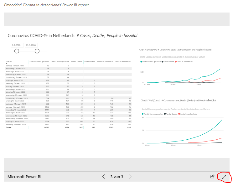
The embedded report below is interactive, so you can do everthing here as you would do when you work in Power BI itself, e.g. filter, drill-down etc.

Hint: when you view the report in your web-browser, use mode 'Open in complete screen' (see red-marked icon in bottom-right icon in fig.1).

Power BI has also a community where members can share their work, which I also did for my Corona-report (under user-name: maartenree), see:

https://community.powerbi.com/t5/Data-Stories-Gallery/Covid-19-in-the-Netherlands-visualising-the-RIVM-data/m-p/985506#M3539

For more details about the report and the PBIX-file (PowerBI), see my previous post.


fig.1  Coronavirus- PowerBI report v3 in webbrowser (i.c. embedded in the page of this blog-post)


HTML (iframe) of today's report (in case you want to embed it in your webpage:

<iframe width="800" height="600" src="https://app.powerbi.com/view?r=eyJrIjoiZjVkOWQ4MzYtM2Q5Yi00MWI0LTllNGYtNDFiY2EyYzgzYjI4IiwidCI6ImI3OWIyMzE3LTM0ZGQtNDNlNS05MWEyLWNkNjZkM2FlMWYwYiIsImMiOjh9" frameborder="0" allowFullScreen="true"></iframe>


Embedded 'Coronavirus in Netherlands' Power BI report

15 Mar 2020

Coronovirus in Netherlands Power BI report

#66 Coronavirus in the Netherlands: Power BI report 

Update 27/3/2020, report v4:
I added a measue for R0 - reproduction number of COVID19 virus.

Update 21/3/2020, report v3:
I  update this blog-post today because I made a new version of the Coronavirus-report. The changes in thin blog-post I marked below with:
 'Update 21/3/2020 begin ... end'
See also my new post: https://worktimesheet2014.blogspot.com/2020/03/coronavirus-in-netherlands-embedded.html
for the report embedded in my blog, and which is daily refreshed (at aprox. 14:00).

Update 15/3/2020, report v2:
I  update this blog-post today because I made a new version of the Coronavirus-report. The changes in thin blog-post I marked below with:
 'Update 15/3/2020 begin ... end'

Spain has declared the state of emergency the other day because of the Coronavirus. My kids were already at home this week because all schools were closed. And this week also the office of the company I work for, Visma Labs Spain  (supporting Visma|Raet in the Netherlands) was closed, and since then I'm working at home. And the Coronavirus crises also lead to a new project I had to work for, to create a report with Coronavirus info in the Netherlands.
In the Netherlands, the official Coronavirus numbers per Dutch municipality are published daily (at aprox. 14:00) by RIVM on:

https://www.rivm.nl/coronavirus-kaart-van-nederland

Here you can download a CSV file with this data. I was wondering if this information was disclosed in a more user-friendly way in Spain, maybe with a REST-API, but it wasn't. My Google-search lead me to this blog-post of Marcos Merino:

https://www.genbeta.com/actualidad/italia-crea-web-datos-abiertos-sus-casos-coronavirus-estas-iniciativas-particulares-buscan-espana

from which I learned that in Italy the governemnt offered Coranvirus-data as open-data here:

http://opendatadpc.maps.arcgis.com/apps/opsdashboard/index.html#/b0c68bce2cce478eaac82fe38d4138b1
(see in bottom-right corner 'Download CSV')

and also on GitHub: https://github.com/pcm-dpc/COVID-19

And Merino also tells that in Spain, the Twitter-user Ecléctikus also shared the Coronavirus-data
 of the Spanish government:

 https://www.mscbs.gob.es/profesionales/saludPublica/ccayes/alertasActual/nCov-China/situacionActual.htm

on GitHub, see: https://nosolodatos.netlify.com/es/covid19/coronavirus

So I wondered if in the Netherlands someone did the same with the Dutch Coronavirus-data from RIVM, and that was the case.  Jonathan de Bruin of Utrecht University offers the RIVM-data here:

https://github.com/J535D165/CoronaWatchNL

And for the meta-data of the datasets on this page. see:

https://dataverse.harvard.edu/dataset.xhtml?persistentId=doi:10.7910/DVN/0PD4JM

I downloaded ('pull- request') his Coronavirus-repository, which also has improments of the RIVM dataset (e.g. it has a Province field, and stores all historic values). And after that, I processed this dataset with Microsoft Power BI . See fig.1-2 for the result, and for the PBIX-file, see Downloads below.

Update 15/3/2020 begin:
I just made a small improvement to the report: I created a  hierarchy for the fields Province and Municipality, so that in Chart 1 you can do a drill down in the map from Province to Municipality, see fig.3 for an example, where I drilled down for province Brabant (the one which is most affected).
(Map-)Chart 1, on municpality-level, makes it visible that the 2 most affected cities within Brabant, Tilburg and Breda, are close, something that (bar-)Chart 2 does not do.

BTW: I created the report yesterday (14/3/2020), and in the screenshots in this blog-post you can also see this date as the 'filter-date' in Chart 1. After a new 'pull' of the GitHub-dataset (15/3/2020 22:00), and a 'Refresh Data' in Power BI, I had the the new data in my report, so without any effort thanks to de Bruins good work.

When you upload a Power BI report to the cloud Power BI Service, you automatically can get 'Quick Insights', see fig.4 for some examples.

Update 15/3/2020 end

Update 21/3/2020 begin
De Bruin added new datasets on his GitHub page, with information about:
- # deaths ("aantal doden")
- # hospitalized ("aantal in ziekenhuis")

I added this new metrics in a new page (3) to the report, together with the old one (# cases ("aantal Corona gevallen"), in a table and 2 line-charts, for both cumulative numbers as 'deltas' (new number per day), see fig.5.

For the 'delta', I used this DAX-formula, which I got from here:

https://community.powerbi.com/t5/Desktop/Delta-Values-from-Previous-Day-Using-Multiple-Columns/td-p/186473

Delta Corona gevallen = SUM(rivm_corona_in_nl_daily[Aantal Corona gevallen]) - CALCULATE(SUM(rivm_corona_in_nl_daily[Aantal Corona gevallen]);DATEADD(rivm_corona_in_nl_daily[Datum];-1;DAY))

NB: De Bruin's source for this data were the RIVM press releases with daily update (below the map) on:
https://www.rivm.nl/nieuws/actuele-informatie-over-coronavirus

Some other improvements of the v3-report are:
- Corona-cases for which RIVM had no data for Municipality, are now having value
"Onbekend" for the fields Province and Municipality in the report
- Chart 3 uses now for stacked bar chart the Province-hierarchy (so enabling drill-down from Province to Municipaliy)
- Page 2 has now also a Date-filter

Update 21/3/2020 end

Update 27/3/2020 begin
The DAX for the  measure  R0 - reproduction number of COVID19 virus is:


R0 = [Delta Corona gevallen] / CALCULATE([Delta Corona gevallen];DATEADD(rivm_corona_in_nl_daily[Datum];-1;DAY))

For the new R0-chart, see fig.6
For more info about R0, see e.g:


Update 27/3/2020 end


fig.1: Power BI report Dutch Coronavirus-data - page 1 (see also fig.3)


fig.2: Power BI report Dutch Coronavirus-data - page 1


fig.3: Power BI report Dutch Coronavirus-data - page 1: Drill-down for Province = Brabant, showing detail for city Breda


Update 15/3/2020 begin


fig.4: Power BI Quick Insights

Update 15/3/2020 end

Update 15/3/2020 begin


fig.5: Power BI table and charts for metrics #Corona-cases, #Deaths, # Hospitalizations

Update 15/3/2020 end


Update 277/3/2020 begin


fig.6: Power BI chart with R0

Update 27/3/2020 end

To conclude, I'd like to share something that was done yesterday here in Madrid, where Coronavirus is hitting hard. Via a Whatsapp-group of school, they asked every child to make a drawing with a rainbow with the text "We'll get trough this", and to hang it out on the balcony, and at 22:00 go out on the balcony and give a big aplaus for all the people who work in public survice (doctors, nurses, police etc.) to thank them for their hard work in dangerous circumstances. And also to support all people in Madrid who now have to stay at home (you can only leave home for the most necessary things as going to the supermarket). For more info about this initiative, see:

https://www.hoy.es/sociedad/salud/dibujos-ventanas-llevadera-20200314172924-ntrc.html?ref=https%3A%2F%2Fwww.google.com%2F

 Below the drawing my 2 sons made.


And for more photos of creations of my kids made in their homeschooling-class with mum or in their free time, see: https://tatinma.tumblr.com/post/613828873964093440/d%C3%ADa-14-de-cuarentena-25-de-marzo-refuerzo


¡TODO SALDRA BIEN!
ANDRÀ TUTTO BENE!

M.


Downloads

Mirror #1

http://tiny.cc/cz50lz


References 

English

De Bruin's GitHub-page:  github.com/J535D165/CoronaWatchNL

https://gisanddata.maps.arcgis.com/apps/opsdashboard/index.html#/bda7594740fd40299423467b48e9ecf6

https://app.powerbi.com/view?r=eyJrIjoiMzIwZWZhM2UtM2RiOS00NTYzLTljMTAtNzdiMTcyNWI5MWMxIiwidCI6IjgzNTU5ODFiLTJlYTYtNDdjZi04ZjJiLTc3MTY3N2FmZjMyZCJ9

https://avatorl.org/covid-19/

https://medium.com/@tomaspueyo/coronavirus-act-today-or-people-will-die-f4d3d9cd99ca

https://data.europa.eu/euodp/es/data/dataset/covid-19-coronavirus-data

https://who.maps.arcgis.com/apps/opsdashboard/index.html#/ead3c6475654481ca51c248d52ab9c61

Spanish

https://www.epdata.es/datos/coronavirus-china-datos-graficos/498

https://www.levante-emv.com/espana/2020/03/13/mapa-coronavirus-espana-mundo/1989172.html

https://www.xataka.com/medicina-y-salud/china-aprendio-wuhan-resto-mundo-no

https://www.comunidad.madrid/servicios/salud/2019-nuevo-coronavirus


18 Jan 2020

Google Data Studio Dashboard for Messi, my blog and my Youtube videos

#65 Google Data Studio (GDS) Dashboard for Messi-goals, my blog and my Youtube videos

4/1/2021:
Today I made a new live Messi Goal Tracker dashboard, see:
https://worktimesheet2014.blogspot.com/2021/01/messi-goal-tracker-dashboard-in-google.html

4/4/2020:
Today I made my Messi-dataset (CSV-file with raw-data, that I used for my dashboard) available as 'open data' on Github, see:
https://github.com/mvanreek/Sports_data


Although this blog is mainly about Microsoft Office's Excel, for this post I took a look at
Google's G Suit ("Google Docs"), especially Google Sheets (a spreadsheet-tool like MS Exel) and Google Data Studio (GDS) (a BI/dataviz. tool like MS Power BI).
For more info about these Google products and a comparison with the 'equivalent' Microsoft products, see Literature below. Most important thing to know is that with GDS, Google wants to make Analytics accesible for anyone, not just for big companies with time, money and (tech) skills.

To test GDS, I first used the 'Messi-dataset' that I used to create dashboards in Excel+Powerview and Power BI for previous blog-posts, see:
http://worktimesheet2014.blogspot.com/2016/12/powerbi-dashboard-for-messis.html
http://worktimesheet2014.blogspot.com/2015/08/dashboard-for-messis-worldrecord-of-91.html

The 'Messi-dataset' was in Excel, and I converted it to Google Sheets (see Downloads below), and in GDS, I connected to this G-Sheets datasource.
For the GDS-report (see fig.1), I used the Excel + Power BI reports I made before as an example, but I made some changes to improve the 'story-telling' by the report, to give insight in how Messi made these goals (the 'mode', e.g. left-foot), where (in which team) and when. This lead to the following charts in the report:
- score-card with total goals
- stacked bar-charts for # goals by Team/Competition
- bar-charts for # goals by Mode
- stacked column-chart for # goals by Time/Competition

fig.1: Google Data Studio Report with Messi goals

https://datastudio.google.com/reporting/39453d65-7507-4819-aeea-b3603d227645


Embedded Youtube-video of maybe Messi's best goal:
https://www.youtube.com/watch?v=WkqecpHcIPw

GDS can connect to various datasources, and I tried 2 others:

-1: Google Analytics (for my blog), see fig.2 for the report. In this report I set the chart-property 'interactivity - filter' to 'on' for all charts, so that if you filter in one chart, this filter is applied to the other charts (see fig.2c, filter: Year = 2019). I also enabled the 'drill-down' option for the Geography and Time dimensions (see fig.2b-c, Continent = Europe).
For a look at the Google Analytics dataset (with facts/meassures and dimensions), see fig.2d.

NB: Google Analytics is also loaded with standard reports, see fig.3, which is good for getting insights for e.g. a business analyst, but if he wants to share these insights with others (e.g. management) in a presentation, he could use GDS to create a nicer report.

-2: Youtube Analytics  (for my YT-channel / some video's I uploaded once), see fig.4.


fig.2a: Google Analytics for my blog - page 1

https://datastudio.google.com/reporting/09d957cc-9cb3-4611-b8ae-37ec5a8af90c


fig.2b: Google Analytics for my blog - page 2: without filters


fig.2c: Google Analytics for my blog - page 2:  with filter on Year and drilldown (Continent > Country)


fig.2d: Google Analytics dataset


fig.3: Google Analytics standard dashboard for my blog


fig.4: Youtube Analytics  (for my YT-channel)

https://datastudio.google.com/reporting/14ca88f6-548d-4cf6-bfc5-ee662f29a4a4


I think with Google Data Studio it is possible to make really nice reports in an easy way, and the fact that is free, easy to share (just like any Google Docs file) and a 100% cloud solution makes GDS a very interesting option for your BI/dataviz.work. And even more so if your company is using Google G Suite, which happens to be the case in the company I work for (#Visma|Raet , part of #Visma)..


Literature

[1]
Google Data Studio: Pricing & In-depth Reviews

[2]
Google Data studio, a killjoy for Microsoft Power BI

[3]
I Evaluated 4 BI Tools: Power BI, Tableau, Google Data Studio, & Sisense. Here's What I Found


Downloads

Mirror #1

Messi-dataset (G-Sheets):
https://docs.google.com/spreadsheets/d/1ldQAt_EV9MqjNdpMDqIa6uzzkFDqPlTlVhM1NqqdKoM/edit#gid=0

Messi GDS-report + PDF:
https://datastudio.google.com/reporting/39453d65-7507-4819-aeea-b3603d227645
https://drive.google.com/open?id=1Lhb0CNO685Bl-zoCGlEdjK0IwH890Wc4


23 Dec 2019

Results 6K run Dehesa de la Villa 2019, Men Veteran B


#64 Results 6K run/cross Dehesa de la Villa 2019, category Men Veteran B

Last week (15/12/2019) I participated in the running race "XXXVII (37th edition) Cross de Invierno Ciudad de los Poetas - Memorial Javier Martínez Morales", a 6 km race in the beautiful park Dehesa de la Villa in Madrid, organised by the local running club Agrupación Deportiva Ciudad de los Poetas (A.D. Ciudad de los Poetas).
For map-details, see: https://runedia.mundodeportivo.com/carrera/cross-de-invierno-ciudad-de-los-poetas-2019/20193350/

For the analysis of the results with Excel, I used the same method as I did last year, see for detailed description:
https://worktimesheet2014.blogspot.com/2018/12/data-analysis-for-finishing-times-of.html
NB: for download-details of the Excel, see end of blog. I also uploaded it to Excel Online (on Microsoft Onedrive) so you can also look into it even if you don't have Excel installed.

Besides Excel, I used this time also Flourish for data-vizualization, see e.g. fig.1 for an example of a chart made with this tool. The Vega-Lite charts that Flourish uses have some nice features, e.g:
- online editor Flourish Studio, to which you can upload an Excel with your data
- charts are described in JSON (very compact), see fig.2a-b
-  animation-effect when a chart is loaded
- you can create a 'story' to group charts which can be embedded in a web-page and 'played' (aka Powerpoint) , as the one I made and you can see below fig.1.

fig.1:  Flourish / Vega Lite Boxplot-chart finish-times byclub
..

My Flourish story (click on below arrow to go through 4 charts of this story):


The Flourish/Vega Lite charts are also responsive, so they adapt to the resolution of the device (laptop, smartphone, tablet), see fig.2c


fig.2a: Flourish Studio

https://app.flourish.studio/visualisation/1132053


fig.2b: Flourish Studio


fig.2c: Flourish responsive charts


I also used Excel to analyze the data and my finish-time (30:42 min., so 1842 sec, rank #83) using the Data Analysis menu with options "Descriptive Statistics' and "Rank and Percentile", see fig.3-4 for the result. And in Excel 2016 it is also quite easy to make Histogram- and Boxplot charts, see fig.5-6.


fig.3: Excel 'Data Analysis'-menu,  option "Descriptive Statistics'


fig.4: Exel 'Data Analysis'- menu,  option "Rank and Percentile"


fig.5: Excel Histogram-chart Finish-times (in sec)


fig.6: Excel Boxplot-chart Finish-times (in sec)


And to conclude I wanted to to thank AD Ciudad de los Poetas and all its volunteers for organizing this race, and also for giving all runners a nice memory of the race with all the photos they made and uploaded to Flickr, like this one of me, in white shirt, which I got with another race , of hospital Nino Jesus, and which I also made an analysis for using Power BI as dataviz.tool, see:
http://worktimesheet2014.blogspot.com/2017/11/statistics-result-10-km-run-corre-por.html
What I liked about Flourish is that it is 100%cloud and there is a free edition. When I looked for the opinion of others on Flourish, I found this interesting article in which various dataviz-tools are demonstrated, among which Flouris (and Power BI, Excel and more):

http://www.storytellingwithdata.com/blog/2019/1/24/new-year-new-tools


IMG_5574

source: 
https://www.flickr.com/photos/adcpoetas/49241485423/in/album-72157712270066027/


Downloads:

#Mirror 1: Google Drive

https://cutt.ly/freIKwU


#Mirror 2: Microsoft OneDrive

https://cutt.ly/oreI1cX

--


31 Dec 2018

Data analysis for finishing times of race Cross de invierno Ciudad de los Poetas 2018


#63 Data analysis for finishing times of race "Cross de invierno Ciudad de los Poetas 2018"

Last week (16/12/2018) I participated in the running race "XXXVI Cross de Invierno Ciudad de los Poetas - Memorial Javier Martínez Morales", a 6 km race (3 rounds o 2 km with some hills, for map, see: https://es.wikiloc.com/rutas-carrera/cross-invierno-dehesa-de-la-villa-8295067) in my neighourhood in Madrid' (Ciudad de los Poetas (Saconia)), in the beautiful park Dehesa de la Villa in Madrid, organised by the local running club Agrupación Deportiva Ciudad de los Poetas (A.D. Ciudad de los Poetas). The nice thing of this race, apart from its environment, is that there are races for all ages, from young to old (competing in 10 categories), so that the whole family can participate, which we also did. And besides, the race is also free, and perfectly organised, so I can really recommend it.
A.D. Ciudad de los Poetas also posted many nice photos of the race on their Flickr-space:

My favourites:
And for a nice video (of an earlier edition of the race):

https://www.youtube.com/watch?v=ejJhOhsDHTU&feature=youtu.be

In my race participated 108 runners, some were member of a running club, or of a school,besides 'independent' runners as me (total: #42, see worksheet "Pivot1" of the attached Excel). 

To analyse the finishing times, I downloaded the PDF-file from: 

and converted this to Excel with this (free) tool: 

https://www.pdftoexcel.com/

I added a column "TimeSecTotal" so that all finish times are converted to seconds (using simple string-functions, e.g. MID and RIGHT).
And also column "RankInRunnersClub", that indicates a ranking in a sub-competition (e.g. my (overall-)ranking was 75 (of 109) (69th percentile), but in my sub-competition ('Independent runners"), my ranking was 24 (of 42) (57th percentile)). For this sub-ranking ranking in a group), I used the function SUMPRODUCT, see e.g.:

https://www.extendoffice.com/documents/excel/4319-excel-rank-by-group.html

In my previous blog-posts about races in which I participated, you can see how you can make a boxplot and histogram for the finishing times in Excel, see e.g.: 

but this time I wanted  to see if there were some free tools with which this can be done, and there are.
To create the histogram (see fig.1), I used:

NB: For other races about which I blogged I could check my histogram with that at the site of Runedia, see e.g.: 

https://runedia.mundodeportivo.com/en/race/carrera-de-las-empresas-10k-actualidad-economica-2014/201419683/

but for this race, they didn't publish it, but maybe later, here:

https://runedia.mundodeportivo.com/en/race/cross-de-invierno-ciudad-de-los-poetas-2018/20183350/.

And to create the boxplot (see fig.2), I used: 

Note that the boxplot also plotted an outlier (so this means that the 'upper-whisker' is not the slowest finishing time (2542 sec.), but the penultimate slowest time (2429 sec.)).
NB: I also found this stats tool:

https://plot.ly 

with which you can create all kinds of charts, but the box-plot didn't show the outliers.

To conclude, an interesting read (article with histogram and analysis):


fig.1: Histogram finishing times category Men Vet.B


fig.2: Boxplot v1 (with outlier) of finishing times category Men Vet.B


fig.3: Boxplot v2 of finishing times category Men Vet.B


fig.3: Boxplot v2 (detail) of finishing times category Men Vet.B


Downloads:

#Mirror 1: Google Drive


25 Feb 2018

Speed skating at Winter Olympics: Power BI Dashboard for all medals


#62 Speed skating at Winter Olympics: Power BI Dashboard for all medals


For the 2018 Winter Olympic Games in PyeongChang (South Korea), in Korean:
평창 동계 올림픽 

I made a Power BI dashboard for all medals won in the long track speed skating competitions, see fig.1 for the result


fig.1: Power BI Dashboard with medals/rankings for all speed skating competitions

NB: translations Dutch - English
- Massastart =  Mass start
- Ploegenachtervolging = Team pursuit


The datasource I used is:

https://nl.wikipedia.org/wiki/Schaatsen_op_de_Olympische_Winterspelen_2018

NB: This is the Dutch version of this English page:
https://en.wikipedia.org/wiki/Speed_skating_at_the_2018_Winter_Olympics#Medal_summary

but I choose to use the Dutch page as the tables on this page (with medals-table and competition-results) where in a better format to import them in Power BI.

This datasource had a table with per competition a row with the athletes with rank 1, 2 and 3 (see the tables at the bottom of the dashboard), which with Power Query's M can be easily be unpivoted, so in 1 row per rank (needed to do the aggregations, leading to the tables and charts in the middle of the report).
For more info about (un)pivoting tables with rankings, see e.g.:

https://blogs.oracle.com/sql/how-to-convert-rows-to-columns-and-back-again-with-sql-aka-pivot-and-unpivot

As you can see in the report, the Netherlands did very well again this Winter Games, and was #1 in medals-table for long track speed skating with16 medals in total. Besides that we won another 4  medals in short track speed skating, so we won 20 in total, see for all medal-winners:

https://en.wikipedia.org/wiki/Netherlands_at_the_2018_Winter_Olympics

Only in the previous Winter Games in Sochi the Netherlands did better.
For my post about these medals ( so in Sochi), see:

http://worktimesheet2014.blogspot.com.es/2014/02/rankings-dutch-skaters-in-wintergames.html

And for a nice chart with Dutch medal-scores at all the Winter Games, see:

https://www.gelderlander.nl/olympische-spelen/de-nederlandse-medailles-tijdens-de-winterspelen~a1e54d7c/117331823/

As I told in my previous post about the 2018 Winter Games, see:

http://worktimesheet2014.blogspot.com.es/2018/02/power-bi-chart-with-map-for-winter.html

skating is a very popular sport in the Netherlands and we did send the max. allowed number of skaters to the Winter Games (20), more then any other country. So you could say that it is logically that we win the most medals in skating.  I read here:

https://www.washingtonpost.com/news/fancy-stats/wp/2018/02/20/2018-winter-olympics-power-rankings-norway-netherlands-dominating/

and interesting article which ranked the Netherlands #2 (after Norway) using a special 'power rating', which not only looks at the medals won, but also to the ranking of the other (not medal-winners) athletes, the # of participating athletes etc.).

Well done #TeamNL !!


Downloads

Mirror #1 (Google Drive):

https://goo.gl/cHb2Q4


18 Feb 2018

Power BI chart with map for 2018 Winter Olympics

#61 Power BI chart with map for 2018 Winter Olympics


For the 2018 Winter Olympic Games in PyeongChang (South Korea), in Korean:
평창 동계 올림픽 

Google did some research of what the favourite winter sport of every country is, and published this on Google Trends, see: 


and:


Not surprisingly, for the Netherlands the favourite sport is (ice) skating (speed skating and shorttrack). I was interested to see how popular skating is world-wide, so I looked at above Google Trends site for 'ice skating', filtering for the period of the Olympics 2018 (9 Feb. until today, 17 Feb.), here:

https://trends.google.com/trends/story/US_cu_vSct5mABAADwQM_en

I downloaded the CSV file from Google Trends and with this I made the Power BI chart in fig.1.


fig.1: Power BI 'filled map' chart with Google Trends Index for ice skating

The only red country on the map, left to the 'E' of Europe, is the Netherlands, with the highest Google Trends index (of 100) (and in green are the lowest scoring countries, and in pink the countries with a medium score).

To make this chart, this site was very helpful for me:


References:


- For some information about Korean, see my blog-post: 

-For some of my blog-posts with skate-statistics of the 2014 Winter Olympics, see: