#72: Tableau-dashboard "COVID-19 in the Netherlands" with CoronaWatchNL-data
My previous post was about a Google Data Studio (GDS) COVID-19 dashboard I made. GDS-reports are meant for viewing on a PC, not for mobile devices, as the GDS-canvas doesn't have a responsive design, although there is a way to make a (embedded) GDR-report reponsive, see e.g. : https://kpis.studio/blog/mobile-friendly-data-studio/
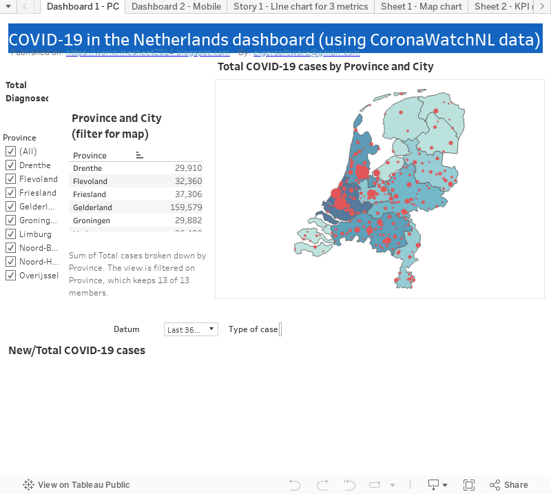
But I decided to make a new COVID-19 dashboard, this time with Tableau, as the Tableau-canvas does have a responsive design, or better said: a "device specific designer", see e.g. Design for mobile devices (device specific designer). And I also choose Tableau because I was inspired by the "Tableau & Visual Analytics inspiration-session' we had at work, in which I saw things of Tableau that I wanted to try myself. For the end-result of my first Tableau- experiment, see FIG.1. And for Tableau-workbook and the 'live' (embedded) dashboard, see the bottom of this post. And the live dashboard you can also find here:

FIG.1: my COVID-19 Tableau dashboard with responsive design, so works both for PC as mobile
To create my dashboard I used the free version of Tableau, Tableau Public 2020.3 (vs the Tableau Desktop client, for which you need a license). This version has the limitation that you can't save your dashboard locally, but only on the web, here:
So this makes your dashboard publically available once you saved (=published) it (for my dashboard that was on 2/12/2020). When I searched for my dashboard (using 'covid-19 netherlands'), I found it, with ranking #2 (se FIG.2). I'm not sure why my dashboard was ranked so high in the 35K(..) results for my search , but maybe it helped that my dashboard is automatically updated each day, which is not true for the other top 6 dashboards in FIG.2. Later I'll explain how this can be done with Tableau Public, but this wouldn't have been possible of course if my datasource, CoronaWatchNL, wasn't updated daily as well (for more details about this datasource, see my previous post).
Out of curiousity I checked if there were other COVID-19 dashboards that used CoronaWatchNL, and I found one, see FIG.3
and for the (very nice) dashboard, see:

FIG.2: my Tableau dashboard on Tableau Public cloud
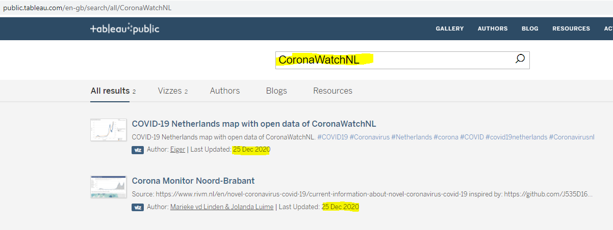
FIG.3: (other) COVID-19 dashboards that use open data of CoronaWatchNL
Now more details about my dashboard:
Datasources
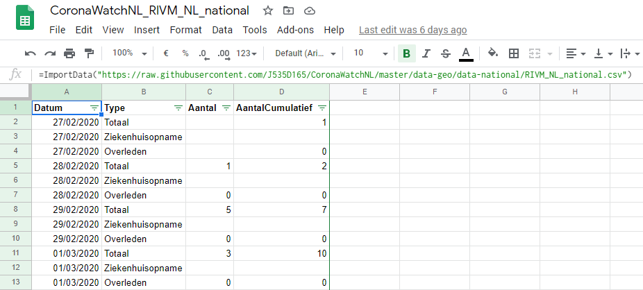
My dashboard has 2 datasource, the same 2 Google Sheets (that import data of CoronaWatchNL) that I used to create my Google Data Studio (GDS) dashboard. For the details of these datasources, see:
- Datasource 1: RIVM_NL_municipal_latest.csv
- Datasource 2: RIVM_NL_national.csv
in my previous post.
Remember that these Google Sheets get updated automatically as soon as CoronaWatchNL has new data. And to get a 'live' dashboard in Tableau Public, you have to select 'Keep my data in sync with Google Sheets..' when you save the Tableau-workbook, see for more details e.g.:
For datasource-1, with geo-data, I set the 'Geographic Role' for the geo-columns as Country :

And for field 'Type' (of COVID-19 case), which has (3) possible values and are in Dutch in the datasource, I created alias-values in English:

Dashboard and Charts
The 2 charts you see in the dashboard have different datasources:
the Map-chart uses Datasource 1(RIVM_NL_municipal_latest.csv) and the Line-chart uses Datasource 2 (RIVM_NL_national.csv). So these charts are not 'connected' (filtering in one chart has no effect on the other chart).
I made 2 dashboard-versions, one for PC (see FIG.4a) and one for mobile phone (see FIG.4B).

FIG.4a: PC-dashboard

FIG.4b: Mobile-dashboard + designer
I started with the one for PC (desktop), and this one I used as a start the the mobile version. I wanted to fit both the Map-chart and the Line-chart in one screen (of a mobile phone), so that the mobile user has (more or less) the same user experience as the PC user, so he can see the current state of COVID-19 in the Netherlands by city (in the Map-chart) and the COVID-19 'curve' (the Line-chart).
For this, I had to eliminate some widgets (e.g. the date-and location-filters). If the mobile user would like to see more details or have more interaction-options (for filtering), he should use the PC-dashboard.
NB: I could have been better to use different 'tabs' for the map- and line-chart, see for an nice (responsive) dashboard that does this: https://covid19.innouveau.com/#/
(TODO)
To get the 2 charts in the mobile dashboard (vertically) aligned and fitting in 1 screen, I used a Vertical Container. For more details how this works, see e.g. :
Map-chart
I made the (Dual-axis) Map-chart, with the colored Provinces and sized Cities/Municipalities, following this Tableau Tutorial ("Maps with shaded States and sized Cities"):
It's a pity that many locations on the map are unrecognized.
I checked with a Tableau expert at my work, and she said:
"With Tableau maps there is a limitation, in the sense that it cannot plot all the locations automatically. This can be overcome with custom geocoding (they offer resources for that online)"
(TODO)
I did solve the issue for one city (The Hague, in Dutch: 'Den Haag' or 's‑Gravenhage) manually, see FIG.5 how I did this.

The map has the option to drill-down (province -> city/municipality), see FIG.6.
For this, I created a 'geo-hierarchy' in the dataset, see FIG.7

FIG.6: Drill-down for province Zuid-Holland to municipality Zwijndrecht

FIG.7: Map-chart with datasource
Line-chart
The line-chart shows both the total (in orange) and new (in blue) COVID-19 cases, where you can select which metric to use for #case:
- Diagnosed ('Totaal')
- Hospitalized ('Ziekenhuis opname')
- Deceased ('Overleden')

FIG.8: Line-chart with datasource
Story
Besides dashboards, you can also create 'stories' in Tableau. As written here:
.. a story is a sequence of visualizations that work together to convey information. You can create stories to tell a data narrative, provide context, demonstrate how decisions relate to outcomes, or to simply make a compelling case.
..a story is also a collection of sheets, arranged in a sequence. Each individual sheet in a story is called a story point.
And for how to create a story in Tableau, see:
https://help.tableau.com/current/pro/desktop/en-us/story_create.htm
https://help.tableau.com/current/pro/desktop/en-us/story_create.htm
In my story (see FIG.9), there are 3 'story-points', which are the line-charts for the 3 different metrics (Diagnosed, Hospitalized, Deceased) and this story I could use if I would like to ask to someone with more knowledge of the COVID-19 situation in the Netherlands (NL), why in the Diagnosed-chart there was no 'spike' in the outbreak (in April 2020) of COVID-19 in NL while in the Hospitalized/Deceased-charts there is a spike for the 1st wave (answer would probably be: there was almost no testing then).

FIG.9: Story (2 of the 3 story-points) with the line-chart for different metrics
N.B:
In this post I marked some pending things in my dashboard with "TODO" . I might do this later...
References
Downloads
Embedded (live) Dashboard
i-frame:
<div class='tableauPlaceholder' id='viz1609218470236' style='position: relative'><noscript><a href='#'><img alt=' ' src='https://public.tableau.com/static/images/CO/COVID-19NetherlandsmapwithopendataofCoronaWatchNL/Dashboard1-PC/1_rss.png' style='border: none' /></a></noscript><object class='tableauViz' style='display:none;'><param name='host_url' value='https%3A%2F%2Fpublic.tableau.com%2F' /> <param name='embed_code_version' value='3' /> <param name='site_root' value='' /><param name='name' value='COVID-19NetherlandsmapwithopendataofCoronaWatchNL/Dashboard1-PC' /><param name='tabs' value='yes' /><param name='toolbar' value='yes' /><param name='static_image' value='https://public.tableau.com/static/images/CO/COVID-19NetherlandsmapwithopendataofCoronaWatchNL/Dashboard1-PC/1.png' /> <param name='animate_transition' value='yes' /><param name='display_static_image' value='yes' /><param name='display_spinner' value='yes' /><param name='display_overlay' value='yes' /><param name='display_count' value='yes' /><param name='language' value='en-GB' /><param name='filter' value='publish=yes' /></object></div> <script type='text/javascript'> var divElement = document.getElementById('viz1609218470236'); var vizElement = divElement.getElementsByTagName('object')[0]; vizElement.style.width='100%';vizElement.style.height=(divElement.offsetWidth*0.75)+'px'; var scriptElement = document.createElement('script'); scriptElement.src = 'https://public.tableau.com/javascripts/api/viz_v1.js'; vizElement.parentNode.insertBefore(scriptElement, vizElement); </script>