16 Nov 2022

FIFA Soccer World Cup 2022 Power BI report

 #84: FIFA Soccer World Cup 2022 Power BI report

 
For the FIFA World Cup 2022 in Qatar, I made a Power BI dashboard based on this data source:

https://en.wikipedia.org/wiki/2022_FIFA_World_Cup_squads

I shared this dashboard here:

https://app.powerbi.com/view?r=eyJrIjoiMDQ0OWVkMDAtZTdjMC00YzMwLTgwNmUtNjY4MzJmMDcxMWFiIiwidCI6ImI3OWIyMzE3LTM0ZGQtNDNlNS05MWEyLWNkNjZkM2FlMWYwYiIsImMiOjh9&pageName=ReportSection


 and on the Power BI Community:

https://community.powerbi.com/t5/Data-Stories-Gallery/FIFA-World-Cup-2022-Team-Player-Stats/m-p/2916797#M8785

Here an example of some charts in this dashboard:


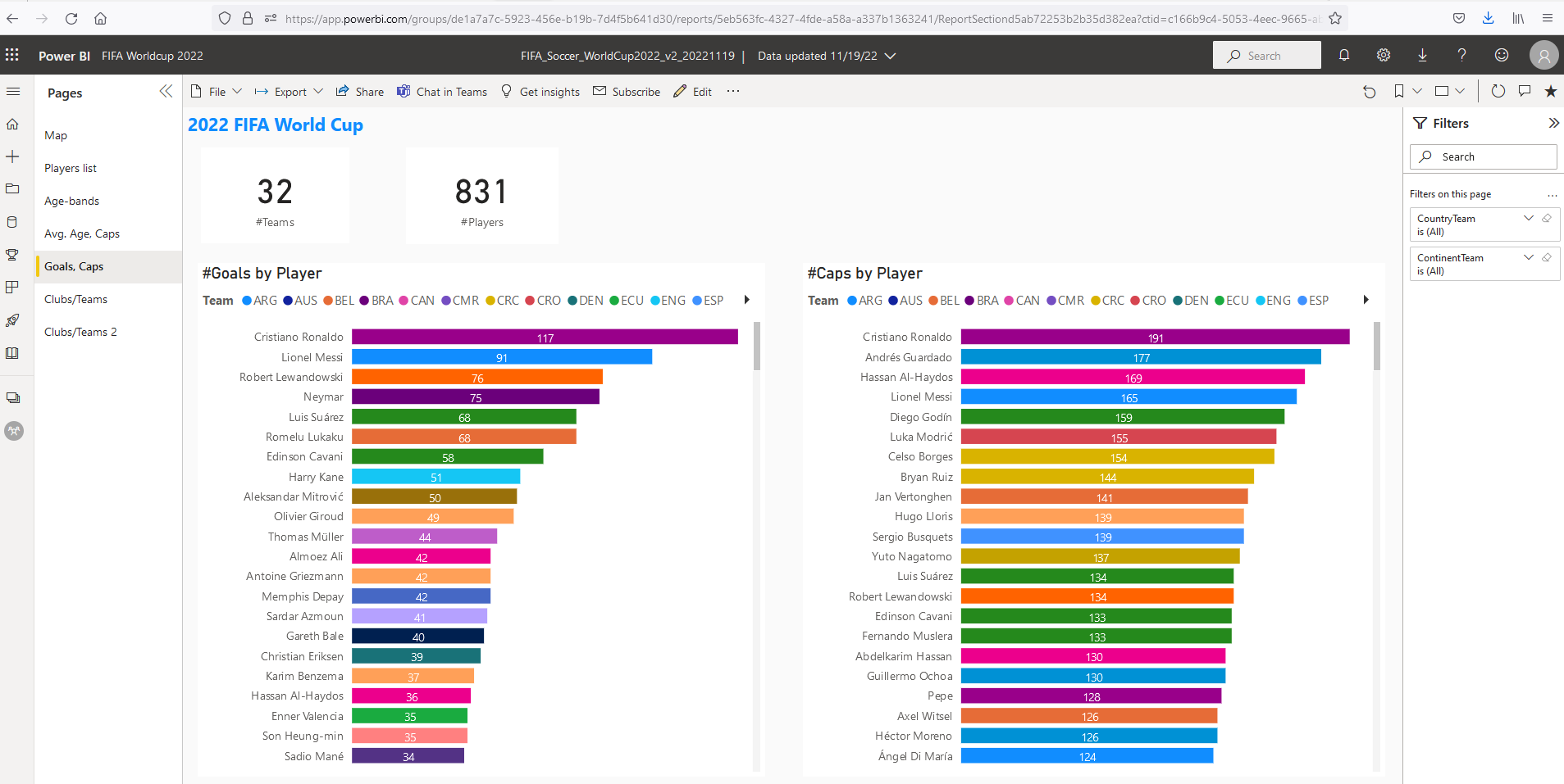
So of course the #Goals-list is led by Cristiano Ronaldo (37 years) and Leo Messi (35), and if they will make some more goals in this World Cup, their goal# will be automatically updated in my report (thanks to Wikipedia that keeps his data up-to-date).
NB: for a full breakdown of all Messi's goals (both for Argentina as for the clubs he played/plays for), see this older blog-post:

https://worktimesheet2014.blogspot.com/2021/01/messi-goal-tracker-dashboard-in-google.html

So as you can see, before the start of the World Cup, Messi has made 91 goals for Argentina:


I'll now show all pages of the Power  BI dashboard and share some 'insights' I got from the charts:


*Page 1


So most teams come from Europe (UEFA), while a lot of good players that play for a club in Europe come from South America. But as this is the last World Cup with 32 countries, and in 2026 there will be 48 countries, this should be solved then.


*Page 2


So this table is filtered for team = ARG.

Fields:

-Pos.: position (GK = Goalkeeper, DF = Defense, MW = Midfield, FW = Forward)

-Country-Club: the country of the club a player plays for, e.g. for Messi, that plays for PSG, this is France. This info was not in the Wikipedia page that was the main source for my report, but I got it from here: http://www.eurotopteam.com/football/EN/club.php
So this is just for European clubs, but as the best players of all countries (continents) play normally in Europe, this is enough for the things I wanted to analyze.

-Continent-Team:Continent in which a country/national team plays its international competition, e.g. for Messi this is South America.

This table allows for all kinds of filtering, e.g. 'players with >= 100 caps' :


*Page 3


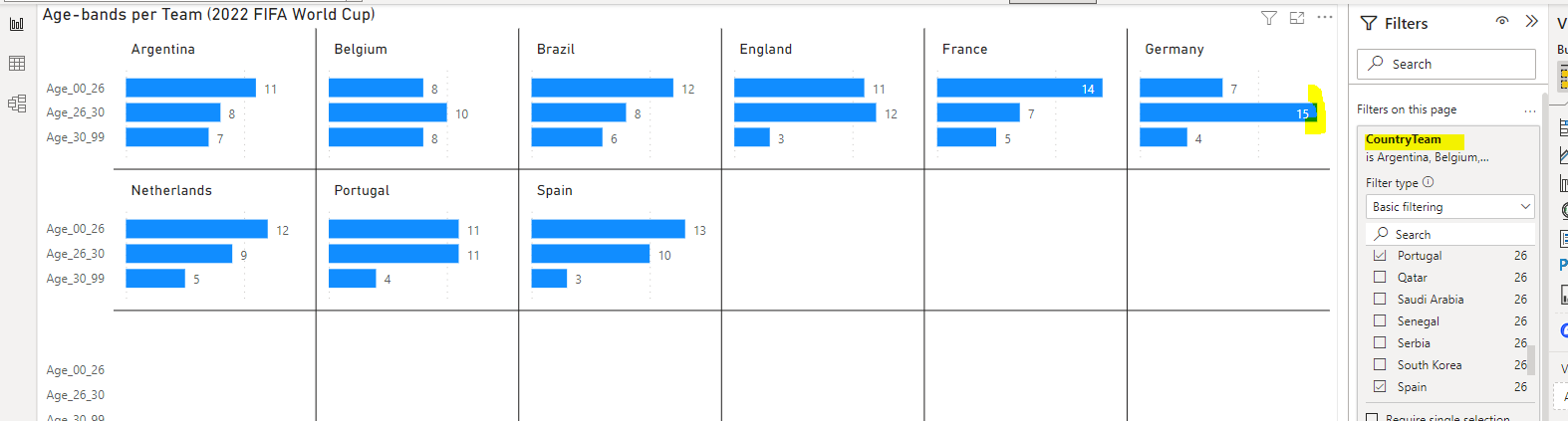
In this 'small-multiples' chart, you can see that for each country the # players for 3 age-bands:

  • < 26 years
  • 26-30-years (this should be the age-range when a player is at his best level, see here)
  • > 30 years

I filtered on what are probably the strongest countries (to compare them more easily), and it looks like Germany has the best 'score' on this age-dimension.


*Page 4


So this shows e.g. that Belgium has a more experienced (older) team than Netherlands

 
(*Page 5: See 1st pic in this post)
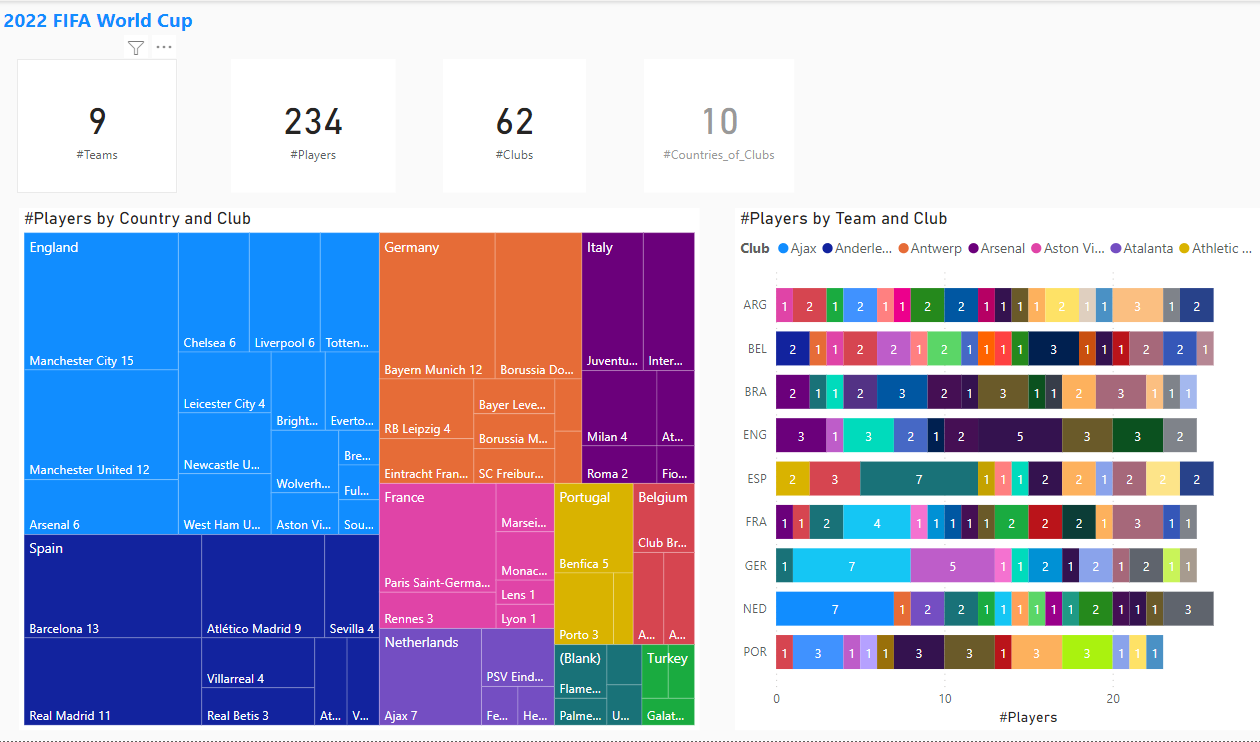

*Page 6


This shows e.g.:
-the (European) club with the most internationals that play in this World Cup is Bayern Munchen
-Barcelona delivers 7 players to team Spain, and same for Ajax for team Netherlands (which is more than any other club in Spain / Netherlands (see Page 7, right chart)  


*Page  7


So most players in the World Cup that play in a European competition (league) do that for an English club, and most in Manchester (Manchester City and Manchester United).

Besides the charts I made myself, Power BI can also generate charts, see here 2 examples that were the result for 'Q&A' and 'Insights' (that use built-in Machine Learning/AI):


Update 22/11/2022 - Start

I also made a Power BI app, so colleagues in Visma (with a Power license for visma.com) can find it in the Apps-space:


And this is how the Power BI app looks on Desktop (PC) and Mobile:


NB: here you can see a (new) report-wide filter Country (added on 22/11/2022)


At work we use Google Workspace (formerly G Suite) and one of the apps in this suite is Google Sites and on this blog-space I also added the embedded report (as in this blog-post, made with Google Blogger):

https://sites.google.com/visma.com/examples-of-self-service-bi/2022-fifa-world-cup


Update 22/11/2022 - End


Update 8/12/2022 -Start

 Today is the first day of the quarter finals. In the dashboard about these last 8 countries/team we can see e.g:

- the top 3 clubs of the players in this round of the World Cup come from Manchester United, Manchester City and PSG.

- most players that play for a (bigger) club in Europe play in England (Premier League)

- most teams come from Europe (5 out of 8)


Update 8/12/2022 -End  


Update 13/12/2022 -Start

Today the semi-finals will be played. Interesting to see that most of the players that play for a (bigger) European club, play in Madrid (#: 8), my home-town;) , for Atlético de Madrid and Real Madrid.
One of them is Luka Modric of Croatia (and Real Madrid), a great player and even Barcelona called him a true gentleman:

https://www.marca.com/en/football/barcelona/2019/12/03/5de59d82ca47418a2e8b45df.html

See also this video

Update 13/12/2022 -End 


If you want to do some 'slicing-and-dicing' of this World Cup 2022 Players data yourself,

click here to open my report

Power BI is IMO quite easy to use, especially if you have worked with Excel pivto-tables. But it has a lot of more features. I can recommend this video from #GuysInACube to get to know these features better:
Using Power BI reports from an end user perspective

And if you have some interesting results, it would be nice to see that, so please share them in the comments below (I only check non-anonymous comments).


If you liked my World Cup 2022 Power BI report, remember there's a Donate button on the top-right of my blog :)

I want to thank Hummel that I asked for a photo to use in my report of the Denmark's World Cup black jersey that they made to mourn over the migrant workers that died in Qatar building stadiums and infrastructure, for more about this see here. (I guess I can forget now that a sheikh that would read my blog would press the 'Donate' button.., but I wouldn't want his money anyway.)

For those who like to organize a World Cup pool (betting-game), I can recommend you this one: https://matejero.es/excel-porra-mundial/
This is used for the pool at my work, and the pool-winner can choose a shirt of the country of his  preference, and if I'd win, I'd choose the black jersey of Denmark, the one with nr. 4, of captain Simon Kjaer (who helped to save the live of team-mate Eriksen at Euro 2020 who suffered a cardiac arrest, see here).


References

*1: video of photo-exposition "Soccer for hope" in Madrid:
Exposición "Fútbol para la esperanza"

*2: Excel with World Cup schedule:
https://www.excely.com/football/2022-fifa-world-cup-schedule.shtml

*3: The first FIFA World Cup hosted in the Middle East - a visual explainer to Qatar 2022

 *4: Fact check: How many people died for the Qatar World Cup?

*5: Cruel Twist Puts Wales in World Cup and Keeps Ukraine Out


Power BI report (embedded)

-


-


Download

FIFA_Soccer_WorldCup2022_v2_20221119.pbix

29 Mar 2022

Tableau report of Ukraine-refugees and destination-countries


#83: Tableau report of Ukraine-refugees and destination-countries


I made already a report 'Ukraine-refugees and destination-countries' with Microsoft Power BI (see this post) and Google Data Studio (see this post), and this post is about a report I made with Tableau Online (a free 2 weeks trial version).


Tableau has several (BI-)products, see:

https://www.arkatechture.com/blog/tableau-101-the-difference-between-tableau-products-plus-infographic

I already worked once with the free Tableau Public (see this post about a Covid-19 dashboard), and this time I chose to use Tableau Online, the hosted version of Tableau Server, so no need to install any software.

As a datasource I wanted to reuse the Google-Sheet for my Google Data Studio report (see this post), but unfortunately it is not possible to use a doc from G-Drive:


With Tableau Public, I could use a G-Sheets doc as a datasource for my (Covid-)report.

Anyway, I downloaded the 3 tables (3 worksheets) from G-sheets to CSV-files and used these files for my Tableau-report. So the data in this report is not automatically refreshed (as it is for the Power BI report and Data Studio report), but has the data from the UNHCR-dataportal as of today (29/3/2022).

I wanted to share my report on https://public.tableau.com/s/ , but to do this, I had to use Tableau Public. And I had to embed the datasources (3 CSV-files) of my report, using Tableau-extracts:

https://help.tableau.com/current/online/en-us/datasource_extract.htm 


For my post on Tableau Public, see:

https://public.tableau.com/views/UkraineRefugees2022/UkraineRefugeesDashboard?:language=en-US&publish=yes&:display_count=n&:origin=viz_share_link


Embedded report


PEACE TO UKRAINE!


Source:

https://euromaidanpress.com/2014/03/02/russian-designer-creates-icon-for-peace-in-ukraine-using-the-shapes-of-the-national-symbolic/


References

https://public.tableau.com/views/UkraineRefugeeAnalysis/Sheet2?:language=en-US&:display_count=n&:origin=viz_share_link

https://public.tableau.com/app/profile/andriantseheno.tiana.val.riane/viz/UKRAINEREFUGEESBINTITIANA/Tableaudebord1

https://public.tableau.com/app/profile/info.unit/viz/UkrainesHumanitarianCrisisMapv2/UkraineIDPmap

https://public.tableau.com/app/profile/.45545509/viz/UkraineWarDataVisualizationsDashboard/1_2


Downloads

Tableau-report


27 Mar 2022

Google Data Studio report of Ukraine-refugees and destination-countries


#82: Google Data Studio report of Ukraine-refugees and destination-countries


The war between Ukraine and Russia is already going on for more than a month now, and the number of Ukraine-refugees who fled to a neighbor-country is close to 4M now. Also another 6M people fled to other safer regions in Ukraine. So in total aprox. 10M have left their homes now. Of them aprox. 4M are children, which is about half of the country's children, see e.g.:

https://www.washingtonpost.com/kidspost/2022/03/26/war-ukraine-has-forced-half-nations-children-flee-their-homes/

https://www.bbc.com/news/world-60555472


A previous post was about a Power BI report that I made with as a source UNHCR-data of Ukraine-refugees, see:

https://worktimesheet2014.blogspot.com/2022/03/power-bi-flow-map-of-ukraine-refugees.html.


In this post I made a similar report, but now with Google Data Studio:

https://datastudio.google.com/reporting/53d717be-f008-49b9-bc67-a2daeece66b7


The data-source of this report is a Google-Sheets that I made:

https://docs.google.com/spreadsheets/d/e/2PACX-1vSX2Oxyqwy6qA2RBRkBkmvlEu_npVea1ZPp6bE7AWBxue6rRIUhL2r_-53iQXyLqPoRH7LyvLMlw4S3/pubhtml

Here I import the JSON-files of the UNHCR data-portal. G-Sheets does not have a built-in function do do this, but there is a G-Sheets extension for this which I used:

https://nodatanobusiness.com/resources/importjson-your-first-importjson-function/

https://www.youtube.com/watch?v=EXKhVQU37WM - IMPORTJSON Function - Google Sheets Tutorial - How to Import JSON feed to Spreadsheets


NB: This add-on has a limit of  #refreshes per day (100), but it looks there is a workaround:
https://discourse.gbif.org/t/api-importjson-spreadsheet-quota-limit-reached/2218

To format this data in table-format and in a separate worksheet (needed for Google Data Studio), I defined named ranges and used the QUERY-function:

https://infoinspired.com/google-docs/spreadsheet/learn-query-function-with-examples-in-google-sheets/

 https://www.youtube.com/watch?v=kQ7DKx3eZQg - Create a Data Table in Google Sheets Like Excel


PEACE TO UKRAINE !

Source:

https://euromaidanpress.com/2014/03/02/russian-designer-creates-icon-for-peace-in-ukraine-using-the-shapes-of-the-national-symbolic/


References

https://www.statista.com/study/86697/russia-ukraine-conflict/#professional

https://www.forbes.com/sites/rashishrivastava/2022/03/15/how-one-google-doc-is-helping-thousands-of-ukrainian-refugees-navigate-borders/?sh=6c2fd8fed18e

https://twitter.com/Schwarzenegger/status/1504426844199669762 

https://eacnur.org/es


Embedded Report


13 Mar 2022

Power BI dashboard with Flow Map Ukraine-refugees and Map NATO-countries


#81: Power BI dashboard with Flow Map Ukraine-refugees and Map NATO-countries

Today is the 18th day of the war between Ukraine and Russia and there are now 2.6 Ukraine-refugees.

In my previous blog-post, there was a live-tracker of the number of refugees based on this page, and I saw it was not updated, but that is fixed now. I also added some elements to the report, and some more details to that post.

In this post I wanted to combine the Flow Map of this live tracker report with the report'
'NATO-countries Map from this post.
Combining reports (or elements of it) is something you can do with Dashboards

Here is the result:

Note that on 2 tiles (coming from the report with the live-tracker of the number of refugees) you can see when it was refreshed.

You can also add tiles with other things than a link to a report, see e.g. the tile with a link to:

https://en.wikipedia.org/wiki/Russo-Ukrainian_War 

See also the sample-comment I made, and by using a tag @.., an email is send to that person.

Update 15/3/2022:

I just saw that the Power BI report on the UNHRC data-portal changed the visualization from bubble-map to flow-map, and a nicer one than that of the custom-visual I used:


PEACE TO UKRAINE !

source pic:

https://euromaidanpress.com/2014/03/02/russian-designer-creates-icon-for-peace-in-ukraine-using-the-shapes-of-the-national-symbolic/


References

https://www.unhcr.org/nl/2022/03/dataportal-cijfer-vluchtelingen-oekraine/ 

https://www.theatlantic.com/photo/2022/03/photos-ukrainian-refugees-say-goodbye-home-and-family-members/626964/

https://news.sky.com/topic/data-and-forensics-9532

https://www.youtube.com/watch?v=yzNxLzFfR5w  - Winter on Fire: Ukraine's Fight for Freedom | Full Feature | Netflix


5 Mar 2022

Power BI Flow Map of Ukraine refugees and destination countries


#80: Power BI Flow Map of Ukraine refugees and destination countries

Update 13/5/2022:
I made some improvements in the report, see Embedded report (at bottom), or see my post on the Power BI Data Stories Gallery here.


Today is the 10th day of the war between Ukraine and Russia and there are already over 1M Ukraine-refugees.

I saw here a flow map which shows to which countries they flee:

https://www.bbc.com/news/world-60555472#:~:text=Which%20countries%20are%20Ukraine's%20refugees,gone%20to%20Russia%20and%20Belarus.

https://www.aljazeera.com/news/2022/2/28/russia-ukraine-crisis-in-maps-and-charts-live-news-interactive\


I made something similar in Power BI, using the custom-visual Flow Map, for more info, see:

https://weiweicui.github.io/PowerBI-Flowmap

 with as data source a Jason-file from the UNHCR site:

https://data2.unhcr.org/population/get/sublocation?widget_id=283559&sv_id=54&population_group=5459,5460&forcesublocation=0&fromDate=1900-01-01


This JSON-file I found here:

https://data2.unhcr.org/en/situations/ukraine

Below the map you can see a JSON-feed, with URL:

https://data2.unhcr.org/population/get/sublocation?widget_id=284488&sv_id=54&population_group=5459,5460&forcesublocation=0&fromDate=1900-01-01

and to view this file, you can use this nice (free) online JSON-file viewer:

https://jsonformatter.org/json-viewer


And I conclude this blog-post with the same picture as in the last post.
So as you can see in the URL, it is made by a Russian designer, wishing 


                PEACE TO UKRAINE


https://euromaidanpress.com/2014/03/02/russian-designer-creates-icon-for-peace-in-ukraine-using-the-shapes-of-the-national-symbolic/


Interesting links

https://www.nytimes.com/2022/03/01/world/europe/ukraine-war-migration.html


Download

Power BI report


Embedded report


2 Mar 2022


#79: Power BI Map of Europe and its alliances NATO EU Euro

Because of the war between Ukraine and Russia, and the importance of NATO-membership for especially East European countries that border with Russia as e.g. the Baltic states (Estonia, Latvia and Lithuania), I was wondering if it would be possible to make visualization in Power BI that can show for all European countries their membership in the most important military, political and economic alliances (NATO, EU and Euro), in one map. I came up with this solution, so a map with a pie-chart for each country that can have between 1 and 4 parts (Europe, EU, Euro, NATO):


REPORT


Note that in this pic, I filtered on field Indicator = NATO (see legend), which is the highlighted purple pie in the chart.

And if you zoom-out, you can see which other countries in the world belong to NATO. 

And to my surprise I also saw that outside Europe, there are some countries were the Euro is used (ex-colonies of Europe, e.g. French Guiana):


DATA

When I googled to find a list with NATO/EU/Euro-countries, I found this site:

https://www.wolframalpha.com

Here you can formulate a natural language query using the Wolfram(computational) language
which does:

Compute expert-level answers using Wolfram’s breakthrough algorithms, knowledgebase and AI technology

and you get the result like this (I used the plain text version):

https://www.wolframalpha.com/input?i=countries+in+nato


MODEL

For the 4 datasets (Wolfram-output files), I made a dataset in Power BI, pivoted the 1-line-file (a list of  countries) to have a table of countries, and added an indicator as e.g. 'NATO' for the NATO-dataset. And the last step was to 'union' these 4 datasets into 1 dataset:


Interesting links

https://www.washingtonpost.com/graphics/world/how-european-countries-are-bound-together/

https://euromaidanpress.com/2014/03/02/russian-designer-creates-icon-for-peace-in-ukraine-using-the-shapes-of-the-national-symbolic/

which this very nice (free to share) icon:


Download

Power BI-file


Power BI Embedded 

(i-frame)