#83: Tableau report of Ukraine-refugees and destination-countries
I made already a report 'Ukraine-refugees and destination-countries' with Microsoft Power BI (see this post) and Google Data Studio (see this post), and this post is about a report I made with Tableau Online (a free 2 weeks trial version).

Tableau has several (BI-)products, see:
I already worked once with the free Tableau Public (see this post about a Covid-19 dashboard), and this time I chose to use Tableau Online, the hosted version of Tableau Server, so no need to install any software.
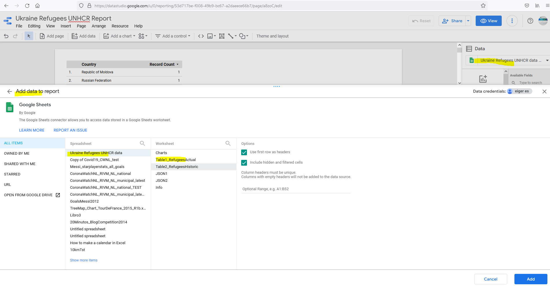
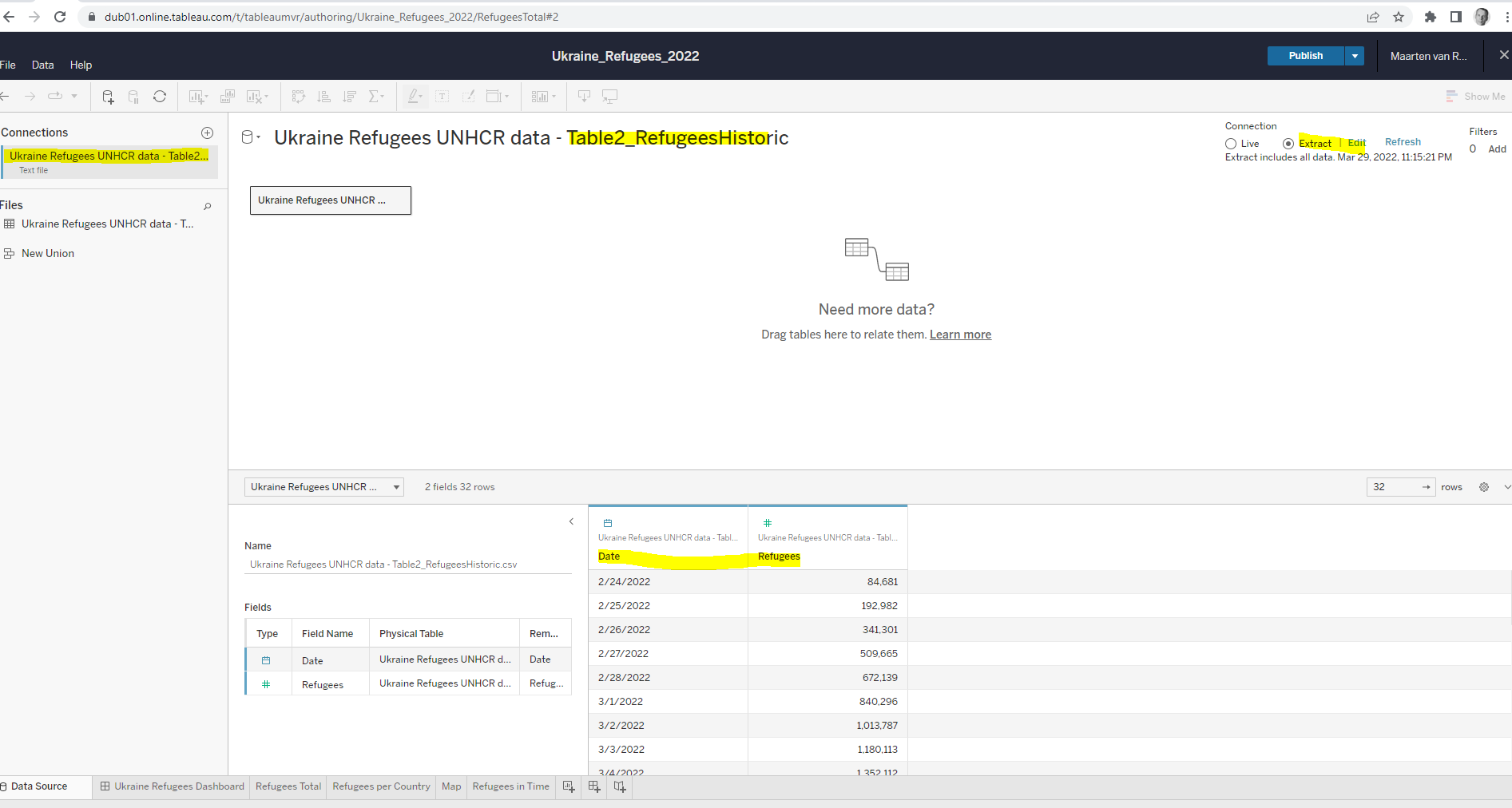
As a datasource I wanted to reuse the Google-Sheet for my Google Data Studio report (see this post), but unfortunately it is not possible to use a doc from G-Drive:

With Tableau Public, I could use a G-Sheets doc as a datasource for my (Covid-)report.
Anyway, I downloaded the 3 tables (3 worksheets) from G-sheets to CSV-files and used these files for my Tableau-report. So the data in this report is not automatically refreshed (as it is for the Power BI report and Data Studio report), but has the data from the UNHCR-dataportal as of today (29/3/2022).
I wanted to share my report on https://public.tableau.com/s/ , but to do this, I had to use Tableau Public. And I had to embed the datasources (3 CSV-files) of my report, using Tableau-extracts:
https://help.tableau.com/current/online/en-us/datasource_extract.htm
For my post on Tableau Public, see:

Embedded report
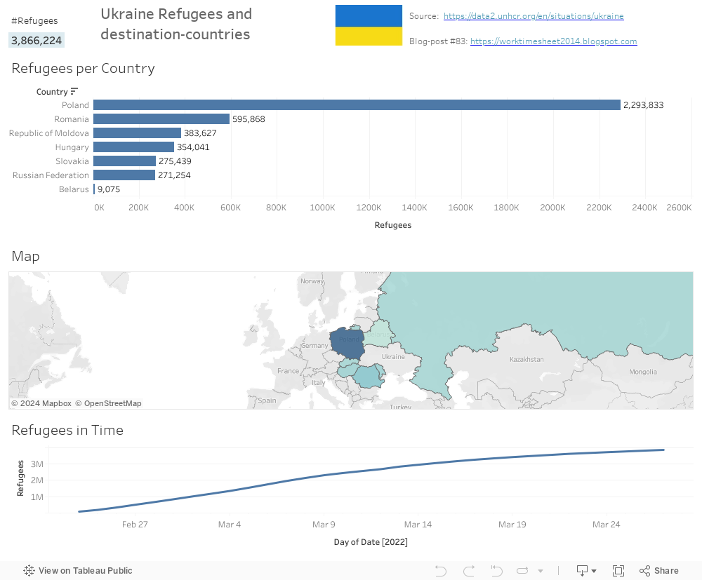
PEACE TO UKRAINE!

Source:
References
https://public.tableau.com/views/UkraineRefugeeAnalysis/Sheet2?:language=en-US&:display_count=n&:origin=viz_share_link
https://public.tableau.com/app/profile/andriantseheno.tiana.val.riane/viz/UKRAINEREFUGEESBINTITIANA/Tableaudebord1
https://public.tableau.com/app/profile/info.unit/viz/UkrainesHumanitarianCrisisMapv2/UkraineIDPmap
https://public.tableau.com/app/profile/.45545509/viz/UkraineWarDataVisualizationsDashboard/1_2
Downloads