#71: "COVID-19 in the Netherlands" live dashboard with Google Data Studio and open data of CoronaWatchNL
In march I made my first "COVID-19 in the Netherlands dashboard", in Microsoft Power BI , based on the open data on: https://github.com/J535D165/CoronaWatchNL
and for the post about that dashboard, see:
Last week I got news from J. de Bruin that his CoronaWatchNL project won the 'Dutch Data prize', a prize for researchers who make (research-)data available for further research, so to offer it as open data, or as much open as possible, also called fair data. For more details about this prize and CoronaWatchNL, see:
and for a video with the award ceremony with J. de Bruin, see:
(starting at min. 8:53).
In the email that J. de Bruin sent to me and some others who participated in his project, to tell us the news, he said that this award was also ours, although I must say my contribution was relatively small compared to the tremendous work he did (and still does).
The success of CoronaWatchNL stimulated me to make a new (and better) dashboard, as my first one was not up-to-date anymore. To refresh the data in that (Power BI) dashboard I had to do some manual work because the datasource was a local CSV-file, which I downloaded daily from CoronaWatchNL, and that I than processed in my (local) Power BI report, which in the end I had to upload to the Power BI cloud.
The new 'live' dashboard for the CoronaWatchNL data, I made with Google Data Studio (GDS), which has a datasource a Google-Sheet with a formula that imports the CoronaWatchNL data, and gets automatically refreshed once the CoronaWatchNL data is updated (daily at aprox 16:00).
The 'dashboard' actually consists of 2 GDS-reports, in 2 UX-flavors (a: Light theme and b: Dark theme), see FIG.1-4 for the screenshots, the URLs and the i-frames of the 4 reports (for embedding the report in a website). And at the end of this post, you can also see the embedded reports (which are always up-to-date).
FIG.1a: COVID-19 in the Netherlands dashboard (part 1/2) - Number of cases by province and city (Light theme)

NB:
- report says 'City', but it is actually 'Municipality'.
- the data in the top-right of the header is the date of the datasource, which is refreshed at aprox. 16:00.
FIG.1b: COVID-19 in the Netherlands dashboard (part 1/2) - Number of cases by province and city (Dark theme)
<iframe width="600" height="450" src="https://datastudio.google.com/embed/reporting/ddb639ef-c243-4941-854e-ef10845a1658/page/xuVpB" frameborder="0" style="border:0" allowfullscreen></iframe>

FIG.2a: COVID-19 in the Netherlands dashboard (part 2/2) - Number of cases over time (Light theme)

FIG.2b: COVID-19 in the Netherlands dashboard (part 2/2) - Number of cases over time (Dark theme)
<iframe width="600" height="450" src="https://datastudio.google.com/embed/reporting/d0e15dd4-e4e0-46a1-9879-ccd5353a5c42/page/lPmpB" frameborder="0" style="border:0" allowfullscreen></iframe>

If you want to use the URLs above in your website, but you want to use a different filter than the default filter, then copy the URL after you applied the filter. As you can see in FIG.3, the URL now has the applied filter in it.
This is because I enabled the 'custom bookmark links' feature of GDS for the dashboard. See: https://www.clickinsight.ca/blog/using-bookmark-links-in-data-studio
FIG.3: URL with filter Province = 'Zuid Holland'

The dashboard is interactive, so you can filter, drill-down or choose different metrics, see FIG4 a-b. for some examples.
FIG.4a: Drill down for Province = 'Zuid Holland' to City

FIG.4b: change the (default) metrics (total/new numbers) for the optional metrics (percentages)

The datasources I used for these reports are:
Datasource 1: RIVM_NL_municipal_latest.csv
https://docs.google.com/spreadsheets/d/1lKWmtYl5hhnlHzqQv2Y6PQcadVdNuI0Pz-VxttRICeA/edit?usp=sharing
=ImportData("https://raw.githubusercontent.com/J535D165/CoronaWatchNL/master/data-geo/data-municipal/RIVM_NL_municipal_latest.csv")

NB:
The grey-columns are not from the CoronaWatchNL file, but extra columns that I added. E.g. column 'Municipality' (shown as 'City' in the GDS-report) replaces the '-1' value of the original column to 'ZZ Unknown'.
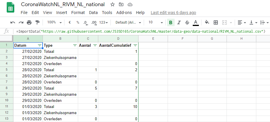
Datasource 2: RIVM_NL_national.csv
https://docs.google.com/spreadsheets/d/1Z9gWo6U3B_GIOsnewwNrqzASaNzW56-Y2hwi207_n3Y/edit?usp=sharing
=ImportData("https://raw.githubusercontent.com/J535D165/CoronaWatchNL/master/data-geo/data-national/RIVM_NL_national.csv")
NB:
*1: The datasources have 1 row per metric (see column 'Type'), and as there are 3 metrics, there are 3 rows per date and location (for datasource 1) or per date (for datasource 2). Therefore it's necessary to filter in the report or chart which metric-type you want to display. An alternative would have been to 'pivot' these 3 rows to 3 columns, so then there would be only 1 row per date and location (for datasource 1) or per date (for datasource 2), and so then the table would be like a 'normal' fact-table (in BI-terms).
*2: In the datasource there are some records with negative numbers, which are corrections I guess. I choose to not plot them in the chart, as these are exceptions and could lead to confusion.
FIG.5: negative numbers (corrections) in datasource

For the dashboard (4 GDS-reports), I enabled Google Analytics, so I can see the usage. Here you can see how this can be done:
One of the sharing options of GDS is by scheduled email. If you are interested in this, please let me know, and I can add you to the mail-list.
To conclude this post I wanted to say congratulations to Jonathan de Bruin and all other people who work on the CoronaWatchNL project, and keep up the good work!
Embedded Google Data Studio report
COVID-19 in the Netherlands dashboard (part 1/2) - Number of cases by province and city (Dark theme)
COVID-19 in the Netherlands dashboard (part 2/2) - Number of cases over time (Dark theme)
Interesting Links about GDS
How to create a [Google Data Studio] dashboard for coronavirus:
GDS-tutorial: