31 Mar 2020

COVID-19: Analysis of number of deaths in Italy, Spain and Netherlands with Power BI

#70 COVID-19: Analysis of number of deaths in Italy, Spain and Netherlands with Power BI 

Update 2/4/2020: Today I improved the report, which you can download now (see link at bottom of page), and I finished this blog-post, and I included the (embedded) report (at the bottom of this page).

In the report subject of this blog-post, I wanted to compare the COVID-19 state in 3 countries:
Italy, Spain (where I live) and the Netherlands (where I'm from). For the comparison I chose to use the number of deaths of Corona-patients, as this indicator shows how well a country can manage the care for the patients, so the infected people who are hospitalized and might need to go to the Intensive Care. And it is known that first in Italy, and now also in Spain, and especially Madrid (where I live), the IC-capacity has reached it's limit, or passed that point..

From this video:
US death rates v UK, Italy and South Korea - BBC News
I learned that to compare the 'curves' (in this case of Corona-death#), you have to have an x-axis with releative time, so not the calender date, but the day-number of when a country passed a certain number of deaths, i.c. 25. So e.g. day #1 is the 1st day with death# >=  25,  which Italy reached first (on 1/3), and then Spain (on 10/3, so 9 days after Italy) and then Netherlands (on 17/3, so 16 days after Italy).
So this I also did for my PowerBI-report, see fig.1.
I also made a chart with the calender-date on the x-axis, see fig.2. As you can see, here it is not as clear as in fig.1 that in Spain, the death# has been rising faster than in Italy (e.g. death# 5000, Spain passed on day 19, Italy on day 23).

For this report, I collected the data (source-files) on 30/3/2020.  This report is not daily updated (it's an ad-hoc analysis, with some manual work to 'shape' the data for my report).
The sources for my report were 3 open data sets (CSV-files), on Github:

-1: Italy
https://github.com/pcm-dpc/COVID-19
file: dpc-covid19-ita-andamento-nazionale.csv

offical source:
 http://opendatadpc.maps.arcgis.com/apps/opsdashboard/index.html#/b0c68bce2cce478eaac82fe38d4138b1

-2: Spain
https://github.com/datadista/datasets/tree/master/COVID%2019
file: ccaa_covid19_fallecidos_long.csv

offical source: https://covid19.isciii.es/

-3: Netherlands
URL: https://github.com/J535D165/CoronaWatchNL
file: rivm_corona_in_nl_fatalities.csv

offical source:: https://www.rivm.nl/nieuws/actuele-informatie-over-coronavirus

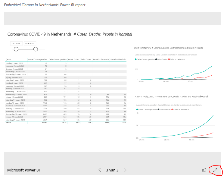
And see also fig.4 for the dashboards created with this data (by the IT/ES/NL governments).
And for a nice dashboard for the Italian data, in English, see:

https://covidashit.herokuapp.com/

which was made by Fabrizio Miano .

For the 'meta-data' of these datasets, see:
https://dataverse.harvard.edu/dataverse/covid-19-eu
by Vyacheslav Tykhonov #4tikhonov , who told me he can need some help to create an international standard for COVID-19 open data, so if you think you can be of help, please contact him.

NB: I also considered using the open data of Johns Hopkins University, see:
https://github.com/CSSEGISandData/COVID-19/tree/master/csse_covid_19_data
which COVID-19 dashboard is the most well-known I think, see:
https://coronavirus.jhu.edu/map.html
because it has the numbers of all countries in1 file. But when I compared the data of the 3 above official sources with that of JHU, I saw that JHU had for Spain, for 28/3 another death# than the official sources (5982 vs 5690), see also fig.5, which shows some sample lines of each source-file (IT, ES, NL and JHU).
For more details about the different COVID-19 sources and a comparison, see:
https://ourworldindata.org/covid-sources-comparison

Besides, the JHU CSV-file has the dates in the column header, so every day the file has one column more, which makes it more difficult to process (better is to have for each day a new record (line in the file) and column# unchanged, as the other sources have.

Because each dataset had a different format, step 1 in my Power BI report was to edit the M-query for importing the CSV-files in such a way that all 3 datasets had the same columns (see fig.3).

For the datamodel, I duplicated the tables with the source data, so I could create 2 parallel schema's, one where the tables were connected via the Calendar-Date and the other one with the Relative-Date (Day-nr) as the 'pivot', see fig.6.

I used 2 DAX-formulas for #new deaths (delta), depending on if this metric is for the relative date or for the absolute date (= calendar date):

*1: relative date:

New Deaths NL = 
VAR RowAbove=
CALCULATE (
SUM (COVID19_Deaths_NL2[Total Deaths NL]);
FILTER (COVID19_Deaths_NL2; COVID19_Deaths_NL2[Day] = EARLIER (COVID19_Deaths_NL2[Day]) - 1))
RETURN
COVID19_Deaths_NL2[Total Deaths NL] - RowAbove

NB: DAX I found here:
https://www.edureka.co/community/47018/how-calculate-difference-between-consecutive-rows-columns
And later I learned that this is a 'DAX-pattern', see this page of the Italian DAX/PowerBI-maestros Alberto Ferrari and Marco Russo: https://www.sqlbi.com/articles/comparing-with-previous-selected-time-period-in-dax/

*2: calendar date:

New Deaths NL = SUM(COVID19_Deaths_NL[Total Deaths NL]) - CALCULATE(SUM(COVID19_Deaths_NL[Total Deaths NL]);DATEADD(COVID19_Deaths_NL[Date];-1;DAY))

I am a 'basic-user' of PowerBI, with little DAX-knowledge, but thanks to the things I learned in a recent (free) webinar by #Salvador Ramos, author of https://www.elfuturodelosdatos.com/ , I could solve some issues I run into when creating my report. (e.g. duplicate values because of an error in entity-relations). Salvador gives these free webinars as long as the lock-down in Spain takes, and I can really recommend it.

I posted my PowerBI report also here:

https://community.powerbi.com/t5/Data-Stories-Gallery/Comparison-of-Coronavirus-COVID-19-deaths-in-Italy-Spain/m-p/1007632#M3666

In this Power BI community there is also a 'data-stories-gallery' for COVID-19 reports, see:

https://community.powerbi.com/t5/Data-Stories-Gallery/bd-p/DataStoriesGallery?sortby=postdate&filter=covid-19

and in fig.7 you can see some of the latest post (incl.mine).

And to conclude, here some interesting things I found when preparing this report/blog-post:

- a video of someone who made a really good PowerBI COVID-19 report:
https://youtu.be/qWHIJikCw-8

- a (Spanish) video which explains the 'virus-curve' using Italy and Spain COVID-19 data:
https://youtu.be/9LWrr5aeSn4
https://youtu.be/hbrNF6thC-A

-  alternative way to visualize the 'virus-curve' :  https://youtu.be/54XLXg4fYsc


FIGURES:


fig.1 report with #Deaths in IT, ES, NL with on x-axis: day(-nr) after #25 deaths


fig.2 report with #Deaths in IT, ES, NL with on x-axis: calendar-date


fig.3: M-Queries to transform CSV file to standard format


fig.4: #Deaths reported on 30/3/2020 in the official publications of Governments of IT, ES, NL


fig.5: COVID-19 comparison sources (CSV files on Github)


fig.6: datamodel


fig.7: Power BI community 'data-stories-gallery' for COVID-19 reports


Downloads

Mirror #1

http://tiny.cc/m10dmz


26 Mar 2020

Coronavirus COVID-19 in Netherlands, analyses of the numbers in the Power BI report

#69 Coronavirus COVID-19 in Netherlands, analyses of the numbers in the Power BI report

This blog-post and the report on: 
https://worktimesheet2014.blogspot.com/2020/03/coronovirus-in-netherlands-power-bi.html
will probably be updated now and then, when there is something interesting in the COVID-19 numbers, that I wanted to analyze, as was the case now (25-26/03/2020, see bottom of this page).

I also add interesting URL's I found, on the date I found them (most recent info is on top). 

And for another, far more creative blog, made during our lock-down in Madrid, of my
kids creations in their 'homeschooling' classes of mum and in their free time,  see:

Homeschooling en tiempo de Coronavirus


4/5/2020

EU has COVID-19 open data , for more details see this site:

https://data.europa.eu/euodp/en/data/dataset/covid-19-coronavirus-data

https://jrc-covid.azurewebsites.net/

https://github.com/ec-jrc/COVID-19

and for some videos for a hackathon with this data that EU will organize, see:

EU Datathon 2020 - Webinar on COVID-19 and media and data monitoring

EU Datathon 2020 - Webinar dedicated to COVID-19 data

EU Datathon 2020 and EU open data with Power BI @PublicationsOffice


5/4/2020
- blog with my kids creations in their 'homeschooling' classes of mum and in their free time:
Homeschooling en tiempo de Coronavirus


03/4/2020
- I just finished (updated) my latest PowerBI report "Corona-deaths curve, comparison of Italy, Spain and Netherlands", see:
https://worktimesheet2014.blogspot.com/2020/03/covid-19-analysis-of-number-of-deaths.html

Het verhaal achter de coronacijfers

- I read on LinkedIn, on page of UMCG :
Help our challenge lead UMCG (University Medical Hospital Groningen), which is in the midst of the #coronavirus crisis, by gathering all publicly available datasets to anticipate the spread and impact of #COVID19.

If you want to help out, please fill in this short form at https://lnkd.in/gU4Tmcv and we’ll be in touch.

https://coronavirus.jhu.edu/data/new-cases : shows for the currently top 10 most affected countries, which included Italy, Spain and Netherlands (subject of my blog-post #70), the trend (up/down).


30/3/2020
- article 'Acceptance and Commitment Therapy applied to Coronavirus', by my sister:
 https://ikwerkaanwerkplezier.nl/leidinggevende/blog/mensgericht-managen/hoe-blijf-je-mentaal-overeind-in-de-coronacrisis


29/3/2020

https://github.com/J535D165/CoronaWatchNL is now used by Dutch Red Cross (to make a report with a map of NL with COVID-19 cases).
- report of status in Madrid by Dutch journalist living here:
https://nos.nl/artikel/2328739-een-ramp-voltrekt-zich-in-madrid-en-ik-sta-er-middenin.html


28/3/2020

- Related to what I wrote below (on 26/3) about the growth-factor of the virus (= R0): I added this measure and a new chart to v4 of my 'COVID19-in-NL' report and updated this blog-post about it:
https://worktimesheet2014.blogspot.com/2020/03/coronovirus-in-netherlands-power-bi.html

- On the Spanish Github-page that I used for my "COVID19-in-Spain" PowerBI-report, see:
https://worktimesheet2014.blogspot.com/2020/03/coronavirus-covid-19-in-spain-power-bi.html
and https://github.com/datadista/datasets/issues/37
I read this message, from Vyacheslav Tykhonov (4tikhonov):

Can you probably connect data from the Netherlands https://github.com/J535D165/CoronaWatchNL and Italy https://github.com/pcm-dpc/COVID-19? I'm trying to get everything in the standardized format ready for linkage.
To 4tikhonov: where can I find more about the 'standardized format' of COVID19-data? (which will have all fields in English I suppose/hope, what is now not the case for the Dutch/Spanish/Italian open data

It would be interesting if he creates an COVID19 open data format standard so that I could use my PowerBI report for all countries (with open data following this standard).

He told me that his work is here:
https://dataverse.harvard.edu/dataverse/covid-19-eu

But there must be already some standardization of COVID19-data, to make reports like this:

https://www.arcgis.com/apps/opsdashboard/index.html#/bda7594740fd40299423467b48e9ecf6

https://www.worldometers.info/coronavirus/
NB: note on this page, in table 'Report Coronavirus Cases" (sort by 'Deaths 1M/population) , that the top 3 (real) countries are 1: Italy, 2: Spain, 3: Netherlands.

https://www.databronnencovid19.nl/
RIVM-list has all (Dutch) COVID19-datasources , which includes:
 - https://www.rivm.nl/nieuws/actuele-informatie-over-coronavirus
which has a section 'Duiding' (to analyze and explain the numbers).
 - https://www.kaggle.com/allen-institute-for-ai/CORD-19-research-challenge

volkskrant.nl/de-komende-dagen-volgt-de-coronapiek-zo-zetten-ziekenhuizen-zich-schrap
says next week comes the 'peek' of number of people that are hospitalized (estimation: 1100) and hopefully the Intensive Care capacity is than ready for this. Today, my report shows 2954 people who are/were hospitalized, but not just the 'are' (actual/current) number.


27/3/2020

- I saw on reports of other countries also the metric 'patients cured (discharged from hospital),
and so with this number and the total infected, you can calculate the current number of patients.
This could be an improvement for the dataset I used for my report. But apparently this data is not provided by RIVM.

- Nice dataviz: https://www.covidvisualizer.com/

- Collection of whitepapers, dashboards etc:
https://www.lesswrong.com/coronavirus-link-database

- A friend told me that in NL, Dutch doctors say that the number of 'Corona-deaths' in NL is probably higher than the RIVM-numbers tell, because if someone dies who was not tested (positive) on Corona, the doctor doesn't have to report (to GGD, who reports to RIVM) this as 'Corona-death', even though the person had all symptoms. See:

https://www.ad.nl/binnenland/huisartsen-trekken-officiele-dodental-in-twijfel-werkelijk-aantal-sterfgevallen-is-hoger~a3aaf38f/

- On this page, I saw a nice Dutch Corona-dashboard, with a link, and then I found these good sources:

https://www.arcgis.com/apps/opsdashboard/index.html#/cfc2084c995c40e7ae72254029bf6251
https://nlcovid-19-esrinl-content.hub.arcgis.com/

from: https://www.esri.nl/nl-nl/home
a GIS-company who offers now free help/resources for those who want to use it for the 'fight' against COVID-19, see: https://www.esri.nl/nl-nl/landingspages/coronavirus


26/3/2020

Yesterday (25/3/2020), the Dutch prime minister and RIVM (National Institute for Public Health and the Environment) said it looked that the Coronavirus-spread was stabilizing, so not growing exponentially anymore as in the beginning. After 2 weeks applying safety measures (e.g. social distancing, working from home, not shaking hands when greeting etc.), the effect is that an infected person is now not infecting 2 to 3 other persons anymore (as was the case in the beginning, but aprox. 1 person.
For a (Dutch) article with more details, see:
https://www.margriet.nl/nieuws/coronavirus-maatregelen-werken-groei-besmettingen-neemt-af/

I googled to learn more about the 'growth-factor' of a virus ('infectiegraad'), or R0 (Reproduction number), and found this:
https://www.worldometers.info/coronavirus/coronavirus-cases/#cases-growth-factor
which says :

Growth factor is the factor by which a quantity multiplies itself over time. The formula used is every day's new cases new cases on the previous day. For example, a quantity growing by 7% every period (in this case daily) has a growth factor of 1.07.
A growth factor above 1 indicates an increase, whereas one which remains between 0 and 1 it is a sign of decline, with the quantity eventually becoming zero, whereas a growth factor constantly above 1 could signal exponential growth
Also this video explains the 'maths' very well: https://youtu.be/Kas0tIxDvrg 
And also this one (less 'technical') I can recommend: https://www.youtube.com/watch?v=6rqpRq7nkO8&feature=youtu.be
I did a quick calculation in Excel (exported data in page 3 of report) for R0, see fig.1 for the result, and for the Excel, see Downloads below. And I also added R0 to the PowerBI-report itself.
So as you can see, the growth-factor is indeed aprox. 1 now, although today (26/3) it was a little bit higher than yesterday. Let's hope soon, the growth-factor is less than 1, so then the decline has started, but meanwhile, we have to be patient and stick to the safety-rules.


fig.1: CODVID-19 in the Netherlands, the growth factor


Downloads

#Mirror 1

http://tiny.cc/j86ylz


25 Mar 2020

Coronavirus COVID-19 in Spain, a Power BI report

#68 Coronavirus COVID-19 in Spain, a Power BI report

NB: the embedded report is at the bottom of this page. This report is not daily updated. In case you are interested in this, please let me know in a comment on this post.

This "Coronavirus (COVID-19) in Spain"- Power BI report I could make thanks to the good work done by Datadista which offers open data on GitHub-page:

https://github.com/datadista/datasets/tree/master/COVID%2019

And for the meta-data of the datasets on this page. see:

https://dataverse.harvard.edu/dataset.xhtml?persistentId=doi:10.7910/DVN/GPFFAQ

Datadista is a 'data-journalism' company in Spain, for a recent publication, about #COVID-19 crises in Spain, see:

https://datadista.com/coronavirus/camas-uci/

The source Datadista used to compile their dataset I used for this report (nacional_covid19_rango_edad.csv) is from the Spanish ministry of health (see table 2 in this doc):

https://www.mscbs.gob.es/profesionales/saludPublica/ccayes/alertasActual/nCov-China/documentos/Actualizacion_55_COVID-19.pdf

The numbers are for a group of aprox. 21k Corona-patients for which Age-group and Gender are known (of the total of aprox 47k infected persons in Spain, on 25/3/2020).

The Datadista open data is really usefull for us 'data-engineers', because also the Spanish government, as the Dutch, is not delivering their data in an 'easy-to-process' format (e.g. PDF), and also the quality of the data is not always as it should be. See also:

https://www.elconfidencial.com/espana/2020-03-19/coronavirus-comunicacion-datos-ministerio-sanidad_2505867/

The governments in Italy does it very well, offering open data:

https://github.com/pcm-dpc/COVID-19/blob/master/dati-regioni/dpc-covid19-ita-regioni.csv

And also Singapore is a good example: they have a dashboard which includes the details of all patients (anonimized), like: gender, age, nationality and the actual status of the patient (e.g. hospitalized, discharged, deceased), see:

https://experience.arcgis.com/experience/7e30edc490a5441a874f9efe67bd8b89

Of course, the more 'attributes' of a patient we store, the more insight we can get. E.g. if you would store if someone who gets infected by the Coronavirus also had some other severe disease, and this patient would die, then you could discuss if Corona was really the cause of death, or the other disease, maybe the patient would have survived if he didn't have that other disease but 'just' Corona. You could decide to exclude this case from the 'Corona-deaths' number, and only include people who died of Corona and had no other diseases.

Datadista's offers a dataset (nacional_covid19_rango_edad.csv) that includes dimensions as gender and age-band of the patients, something missing in the Dutch dataset (as this is not given by RIVM).
In fig.1 you can see  the report with these dimensions.
NB: when I made this report, I found a small error in the file, which I reported here:
https://github.com/datadista/datasets/issues/37
and it was fixed within minutes. So by using GitHub to offer open data, the GitHub-community (from which I am a member (user: mvanreek) can help to make the open source 'product' (i.c. Spanish CODVID-19 open data) better.


fig.1 Power BI report with stats about CODVID-19 cases in Spain, incl. details Gender and Age-group.


Downloads

Mirror #1

http://tiny.cc/6cazlz

21 Mar 2020

Coronavirus in the Netherlands: embedded daily refreshed Power BI report

#67 Coronavirus in the Netherlands: embedded daily refreshed Power BI report

NB 31/3/2020:
Since today, this report is not daily updated anymore, because the format and content of the source-data (RIVM CSV file) has been changed and I haven't adopted my reported for this. In case you are interested in this, please let me know in a comment on this post.

NB: the embedded report is at the bottom of this page, and is updated Daily 


The Coronavirus (COVID-19) Power BI report that I made and wrote about in my previous blog-post:

http://worktimesheet2014.blogspot.com/2020/03/coronovirus-in-netherlands-power-bi.html

, I embedded in this new blog-post, so you can see every day the latest numbers. The data in this report get's refreshed daily at aprox. 14:00, when RIVM  (National (Dutch) Institute for Public Health and the Environment) made the new Coronavirus-numbers in the Netherlands available again on their website:

https://www.rivm.nl/coronavirus-kaart-van-nederland-per-gemeente

and after this CSV file was processed by Jonathan de Bruin (Research Data Engineer at Utrecht University) and made available for the public on:

https://github.com/J535D165/CoronaWatchNL

How to embed a PowerBI report in a web-page is described here:

https://powerbi.microsoft.com/en-us/blog/easily-embed-secure-power-bi-reports-in-your-internal-portals-or-websites/

The embedded report below is interactive, so you can do everthing here as you would do when you work in Power BI itself, e.g. filter, drill-down etc.

Hint: when you view the report in your web-browser, use mode 'Open in complete screen' (see red-marked icon in bottom-right icon in fig.1).

Power BI has also a community where members can share their work, which I also did for my Corona-report (under user-name: maartenree), see:

https://community.powerbi.com/t5/Data-Stories-Gallery/Covid-19-in-the-Netherlands-visualising-the-RIVM-data/m-p/985506#M3539

For more details about the report and the PBIX-file (PowerBI), see my previous post.


fig.1  Coronavirus- PowerBI report v3 in webbrowser (i.c. embedded in the page of this blog-post)


HTML (iframe) of today's report (in case you want to embed it in your webpage:

<iframe width="800" height="600" src="https://app.powerbi.com/view?r=eyJrIjoiZjVkOWQ4MzYtM2Q5Yi00MWI0LTllNGYtNDFiY2EyYzgzYjI4IiwidCI6ImI3OWIyMzE3LTM0ZGQtNDNlNS05MWEyLWNkNjZkM2FlMWYwYiIsImMiOjh9" frameborder="0" allowFullScreen="true"></iframe>


Embedded 'Coronavirus in Netherlands' Power BI report

15 Mar 2020

Coronovirus in Netherlands Power BI report

#66 Coronavirus in the Netherlands: Power BI report 

Update 27/3/2020, report v4:
I added a measue for R0 - reproduction number of COVID19 virus.

Update 21/3/2020, report v3:
I  update this blog-post today because I made a new version of the Coronavirus-report. The changes in thin blog-post I marked below with:
 'Update 21/3/2020 begin ... end'
See also my new post: https://worktimesheet2014.blogspot.com/2020/03/coronavirus-in-netherlands-embedded.html
for the report embedded in my blog, and which is daily refreshed (at aprox. 14:00).

Update 15/3/2020, report v2:
I  update this blog-post today because I made a new version of the Coronavirus-report. The changes in thin blog-post I marked below with:
 'Update 15/3/2020 begin ... end'

Spain has declared the state of emergency the other day because of the Coronavirus. My kids were already at home this week because all schools were closed. And this week also the office of the company I work for, Visma Labs Spain  (supporting Visma|Raet in the Netherlands) was closed, and since then I'm working at home. And the Coronavirus crises also lead to a new project I had to work for, to create a report with Coronavirus info in the Netherlands.
In the Netherlands, the official Coronavirus numbers per Dutch municipality are published daily (at aprox. 14:00) by RIVM on:

https://www.rivm.nl/coronavirus-kaart-van-nederland

Here you can download a CSV file with this data. I was wondering if this information was disclosed in a more user-friendly way in Spain, maybe with a REST-API, but it wasn't. My Google-search lead me to this blog-post of Marcos Merino:

https://www.genbeta.com/actualidad/italia-crea-web-datos-abiertos-sus-casos-coronavirus-estas-iniciativas-particulares-buscan-espana

from which I learned that in Italy the governemnt offered Coranvirus-data as open-data here:

http://opendatadpc.maps.arcgis.com/apps/opsdashboard/index.html#/b0c68bce2cce478eaac82fe38d4138b1
(see in bottom-right corner 'Download CSV')

and also on GitHub: https://github.com/pcm-dpc/COVID-19

And Merino also tells that in Spain, the Twitter-user EclĂ©ctikus also shared the Coronavirus-data
 of the Spanish government:

 https://www.mscbs.gob.es/profesionales/saludPublica/ccayes/alertasActual/nCov-China/situacionActual.htm

on GitHub, see: https://nosolodatos.netlify.com/es/covid19/coronavirus

So I wondered if in the Netherlands someone did the same with the Dutch Coronavirus-data from RIVM, and that was the case.  Jonathan de Bruin of Utrecht University offers the RIVM-data here:

https://github.com/J535D165/CoronaWatchNL

And for the meta-data of the datasets on this page. see:

https://dataverse.harvard.edu/dataset.xhtml?persistentId=doi:10.7910/DVN/0PD4JM

I downloaded ('pull- request') his Coronavirus-repository, which also has improments of the RIVM dataset (e.g. it has a Province field, and stores all historic values). And after that, I processed this dataset with Microsoft Power BI . See fig.1-2 for the result, and for the PBIX-file, see Downloads below.

Update 15/3/2020 begin:
I just made a small improvement to the report: I created a  hierarchy for the fields Province and Municipality, so that in Chart 1 you can do a drill down in the map from Province to Municipality, see fig.3 for an example, where I drilled down for province Brabant (the one which is most affected).
(Map-)Chart 1, on municpality-level, makes it visible that the 2 most affected cities within Brabant, Tilburg and Breda, are close, something that (bar-)Chart 2 does not do.

BTW: I created the report yesterday (14/3/2020), and in the screenshots in this blog-post you can also see this date as the 'filter-date' in Chart 1. After a new 'pull' of the GitHub-dataset (15/3/2020 22:00), and a 'Refresh Data' in Power BI, I had the the new data in my report, so without any effort thanks to de Bruins good work.

When you upload a Power BI report to the cloud Power BI Service, you automatically can get 'Quick Insights', see fig.4 for some examples.

Update 15/3/2020 end

Update 21/3/2020 begin
De Bruin added new datasets on his GitHub page, with information about:
- # deaths ("aantal doden")
- # hospitalized ("aantal in ziekenhuis")

I added this new metrics in a new page (3) to the report, together with the old one (# cases ("aantal Corona gevallen"), in a table and 2 line-charts, for both cumulative numbers as 'deltas' (new number per day), see fig.5.

For the 'delta', I used this DAX-formula, which I got from here:

https://community.powerbi.com/t5/Desktop/Delta-Values-from-Previous-Day-Using-Multiple-Columns/td-p/186473

Delta Corona gevallen = SUM(rivm_corona_in_nl_daily[Aantal Corona gevallen]) - CALCULATE(SUM(rivm_corona_in_nl_daily[Aantal Corona gevallen]);DATEADD(rivm_corona_in_nl_daily[Datum];-1;DAY))

NB: De Bruin's source for this data were the RIVM press releases with daily update (below the map) on:
https://www.rivm.nl/nieuws/actuele-informatie-over-coronavirus

Some other improvements of the v3-report are:
- Corona-cases for which RIVM had no data for Municipality, are now having value
"Onbekend" for the fields Province and Municipality in the report
- Chart 3 uses now for stacked bar chart the Province-hierarchy (so enabling drill-down from Province to Municipaliy)
- Page 2 has now also a Date-filter

Update 21/3/2020 end

Update 27/3/2020 begin
The DAX for the  measure  R0 - reproduction number of COVID19 virus is:


R0 = [Delta Corona gevallen] / CALCULATE([Delta Corona gevallen];DATEADD(rivm_corona_in_nl_daily[Datum];-1;DAY))

For the new R0-chart, see fig.6
For more info about R0, see e.g:


Update 27/3/2020 end


fig.1: Power BI report Dutch Coronavirus-data - page 1 (see also fig.3)


fig.2: Power BI report Dutch Coronavirus-data - page 1


fig.3: Power BI report Dutch Coronavirus-data - page 1: Drill-down for Province = Brabant, showing detail for city Breda


Update 15/3/2020 begin


fig.4: Power BI Quick Insights

Update 15/3/2020 end

Update 15/3/2020 begin


fig.5: Power BI table and charts for metrics #Corona-cases, #Deaths, # Hospitalizations

Update 15/3/2020 end


Update 277/3/2020 begin


fig.6: Power BI chart with R0

Update 27/3/2020 end

To conclude, I'd like to share something that was done yesterday here in Madrid, where Coronavirus is hitting hard. Via a Whatsapp-group of school, they asked every child to make a drawing with a rainbow with the text "We'll get trough this", and to hang it out on the balcony, and at 22:00 go out on the balcony and give a big aplaus for all the people who work in public survice (doctors, nurses, police etc.) to thank them for their hard work in dangerous circumstances. And also to support all people in Madrid who now have to stay at home (you can only leave home for the most necessary things as going to the supermarket). For more info about this initiative, see:

https://www.hoy.es/sociedad/salud/dibujos-ventanas-llevadera-20200314172924-ntrc.html?ref=https%3A%2F%2Fwww.google.com%2F

 Below the drawing my 2 sons made.


And for more photos of creations of my kids made in their homeschooling-class with mum or in their free time, see: https://tatinma.tumblr.com/post/613828873964093440/d%C3%ADa-14-de-cuarentena-25-de-marzo-refuerzo


¡TODO SALDRA BIEN!
ANDRĂ€ TUTTO BENE!

M.


Downloads

Mirror #1

http://tiny.cc/cz50lz


References 

English

De Bruin's GitHub-page:  github.com/J535D165/CoronaWatchNL

https://gisanddata.maps.arcgis.com/apps/opsdashboard/index.html#/bda7594740fd40299423467b48e9ecf6

https://app.powerbi.com/view?r=eyJrIjoiMzIwZWZhM2UtM2RiOS00NTYzLTljMTAtNzdiMTcyNWI5MWMxIiwidCI6IjgzNTU5ODFiLTJlYTYtNDdjZi04ZjJiLTc3MTY3N2FmZjMyZCJ9

https://avatorl.org/covid-19/

https://medium.com/@tomaspueyo/coronavirus-act-today-or-people-will-die-f4d3d9cd99ca

https://data.europa.eu/euodp/es/data/dataset/covid-19-coronavirus-data

https://who.maps.arcgis.com/apps/opsdashboard/index.html#/ead3c6475654481ca51c248d52ab9c61

Spanish

https://www.epdata.es/datos/coronavirus-china-datos-graficos/498

https://www.levante-emv.com/espana/2020/03/13/mapa-coronavirus-espana-mundo/1989172.html

https://www.xataka.com/medicina-y-salud/china-aprendio-wuhan-resto-mundo-no

https://www.comunidad.madrid/servicios/salud/2019-nuevo-coronavirus